Curation Revolution
55.1K views | +0 today
Follow
Curation Revolution
Curation the next web revolution.
Your new post is loading...
Scooped by Martin (Marty) Smith
Scoop.it!

The Infographic that Will Revolutionize Your Approach to Content Creation

The Infographic that Will Revolutionize Your Approach to Content Creation | Curation Revolution | Scoop.it

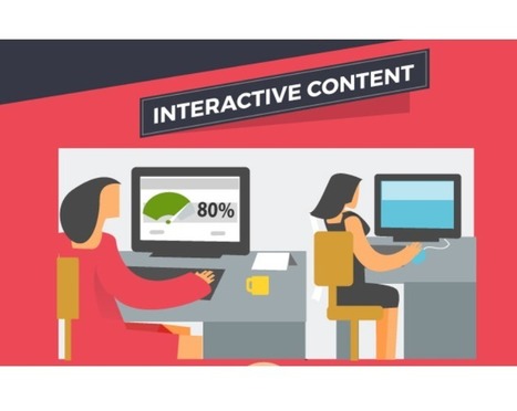
Rise of Interactive Content
We agree with the premise if not the over-hype of this infographic. We see a trend to making websites more conversational, more interactive. The "one size fits all" days are gone. 

In the next few years, we'll see websites capable of wrapping themselves around users like a glove. Web sites that look and feel different from one visitor to the next based on predictive analytics, behavior and creative. If this sounds like the quants and the creatives are about to take over that is what we think too. 

These unlikely affinity groups - right brain engineers and left brain creatives - will need to think, act and design as one. Don't forget our favorite content creation rule - don't create your content ask for help and get others to create it for you. 

Such a "community approach" to content creation is the best way we know to turn your tribe into zealous advocates. Think about it. What are you more likely to advocate your stuff or ours? Answer to that question is obvious and an indication why community is the key to future commerce online. Now that is a revolutionary infographic we'd like to see :). 

Gail Grannum's curator insight, April 9, 2017 6:04 PM
Now is the time to get comfortable with content creation tools that curate information for website visitors and customers.
Scooped by Martin (Marty) Smith
Scoop.it!

Ultimate Guide To Creating A Great News Page via @mkramer

64 Ways To Think About a News Homepage - TheLi.st @ Medium - Medium

This has to be the most comprehensive, well thought out post we've ever seen on creating a news page. They focus on "news homepage", but the lessons apply well to a page every website needs - News. 

News is becoming increasingly important. We are drowning in information, but your ability to filter, curate and share what is really important builds following, increases traffic and shares. News pages need to be constructed in particular ways to as the post points out.

Build in some Feedly, Twitter widgets or Buzz Sumo (or other ways to make the page ping automatically. Don't go 100% feeds since that opts out of the principal benefit - showing your ability to filter, curate and influence by what you choose.

Best curator at exposing his filter preferences and building substantial following I know is Brian Yanish at Marketing Hits (@Marketinghits). 

Create a great news page, have some of it fire with a robot and curate the rest and your following, traffic and return will grow.  

No comment yet.
Scooped by Martin (Marty) Smith
Scoop.it!

Holidays Are Hot: 5 Holiday Website Design Tips via @HaikuDeck

Holidays Are Hot: 5 Holiday Website Design Tips via @HaikuDeck | Curation Revolution | Scoop.it
This holiday selling season (2014) will happen as close to real time as any thanks to the social / mobile web. Listening and curating are going to be important, but so is tapping the nostalgia and spirit of the season in creative and collaborative ways.
No comment yet.
Scooped by Martin (Marty) Smith
Scoop.it!

Turn Visitors Into Your Customers With Persuasive Web Design

Turn Visitors Into Your Customers With Persuasive Web Design | Curation Revolution | Scoop.it

Persuasive Web Design

Clarity – the Basic RequirementVisual FirstSet the Visual in Proper HierarchyAdd a Call to ActionKeep User Behaviors in Mind

Martin (Marty) Smith's insight:

add your insight...

No comment yet.
Scooped by Martin (Marty) Smith
Scoop.it!

Thinking About ThoughtBot.com - Ideo-like Design Team With New Raleigh, NC Office

Thinking About ThoughtBot.com - Ideo-like Design Team With New Raleigh, NC Office | Curation Revolution | Scoop.it


Designers and developers for hire

I LOVE Ideo the west coast design consultancy. I've always wanted to work with Ideo, but their price tag is out of reach. ThoughtBot is an interesting Ideo - like mashup of marketing, programming and design expertise.

CrowdFunde, our "power of the conversation" startup, is discussing using the new ThoughtBot Raleigh team to help with a 5 day product design sprint. We are so close to our idea it would be helpful to have outside perspective before we start writing code.

If you think of the elements of a successful startup, those things that must be balanced, according to Adam Schultz they are:

Money - Who is paying you and for what.

Market - Why are they paying you, what are the pain points you are helping resolve.

Product - What is the tool you are creating and is it aligned to what you've learned in the Money and Market investigations.

ThoughtBot creates a 5 day sprint where each day determines key product attributes from look and feel to functionality and the personas who will be using your better mousetrap.

CrowdFunde can afford to be complex inside the "black box" where algorithms create dashboards. CrowdFunde must be "falling off a log easy" to use, mobile first and with enough hooks we can figure how to expand its billable footprint as we go. We hope the team at http://www.thoughtbot.com can help.


No comment yet.
Rescooped by Martin (Marty) Smith from ma veille d'optimisation
Scoop.it!

The Disappearing Interface: Colored Content Blocks and Squares Are Next

The Disappearing Interface: Colored Content Blocks and Squares Are Next | Curation Revolution | Scoop.it
Since my first site design in 1999 was based on a Modrian grid I love this new trend. Marty


Robin Good: If you have not noticed yet, the next design trend is all about “undesign”.


"Undesign, a minimalist, tablet-friendly approach to website design."


It's not, like Dylan Tweney writes on Venturebeat, that design has become less important, but rather that it is receding in the background to leave space for direct access to content.


"Instead of pages crowded with links, buttons, and display type of all different sizes, designers were simplifying their layouts. The smartest designers stripped away the nonessential elements of their designs, leaving clean pages that let the eye focus on whatever images or words had been put there by writers and editors.


Why?


Because if the designers didn’t simplify their web pages, readers were going to use utilities like Readability and Instapaper to do it for them."


...


"One of the first apps to embrace this sort of rectangularity was Flipboard, which launched in mid-2010. It transformed the process of browsing RSS feeds into a magazine-like experience by putting stories into a boxy, more readable layout.


Last year's big fashion trend was the color block, and this year's tech trend follows suit: It's the square. More precisely, it's the big, colorful rectangle filled with a solid color (like Windows 8) or a photograph (like Pinterest)."


Right on the mark. 9/10


Full article: http://venturebeat.com/2012/03/07/dylans-desk-design-goes-minimal-online-and-off/ ;


Via Robin Good, Johnny E. Ramos Ch.
No comment yet.
Scooped by Martin (Marty) Smith
Scoop.it!

The Rise of Q&A Marketing - Curagami

The Rise of Q&A Marketing - Curagami | Curation Revolution | Scoop.it

Rise of Q&A Marketing

One of the biggest trends we've seen in 2017 is the Rise of Q&A Marketing. It's not hard to see why either. Amazon's Echo and Google Home point to the coming Internet of Things (IOT).


Once that tsunami hits Google's currency - searches fueled by questions and answers - becomes universal, ubiquitous, and demanding. New information architecture and really understanding what "responsive design" and "mobile first" really means is the least of what we'll need to understand as our content marketing and websites become crowdsourced platforms.

http://www.curagami.com/rise-of-q-a-maketing/ 

No comment yet.
Scooped by Martin (Marty) Smith
Scoop.it!

6 Reasons Your Biz Blog Sucks & How To Fix

6 Reasons Your Biz Blog Sucks & How To Fix | Curation Revolution | Scoop.it

Marty Note
Great post by Scoop.it team. At our cool tools for ecommerce merchants startup http://www.curagami.com we see all six of these mistakes. Here are some of the ways we've helped clients fix reasons their biz blogs sucked:

  1.  No Subscription Form
    Agree with this mistake being #1 since it cuts off your Internet marketing nose to spite your face. BUT adding a subscription form can be tricky. If a client has a vast archive we always locate a large search box in their header. If NOT we  cross our fingers and put a subscription from up there.
    We HATE subscription forms in footers since it since the WRONG message. Footer forms say, "Sure you can join, but we don't care." Best location is left rail somewhere below your hero (largest image on the page is a hero) and that means your left column should be navvy (i.e. about 200 - 300 pixels and have other nuggets like social in there too). We don't like being forced right either since we read left to right so stuff on the left typically gets more "eye time". WE HATE popunders those annoying requests to join that must be cleared BUT they work with enough people that most online merchants use them. Our answer to that is if everyone jumped off a cliff would you too and then we realize we are sounding like our parents so we shut up (lol). If you have to popunder use http://rocketbolt.com/ as they are the least obnoxious popunder we've seen.

  2. Content Is Skinny & Stale
    Blogs are a commitment. The deal you make is you WILL be blogging several times a week. Break that commitment and your biz blog will suck, never receive links and so you may as well stay home and watch TV for all the good adding less than 300+ posts a year will do you. Blogging is a discipline, a habit, your routine must incorporate if you want your content marketing to mean anything to visitors not related to you. Daily blogging gets easier the more you do it, but do it you must as fresh content is a huge part of the bargain you are striking with Google when you put a website into its view. Google is important, but your customers are even more important and they believe in QDF too (Quality Deserves Freshness), so blog it out. 

  3. No Relevant CTAs
    Boy this is one of our HUGE pet peeves. If you don't have a BUTTON or LINK on your site that says the equivalent of CLICK ME THERE IS COOL STUFF HERE your biz blog sucks. CTAs are important, but you can have TOO MANY too, so strike a balance and ask for attention HERE and HERE.

  4. No Related Links
    Blogs are NASTY bad at building relevant next links. Without a plugin your blog will be backwards. Most default WordPress themes publish "archives" in reverse publishing order (most recent first). BTW, that sucks. You are better off to have related links at the bottom of a post AND create Top 5 lists across several dimensions such as popularity, most shared, most commented on, staff favorites and even bottom 5. Creating a priority list does wonders for content because it brings the MOB into play. We want to know what OTHERS think is interesting or bad or amazing. Lists work so USE 'em.
    We think of content as products. We want to merchandise, combine and suggest content just like an ecommerce merchant creates cross-sale and up-sale.

  5. Don't Leverage Analytics in PUBLIC
    I'm sitting at a Panera Bread writing this and there is a big sign sharing that the owners shared $19M with charity last year. Public feedback loops such as Top 5 ordered lists and Most Searched summaries help your visitors know you, your content and your tribe.

  6. No Social Shares or BAD Social Shares
    Wow we could write a mile on this one, but we will give you the quick version. 1. Make it easy to share every page 2. Remember you want some shares for your SITE and some for the content people are reading now and those are two different things and need two different social widgets. 3. ALWAYS include your @name in your auto-tweets and shares. 


Great post by the Scoop.iteers. Hope those ideas help you know how to fix six reasons your biz blog sucks. Time and web attention are way to valuable to ever SUCK. That is not to say we've never SUCKED (lol), but we try not to stink forever. Blog on :). M


Marijo's curator insight, November 19, 2014 12:10 PM

Great tips to fix your blog.

If you didn't do it already do it now.

Scooped by Martin (Marty) Smith
Scoop.it!

Share Your Website Pain Story Burn Down Your Website via @Curagami

Share Your Website Pain Story Burn Down Your Website via @Curagami | Curation Revolution | Scoop.it

Mobile makes web design game-like & collaborative. Learn how mobile impacts web design & shoppers & marketers share your favorite website pain story.

Shoppers, Web Designers & Marketers Share Your Story:
http://www.curagami.com/featured/burn-your-website-down/

malek's curator insight, October 18, 2014 10:16 AM

a novel idea for a chronic pain. Support group therapy on Curgami

Scooped by Martin (Marty) Smith
Scoop.it!

Making Process Visible & A Lesson In Web Design: Mario Botta at Bechtler Museum

Making Process Visible & A Lesson In Web Design: Mario Botta at Bechtler Museum | Curation Revolution | Scoop.it

Curator As Hero
I won't copy my linked GPlus (https://plus.google.com/102639884404823294558/posts/3KLUrc157bC ) post except to say look at the ceiling. I left the top of this image so you can see THE LIGHTS.

I like to do this exercise in department stores too. Looking at the lights gives you a sense for how some a hard working team created the subtle emphasis that now guides your learning and eye. Seeing the lighting always tells you how DRAMATIC the act of curating is too.

NOW ask yourself how you create drama, emphasis, light and shadow on your website? I share more #webdesign thoughts on the linked post. Bravo to the team at the Bechtler Museum in Charlotte, NC for their hard work on the Mario Botta exhibit. KUDOS!

No comment yet.
Suggested by Iulian Grigorescu
Scoop.it!

eCommerce Websites Convert Better With Modern Web Design Techniques

eCommerce Websites Convert Better With Modern Web Design Techniques | Curation Revolution | Scoop.it

You probably heard about the modern web design term at least once, but how can be used correctly with an online shop? What are the requirements?

Marty Note (here is how I shake out on each of these recs)

Big Hero Or Sliders Agree With Caveat!
Depends on what you do immediately to the right or under your large hero. Hero's create HOT SPOTS on the right and immediately below, hot spots that convert and hot spots NO ONE uses (goofystupid). If you are running an ecommerce site you aren't selling the picture, but you do need the attention it can grab. Make sure you put a Call-To-Action to the right or immediately below. People don't like to click within a hero (especially a big one), so CTA below even if it is a restatement.

http://www.charitywater.org/
Does a good job with a large static hero and a "can't miss" CTA with 3 critical links almost directly below the hero. & I DO NOT like sliders.

Warmer Colors - AGREE!
Websites are inherently COLD so warming them up with strong accent colors is a must. Remember to figure in the images you like to include. You can use more warm color if your images always have white backgrounds. If not, you may achieve "warmer" with images instead of needing to modify your design.

Interesting Grids - AGREE!
Thanks to Pinterest the GRID is getting creative. Grids are a great way to share a lot of information fast.

Flat Design - Agree!
The web doesn't do 3D well (yet), so flattening out your design can help make buying decisions easier. Include zooms if applicable and remember to ask your customers to share pics of your products on them or in their homes (great User Generated Content).


Animation
Vine has me convinced there are ways to create animations that help and don't hurt, but be careful. An animation that doesn't stop (like Vine videos) can be obnoxious. I prefer giving control of animations to the click over auto-play. If someone ASKED to see the animation its different than if you just start playing it and it doesn't stop.


Mobile Friendly UI - Agree!
Your responsive design must master the swipe, spin and scroll of the mobile experience. If your site isn't FUN and easy to spin, snip and buy from your customers won't. Spoke with a friend at lunch in the craft space today and her traffic is now HALF mobile, so make sure your content is FUN to use on a phone or pad and takes advantage of the mobile UI.

No comment yet.