Must Design
75.5K views | +0 today
Follow
Must Design
Design Is Revolutionary
Your new post is loading...
Scooped by Martin (Marty) Smith
Scoop.it!

How Emotional Design Will Make Your Brands Stand Out

How Emotional Design Will Make Your Brands Stand Out | Must Design | Scoop.it

Emotional Branding Guide
This excellent guide to building emotions into your brands focuses on products, but every lesson here applies to web design too. Finding ways to infuse your web designs with relevant value, cultural, and "made to stick" messages, connections, and images are every designer's and web marketer's job. 

Martin (Marty) Smith's insight:

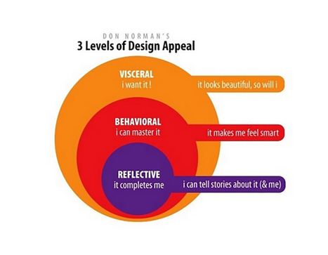
Great primer on how to build emotions into your product, web, and services designs. 

No comment yet.
Scooped by Martin (Marty) Smith
Scoop.it!

What is SEO? Content Tips For Graphic Designers - HOW Design & Scenttrail Note

What is SEO? Content Tips For Graphic Designers - HOW Design & Scenttrail Note | Must Design | Scoop.it

How strong is your content marketing strategy? What is SEO, anyway? Read 6 SEO tips and tricks to help you boost the visibility of your web content.

1. Strong Copy Trumps SEO.
2. Do Keyword Research.
3. Share Link Love (i.e. create great content).

Marty Note
Interesting to see how How Design explains SEO to graphic designers. I would take a slightly different tack. Let's reframe SEO in ways graphic designers can understand and adapt.

I create content daily and am learning SLOWLY how to make headlines sing and links flow in. As competition for links goes UP with the rising tide of content publishers are the right side of the bell curve where more than average links reside will learn a few tricks from graphic designers such as:

* ARRESTING Images.
* Demand hierarchy.
* Clear Calls To Action (CTAs).
* Headlines that GRAB and HOLD.

Content that doesn't get read doesn't help. The first rule of getting your content read is find an ARRESTING related image you won't get sued to use. Haiku Deck (http://www.haikudeck.com) is one of my favorite visual marketing tools. Need lawsuit free arresting images? Use Haiku Deck.

Demand Hierarchy is keeping demands on your visitors LOW. When I was a Director of Ecommerce we did extensive analysis of our 40+ homepage links and 5 mattered. Vicious 90%/10% rule in links. Key is to lower choice and eliminate the superfluous. 

CTAs don't have to be "buy now" anymore. We love asking a question with the link between the present page and the answer. Want To Be A Great Internet Marketer? Highlight and underline that sentence and it will get clicked because it is an IMPLIED CTA.

This doesn't mean we are above a good "Learn More", but too many "old style" CTAs can get boring and lose their punch.

Finally your HEADLINE or subheads matter. Headlines should set a hook. Subheads should organize the answer so readers can scan and skip sections. I try to live by the 7 word rule.

I read this rule about roadside billboards. Billboard creators limit their copy to 7 words because who can read more zipping buy at 60 mph. We all zip by at 100 mph on the web these days so short, punchy headlines that align with your arresting image and plant a hook work best.

We like KEYWORDS, Brands and questions in headlines too. Questions create curiosity. Keywords create scenttrail and brands create comfort and "like me" feelings of trust and security.


No comment yet.
Scooped by Martin (Marty) Smith
Scoop.it!

Time To Go Pageless? 8 Reasons Why Pageless Design is Future of Web Design

Time To Go Pageless? 8 Reasons Why Pageless Design is Future of Web Design | Must Design | Scoop.it

Pageless design frees websites from the outdated conventions of print design and fully utilizes the digital platform they’re built on. 

8 Compelling Reasons Why "Pageless' Web Design Wins (in the end):


* Tells a better story.

* Easier to "digest" or understand what to do.

* Emotionally more powerful.

* Higher Conversion Rates!!!
* Makes updating faster & easier.

* Lowers BOUNCE & encourages sharing.

* Looks great on all devices (mobile included).

* Lower cost to develop.

Marty Note
I confess to not being in love with the "infinite scroll" just yet. One modification we worked out for @Curagami, our Startup Factory funded startup, is to include a Call-To-Action at the top & Bottom.

CTAs help prepare the scroll. Remember "open book" tests? Putting a CTA on top of a waterfall of content helps prep a visitors mind. It "opens the book" for them. With this many impressive benefits I'm going to have to figure out how to start loving "pageless" design (lol).

I bet there are 5 (or so) similar modifications we can make to help us know how to create the paths and conversion we want by going "pageless".  

Scooped by Martin (Marty) Smith
Scoop.it!

The Role of Color in Marketing [INFOGRAPHIC] | Social Media Today

The Role of Color in Marketing [INFOGRAPHIC] | Social Media Today | Must Design | Scoop.it
It’s vital to move beyond the standard logo and tagline and take a holistic approach to evoking emotions among potential customers across all of your marketing channels — including social media sites.
Martin (Marty) Smith's insight:

Love this graphic, part of a solid Social Media Today article about how color converts. 

Drora Arussy's curator insight, June 16, 2013 9:46 AM

Color speaks to us - from what the teacher wears in a frontal classroom to what the background color is in a virtual assessment. We want our students to connect and "buy into" what we are teaching, branding is so important. As a side note, note that blue (of blue and white fame) signifies dependability and strength, isn't that what we want our students to see when they think of Hebrew and Israel? Of course, we would love to have all the colors blended in at certain points, be aware of the colors you use across the board - literal and virtual.

Scooped by Martin (Marty) Smith
Scoop.it!

35 Rock Band Website Design Examples With 5 Conversion Problems

35 Rock Band Website Design Examples With 5 Conversion Problems | Must Design | Scoop.it

You can’t imagine your life nowadays without the internet. We all spend hours and hours doing various things, like work, research, entertainment.

Marty Note
Sometimes it is good to look at a group of websites. This link includes 35 examples of rock band websites. The convention is clear. Rock band staged photo looking out directly at the camera, lots of texture and dark colors in the designs. Here is how any one of these sites could increase conversion 3x or 4x:

* Lighten Up - all that dark texture and color lowers conversion.
* Calls To Actions - few CTA's (BUTTONS) hurt conversion.
* Scream Less - visitors are fans, so scream less convert more.

* FANS - where are the fans (testimonials, games, contests).

* Games & Mobile - scream to download the app.


Of these 35 designs Metallica and Incubus would convert the best. I understand branding must be done, but this much screaming branding is obsessive and damaging to conversion. Sometimes the best brand strategy is to make it easy for fans or supporters to JOIN and CONTRIBUTE.

Everyone of these band sites feels like a lecture NOT a conversation. Funny concerts aren't like this. Concerts are a give and take between the crowd's energy and the band's performance one contributing to the other. Web, at its best, works that way too but not here so much.

No comment yet.
Scooped by Martin (Marty) Smith
Scoop.it!

5 Must Knows BEFORE You Design A Website

5 Must Knows BEFORE You Design A Website | Must Design | Scoop.it

Team Curagami (http://www.Curagami.com ) has, over the course of our combined careers, helped thousands of clients build websites and about 99% have cart before the proverbial horse. "What is our design going to look like," they ask.

Most think "web design" is creating the look and feel of a site. Actually the look and feel, while important, is at least #6 on the "do these things to create a great web presence" list. Here are the first 5 things on that list:

1. Elevator Pitch - Who Are You?
If we were riding in an elevator could you explain your business before we reached your floor? If NO is your answer you are not alone and you need to go back to the drawing board and practice until you have your "elevator pitch" down. All things flow from that defining snippet.

Tags can help define your elevator pitch. Curagami.com Cool Tools For Ecommerce Merchants explains what we do in 5 words. Note that I don't have the the site yet so do as we are saying not as we do (always :).

2. Pain Point - Whose Your Tribe?
We create stuff to DO SOMETHING. Your product or service must help some tribe. Curagami helps ecommerce merchants understand content marketing because finding the balance beam between content that works and content that hurts is a CSF (Critical Success Factor) for ecommerce merchants. So our tribe begins with ecom merchants and we address the PAIN of understanding content marketing. We don't LIMIT ourselves. We don't say, "Go away" to B2B SaaS clients but they are cream on the top of our core tribe and mission.

3. UCA - What Are Your Customers' Aspirations
Unique Customer Aspirations is a metrics we developed as Marketing Director for Atlantic BT. UCA speaks to the transformation your content, product and service creates. Yes Curagami helps merchants make more money, but we also relieve the STRESS of not knowing what to do and why. We help merchants have confidence in their content. No one can build sustainable online community (everyone's master goal whether they know it or not) without being confident in their ability to create, share and curate content. Content is king online and the implications of that statement go far and wide. It's not enough to know your tribes shape you must know their CHARACTER too. Our tribe is STRESSED OVERWHELMED and WORRIED. Anything we do to relieve any of that makes our content sticky and sure to be shared.

4. Know Difference Between Content CREATION and CURATION
Being able to create content is important. We suggest our clients create about 10% of content from unique brand based strings. 90% of the content we want clients to share, discuss and riff off of comes from gurus, customers and THE OTHER. The other is anyone other than you and keeping tabs on your category information, knowing what matters most to your readers and why and understanding the need to tuck ego in back pocket and share competitive information is one of the hardest skills we teach. Web marketing is MOSTLY about THEM not YOU so knowing when you need to blog vs. when you need to comment is key.

5. Know Social Marketing Basics
I'm staying at The Blackwell Inn in Ohio while being treated at Ohio State's James Cancer Center. I've tweeted several positive comments @theBlackwell. Noneof those comments have been ReTweeted and they don't follow me.

ERROR.

My social following dwarfs theirs so breaking the FOLLOW BACK rule hurts 'em. By not picking up my @tweets they discourage such shares and lose the value of that communication (that they actually LISTEN and CARE). I think they do listen and care, but they don't have the skills to do so ONLINE. Before you create a website you need to know what's up in social media.

The Blackwell's lackof knowledge isn't fatal since they are located on Ohio State's campus and are the ONLY such hotel so located. They can SUCK at social media (for a bit) without pain. Doubtful your website, especially if it brand spanking new can afford such a deficit.

Since the master goal of your site is the creation of sustainable online community NOT understanding the implied contracts and un-stated ways social media works can be DEADLY.

Know those 5 things and we can begin to discuss wireframes, look and feel and visual marketing :). Marty

One More Thing - reason this stuff is so important, as my friend Frank Pollock would explain, is the web is a lie detecting amplifier. If you lie it will be shared with the world and known instantly or before, so don't lie. If you are CONFUSED, as many SMBs are, get STRAIGHT before you put crayon to paper and design a site or risk having your confusion being your main message.

No comment yet.
Scooped by Martin (Marty) Smith
Scoop.it!

Should Our Web Designs Be Harder? Adding DEMANDS Back Into Our Web Designs

Should Our Web Designs Be Harder? Adding DEMANDS Back Into Our Web Designs | Must Design | Scoop.it

Making Demands Again & Designing Design In
At our Startup Factory funded startup Curagami we've been asking questions about how online communities are built and sustained. We are beginning to connect some important ideas from great thinkers:

Dan Ariely TED Talk on Meaning, Work and Motivation
http://www.ted.com/talks/dan_ariely_what_makes_us_feel_good_about_our_work

Trendwatching Report on "Demanding Brands"
http://trendwatching.com/trends/demandingbrands/

Daniel Pink's book Drive: Surprising Truth Behind What Motivates Us
http://www.danpink.com/books/drive


Content Marketing Triptych
http://sco.lt/4iT0xl

Web Design & "Work"

Yes, we now realize, you can make your website too easy. You can also make it too hard. Perceptions of "hard" and "easy" are highly relative judgements. An experts will find things easy the novice find very difficult.

SO one of the most important ideas for designing "work" into a website is finding a way to put people of similar levels of understanding in the same bus. We thinking of all visitors in 3 cohorts or tribes:

* Novice or new to whatever the site is sharing.
* Learning and so exposed to and thinking about the subject.

* Expert able to teach the Novice and Learning group.

At first we thought we should cluster members of each of these tribes into their own paths. All novices together, all learners together. After listening to Malcolm Gladwell and refining some of our testing conditions we realize such artificial selection harms rather than helps.

Community Is The Key
The key is creation of online community where peer to peer interaction is possible, supported, encouraged and rewarded. We, as website designers, can't combine our Lego blocks in as many variations as possible given the real creativity and engagement of our customers.

The ONLY thing we can do as web designers is clearly communicate OUR creation story, provide access to our Lego-blocks and CURATE the cool creations of our tribe.

The rub comes in at the "provide access to our Lego-blocks" web design stage. If your blocks encourage creativity and just the right amount of work your customers will want to SHOW YOU their creations as we learned from our friends at Haiku Deck.

Our interaction with Haiku Deck helped us create the Content Marketing Triptych:

* Tool that engages the BUILDER in us.
* Gallery where tool users share their creations (their work).
* Personal Profile (their content on your site).

The missing "magic box" for web designers is knowing WHO to ASK what. These ideas are "live ammunition" for ecommerce merchants. Too much work and you lose money. Too little and you lose the opportunity to win hearts and minds through just the right amount of work on top of the perfect contextually relevant ask.

What IS clear is finding ways to make demands and reward what our customers and advocates do with those demands is a CSF (Critical Success Factor) to winning web design. What are your experiences with building work back into your marketing?

No comment yet.
Scooped by Martin (Marty) Smith
Scoop.it!

Google's Disparate Design Lesson - Agnes Martin Feature

Google's Disparate Design Lesson - Agnes Martin Feature | Must Design | Scoop.it

Google Features Work of Artist Agnes Martin
When I lived in Chicago the Milwaukee Art Museum was having an Agnes Martin exhibit. One Saturday I decided to drive the hour and a half to see the exhibition since I love the Milwaukee Art Museum (and this was before they got their amazing "cap")..

On the outside looking in you might think painting lines over and over again for most of your life would be boring to do and even more boring to view. You would be wrong on both sides of the equation.

Agnes Martin's work is a study in quiet power. Google's use of an Agnes Martin image today celebrating a great but hardly well known American artist teaches valuable design lessons including:

* Embrace the seemingly disparate.
* In a noisy world QUIET Design works.
* Simple and clean is the hardest design to do.
* Quiet repetition works too.
* Brand the unknown but beautiful.
* Share your brand authority with high quality but unknown memes.

If your designs can do any two of these six ideas you would be a hero and your company will WIN. Today Google did all six, but then they are GOOGLE :).

No comment yet.
Scooped by Martin (Marty) Smith
Scoop.it!

Fonts & Colors Big Brands Use To Win Loyalty and Promote Engagement [Infographic]

Fonts & Colors Big Brands Use To Win Loyalty and Promote Engagement [Infographic] | Must Design | Scoop.it
Having trouble coming up with a logo? Our latest study highlights which combinations of fonts, colors and formats are used by the world's top brands.
No comment yet.