


 Your new post is loading...

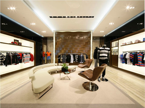

Paul & Shark's new flagship store demonstrates how design can refresh a brand...
Rejuvenating a brand speaks volumes about the brand identity, its USP and its projected future, all rolled into a single wholesome experience. When B+H Architects were asked to work on the new flagship store in Hong Kong to augment the launch of Paul & Shark into the Asian markets, they capitalized on two aspects: fine craftsmanship and innovative spirit of the brand.
Marty Note
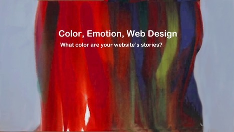
Appreciate India Art & Design sharing this post. The post is about how Paul & Shark used design to rebrand their stores and it gives us a chance to discuss one of our favorite aspects of web design.
All the world is a stage.
When team Curagami (http://www.Curagami.com ) helps design an ecommerce website NOTHING is left to chance. In an ideal world we TEST everything before we pull triggers.
Ideal world's rarely exist, so we model many core details based on other similar tests or intuition (influenced by thousand of tests, reading and stealing from those we know test a lot lol).
NOTHING is left to chance.
Just as a store wraps around its shoppers websites wrap around visitors. Great ecommerce websites such as REI.com or Threadless.com understand HOW they set the stage frames the play. Websites as stage are far from a passive communication medium.
When you walk into a store the store's stage communicates a million messages to our "shopper brain". One day standing in Nordstrom I looked UP. Thousands of lights carefully directed reinforced store as stage. Nordstrom's display team must spend HOURS directing those lights (look up next time you visit a big box store).
Web designs use COLOR as "light". Color is a web designrer's klieg lights. Images come and go, but color is forever (lol). Online color creates excitement, awareness, a desire to take an action and chances shoppers will join, buy and share.
Look HARD at how B+H used color to reinforce Paul & Shark's "Brand Ideals", Unique Selling Propositions (well articulated in the article) and what we call Unique Customer Aspirations or UCA (how customers want to use a brand to actualize their aspirations and dreams for themselves) and ask yourself, "Does our web design do that too?".


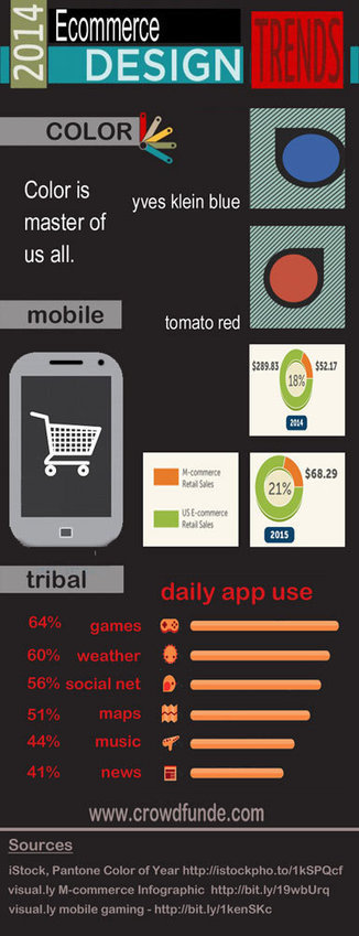

![Color Is MASTER of Us All [Infographic] | Must Design | Scoop.it](https://img.scoop.it/Kz1Zt8f2ZttL8kN2rA-1yzl72eJkfbmt4t8yenImKBVvK0kTmF0xjctABnaLJIm9)


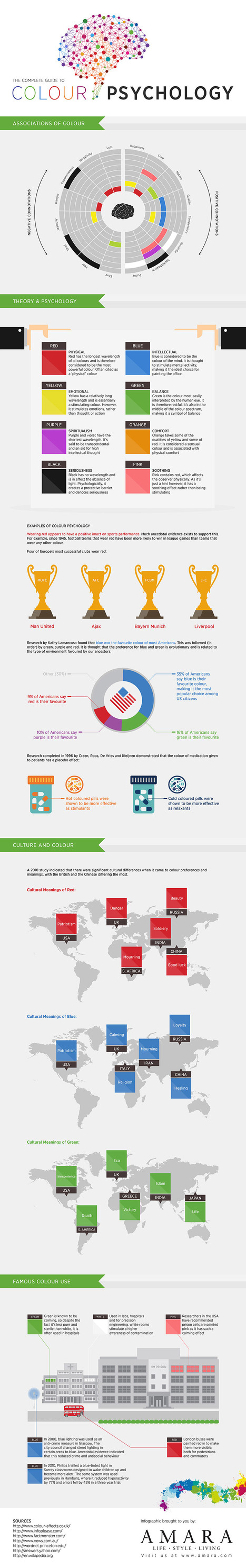
![The Role of Color in Marketing [INFOGRAPHIC] | Social Media Today | Must Design | Scoop.it](https://img.scoop.it/5ZsauP9vA_nIpv1lGd_Vszl72eJkfbmt4t8yenImKBVvK0kTmF0xjctABnaLJIm9)


