Must Design
75.5K views | +0 today
Must Design
Design Is Revolutionary
Your new post is loading...
Scooped by Martin (Marty) Smith
Scoop.it!

1 Well Designed Content Site & A Rare KISSmetrics Miss

1 Well Designed Content Site & A Rare KISSmetrics Miss | Must Design | Scoop.it

I’ve compiled a list of websites that produce great content, each of which has its own unique qualities. I’ll break them down and explain why they’re good and what you can take away.

KISSMetrics Misses The Mark 2 out of 3
I was looking for a great content/design mix and KISSmetrics got it right one out of the three times here. CopyBlogger is the only site in this group that both has great content and a great design.

The other two blogs may have great content, but their design is so off putting who is going to wade through their content? What makes Copyblogger work well?

* Snowfall design (long page scrolls down).
* Clear and LARGE Call-to-Actions (bet they've tested those big green buttons).
* Good use of icons that mask ads (very non-disruptive).
* Flat responsive design (probably looks great on mobile too).

* Big headline with interesting sophisticated font treatment.

* Video on homepage.

Ignore the other two suggestions here and focus on Copyblogger. Do you know a great content website? We are looking for great examples of DESIGN in content marketing. Share your favs and we will curate in.


No comment yet.
Rescooped by Martin (Marty) Smith from Curation, Social Business and Beyond
Scoop.it!

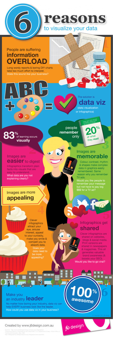
6 Reasons to Visualize Your Data in the Age of Distraction

6 Reasons to Visualize Your Data in the Age of Distraction | Must Design | Scoop.it

This piece was posted by Loren Sorenson for Hubspot, I selected it because as she says "If you aren’t prepared for the visual content revolution, you may be left in the dust.


Not convinced? Let's take a look at exactly how visual contentis positively contributing to marketing strategies -- it may just give you the push you need


"Learn why visual content is a critical part of your content creation strategy.


Here are some highlights:


**People remember only 20% of what they read


**83% of learning is visual


Condenses and Explains Large Amounts of Information


**Today, there is too much information on the Internet you have about 3 seconds to catch someone’s eyes so they'll consume your information.


Gives Your Brand an Identity


**Visual content draws people in, letting viewers better understand your brand's identity


Drives User Engagement


**If you've ever read a book with a child, you probably know they find pictures more interesting than words; but are adults really that different?


Selected by Jan Gordon covering "Content Curation, Social Business and Beyond"


Read full article here: [http://bit.ly/Ifujbp]


Via janlgordon
janlgordon's comment, April 11, 2012 3:21 PM
Beth Kanter
Thank you for adding me to the wiki and for your kind words, it's greatly appreciated. Yes this is the conversation of the moment so to speak. I'm sure your presentation was amazing. Would love to hear it if you have a replay.
Beth Kanter's comment, April 11, 2012 10:08 PM
Jan: There's a link in the wiki to the live stream of the session - and a lot of notes and resources ... I love this topic! I'm holding myself back from created another scoop.it on it ...
janlgordon's comment, April 13, 2012 10:05 PM
Beth Kanter
Thanks for looking forward to seeing this info. Knowing you, I can imagine that you want to start another scoopit on this topic but it's not necessary because you're already doing a wonderful job covering it now.