Must Design
75.5K views | +0 today
Follow
Must Design
Design Is Revolutionary
Your new post is loading...
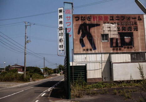
Rescooped by Martin (Marty) Smith from Tracking Transmedia
Scoop.it!

Future of Storytelling Online? Convergence & Mashups as Illustrated By Unknown Spring

Future of Storytelling Online? Convergence & Mashups as Illustrated By Unknown Spring | Must Design | Scoop.it

Unknown Spring

In March 2011 Jake Price, a freelance producer for the BBC, journeyed to Tohoku, Japan to document the devastation left in the wake of the Pacific tsunami.


The  result of his trip is evident in his powerful and beautiful immersive web documentary, "Unknown Spring," which was awarded the World Press Photo Multimedia Awards...'


Via siobhan-o-flynn
Martin (Marty) Smith's insight:

Agree with the @Art Jones note. The mashup of many channels into an immersive environment as illustrated by Unknown Spring is a fascinating and a sign of things to come. The execution on my mac was a tad bumpy, but the convergence of media, narration, navigation, image and "hero's journey" storytelling is powerful.

Here is the link to the Unknown Spring site:
http://www.unknownspring.com


Article about the "new" convergence storytelling:
http://www.indiewire.com/article/whats-the-future-of-storytelling-unknown-spring-provides-some-answers-20140927

No comment yet.
Scooped by Martin (Marty) Smith
Scoop.it!

The Psychology of Color in Marketing and Branding via HuffPost

The Psychology of Color in Marketing and Branding via HuffPost | Must Design | Scoop.it

Marty Note
Great HuffPost roundup of several important infographics and psychology of color studies. Which ones surprised you? Problem is every website wants ALL of those emotions, but not all at once (lol). Key is picking right color for right content / place on your site.

RED may SUCK as a homepage because it chases people away, but red could ROCK as an accent. Red "buy" buttons have only been beat ONE TIME in thousands of tests we've run. So find the right color conversation and have it at the right time.

At Curagami (http://www.Curagami.com) we think of colors as ways to help tell stories. We try to "match the hatch" of the story we are telling to colors in our images or within supporting graphics such as icons or widgets.

When our story is EXCITING we like RED or variations of it. We may also isolate the red by using black and white. Isolating red makes its power SHOUT in just the right minimal way sometimes. Too much red makes you want to RELAX so we may follow a RED with a soothing green or blue.

Websites are hub and spoke so it van be impossible to map stories to color in sequence. BUT if you match the PAGE to your colors you can win and be sure to daisy chain content telling the same story with enough similar colors and scenttrail to create a sense of connection. If you tell a GREEN story and suddenly smack your readers with too much red they RUN.

Win the page, link the page and win the psychology of color battle in your web design.

And YES I'm breaking my Big Blogs curation rule for the 3rd time in a day (lol). Soon as you state a stupid rule like that you break it and that is a definite RULE (lol). M


Martin (Marty) Smith's insight:

add your insight...


Scott Langston's curator insight, September 23, 2014 11:52 PM

Emotion and marketing