Must Design
75.5K views | +0 today
Follow
Must Design
Design Is Revolutionary
Your new post is loading...
Scooped by Martin (Marty) Smith
Scoop.it!

5 Web Design Trends on the Decline

5 Web Design Trends on the Decline | Must Design | Scoop.it
Buy and sell handcrafted, mousemade design content like vector patterns, icons, photoshop brushes, fonts and more at Creative Market.
Martin (Marty) Smith's insight:

Easy agreement here:

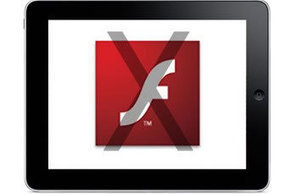
1. Flash Intros - not SEO or mobile friendly and effectively killed by Apple.
2. Complicated Forms - Don't ask for information you don't need and expect your email open rates to continue to decline even as your list grows.
3. Skeuomorphic 3D Design - Flat design is in.
4. Stock Photos - YES, finally we kill the Stepford people.

5. Pop Overs - Maybe, but pop unders are all the rage and they are gross and obnoxious, predict they will wane in 2014 too. Look at Rocketbolt.com's much less offensive triggered, subtle popunder instead.


Rita Jordan's curator insight, January 15, 2014 10:43 AM

check out the additional links at the end of the article.

Scooped by Martin (Marty) Smith
Scoop.it!

5 Disappearing Web Design Trends & 10 We Wish WOULD Vanish (fat chance)

5 Disappearing Web Design Trends & 10 We Wish WOULD Vanish (fat chance) | Must Design | Scoop.it
If you’re looking forward to changes that come with starting a new year, you may also be excited to learn what sorts of trends are emerging in the web design
Martin (Marty) Smith's insight:

Great post and here are my takes on web design trends that will disappear next year:

Sliding Banners - AGREE and good riddance.
Flash Intros - Agree and bye to the pad and SEO killers.
Too Many Fonts - Agree


10 web design trends we WISH would go away (but won't)

Ubiquitous, nasty popunders demanding email subscription.
Bad headlines or poor "tease" intros.
Visuals that don't align to the content they are on.
No contrast CTAs.
No clear CTAS.
The more than 2 minute long online video.
The "White Paper".
The lack of great storytelling.
The "lowest common denominator" design.
Too much color misaligned with the brand or the site


Intriguing Networks's curator insight, December 7, 2013 9:08 AM

A good weekend subject thanks