Must Design
75.5K views | +0 today
Follow
Must Design
Design Is Revolutionary
Your new post is loading...
Scooped by Martin (Marty) Smith
Scoop.it!

Blockchain and the Future of Web Design via @Scoopit

Blockchain and the Future of Web Design via @Scoopit | Must Design | Scoop.it

Blockchain Disruptions

As we shared in BI Revolution and Curation RevolutioBlockchain isn't just for Bitcoin anymore.  Imagining a distributed, verified and all but fraud-proof transaction network will change how we think about designings websites too. 
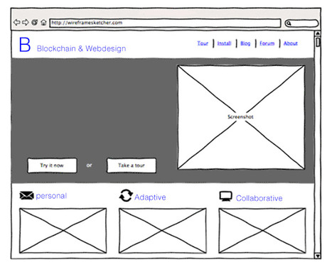
 

Websites are Dumb
Today, as social media proves, our customers want collaboration, community, and conversations. Google understands the value of highly personalized results. 


The Google "float" where you and I can type the same search at the same time and receive different results is an example of hyper-personalization blockchains are sure to bring to e-commerce. 


Websites powered by algorithms to read a customer's blockchain show the most relevant information to convert now. Lectures die in favor of predictive analytics and conversations. 

When we learn, thanks to the blockchain, a customer just purchased something related to what we sell why show customers anything other than the products our data tells us will convert visitation to transactions? Answer: we wouldn't. 


Internet of Things

The "life is better" promise suggested by the Internet of Things (IOT) is a harvest we only reap with creative use of blockchain. If everything knows everything about everyone, where we are head anyway, our ability to turn chaos into meaning, efficiency and a better life depends on a multipoint, verified and shared network. 

As we noted in our Curagami post The Blockchain Disruption Is Coming Sun Microsystems John Burdette Gage was right - the network is the computer. And the only way our lives don't dissolve into a puddle of chaos, confusion, and anger is by using community blockchain to inform, personalize, and humanize the Internet of things. 

Read our friend David Amerland's great What If We Had A New Value System for Goods and Services to understand the need for, the promise of, and difficulty to create a meaningful, fair, and efficient future. 


How Blockchain Change Web Design

Web design changes from static to flexible, from we create to we curate and from lectures to conversations. Like Google, we won't create a single, static, boring page. Instead, thanks to the blockchain, we will design interactive experiences capable of changing on the fly. 


And we'll have flying cars too. We realize we've heard similar mostly unfulfilled promises before. And there are significant hurdles such as how most merchants feel about their customer information - highly proprietary. 


If the web proves anything, it is the absurdity of "highly proprietary" thinking. What is exclusive when what we do is digital and so easily shared instantly and around the world? Answer: nothing is uniquely yours anymore. 

We don't see the usual drip, drip, drip of acceptance for blockchain empowered, flexible and personal web design. Everyone goes, or no one and the undeniable benefits of using a "dispersed ledger" to inform our digital marketing is so holdouts will lose share, traffic, and loyalty. 

Best to LEAD in innovative ways to use blockchain to inform your web designs since to do otherwise is to risk...well everything. 

Martin (Marty) Smith's insight:

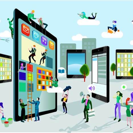
How blockchain will make the Internet of Things possible and change web design. 

No comment yet.
Scooped by Martin (Marty) Smith
Scoop.it!

10 Trends Sure To Change Web Design in 2015

10 Trends Sure To Change Web Design in 2015 | Must Design | Scoop.it

Updated! Some of the web's smartest thinkers reveal what they believe will transform the web.

Summary & Marty Notes

1. Huge Background Images (Agree, but hard to do well in responsive design).
2. Card Based Design (Agree and need to know more about this since cards = responsive and responsive i.e. platform agnostic is the way to go now).
3. Digital First Branding (Agree and this will be a big shift for many who think of their websites as additions not the MAIN THING).

4. Open Data (Need to know more about this).
5. Responsive Design...Evolved (Agree, Agree, Agree).
6. Privacy (not sure about this one, think that ship has sailed).
7. Isomorphic Java Script (Need to know more about this).
8. Iteration (Agree, we will make MVPs, ship them and then watch and improve them).
9. Vibrant Design (not sure about this one, the example made my eyes hurt).
10. Web Components & Adaptive Design (this is Internet of Things and I agree).

No comment yet.
Suggested by David Fournier
Scoop.it!

Web Design Trends 2015 [Infographic]

Web Design Trends 2015 [Infographic] | Must Design | Scoop.it
Explore the top web designing trends for 2015. The infographic discusses the top 6 predictions that are set to rule the web designing world in 2015.
Martin (Marty) Smith's insight:

Liked and agreed with all 6 of these 2015 Web Design Trends when I read the post without the infogfpahic. Infographic helps and I bet wil get more shares :). M

malek's curator insight, December 8, 2014 11:24 AM

I like“Card” design, no, it\s not new, but I find it a good tool for designers working on responsive websites. Cards are a great way to keep things modular

Scooped by Martin (Marty) Smith
Scoop.it!

The Hottest Web Design Trends of 2014: Updated | JUST™ Creative

The Hottest Web Design Trends of 2014: Updated | JUST™ Creative | Must Design | Scoop.it

An updated look at the hottest best web design trends of 2014 including a showcase of modern web design inspiration.

Marty Note
This @justcreative post hit many nails on the head when it was initially published and Jacob's update of Helga Moreno's post doesn't disappoint either. Things I REALLY agree with:

See Less of (PLEASE):

* Stock photography (no photos? ASK your employees / followers for help but please no more Stepford people in pics on websites).
* Flash (has killed more #seo and sites than you can shake a stick at and fact it is still alive is amazing).
* Capcha - spam sucks but so do capcha forms.

More of PLEASE:

* Content First (implied in Responsive or Mobile First Design is a new way of thinking about, tagging and presenting content).
* Interactive Exploring (BIG AGREEMENT see my post about Time is Money Online https://plus.google.com/+MartinWSmith/posts/RdjAjWoJTHw and tag this next to #gamification).
* Arresting pictures and Video (YES, your great content will be ignored or under-shared UNLESS it is paired with strong visual hooks and supports).

Great post by Helga for Just Creative and so TRUE to our experience of web dev in 2014 for leading ecommerce clients such as Moon Audio.com.

No comment yet.
Scooped by Martin (Marty) Smith
Scoop.it!

How Responsive Web Design Works [Infographic]

How Responsive Web Design Works [Infographic] | Must Design | Scoop.it
This infographic illustrates what responsive web design is, how it works, and why you should make the switch.
Martin (Marty) Smith's insight:

Responsive Web Design 
Here is an email I wrote to a friend this morning about responsive:

NO ONE understands mobile seo btw (lol). Not a huge leap to think that what makes a site responsive could also confuse the spider. Could also HELP the spider since the re-imagining of the information architecture should do things like:


* Move from novels to linked snippets. 
* Rely on tags (tags are about to be HUGE because they create new dimensions into the data). 
* Can open a site's content for social (reduce distance between THEM [customers] and US [site creators / managers]).
* Create clear meta data (goes with connected snippets). 

That last bullet puts stress on current database thinking and tech. With this many windows into the same data a developer must know about how to cononicalize a URL (or the dupe penalties will be crushing). Responsive websites become an evolving puzzle. As new pieces get created they must fit the existing framework or blow the whole thing up. 

That said, I don't see any way BUT thinking mobile first from here on out. In the end that is going to be a good thing for all of us, but transitioning is a bear :). Marty 


Tony Guzman's curator insight, October 6, 2014 11:28 AM

This infographic describes what responsive website design is and how to best accomplish it.

Scooped by Martin (Marty) Smith
Scoop.it!

65 Best Responsive Web Designs 2014 via SocialDriver.com

65 Best Responsive Web Designs 2014 via SocialDriver.com | Must Design | Scoop.it

Responsive Web Designs
Responsive design, forming a website's information so it looks great on any device, is becoming mission critical. Here are 65 of the best responsive designs in 2014 via SocialDriver.com.

Martin (Marty) Smith's insight:

I like Salesforce and SquareSpace and was surprised I didn't hate the Microsoft design.

Helen Stark's curator insight, September 30, 2014 3:53 AM

Unusual and creative responsive designs that look great on a huge monitor and a tiny smartphone screen - that's great

Scooped by Martin (Marty) Smith
Scoop.it!

Clean & Simple Website Design Trends In 2014

Clean & Simple Website Design Trends In 2014 | Must Design | Scoop.it
Like the World Wide Web itself, the world of website design is constantly in flux as technologies change and design standards evolve. What worked in 2013 may

Martin (Marty) Smith's insight:

Worth revisiting some of these web design trends. What is the engine behind these trends? Social / Mobile web. Like the "winners" and "losers" organization here.

Carlos Polaino Jiménez's curator insight, July 29, 2014 2:59 PM

En el momento en que me lo estoy planteando

Scooped by Martin (Marty) Smith
Scoop.it!

Best Responsive Ecommerce WordPress Themes

Best Responsive Ecommerce WordPress Themes | Must Design | Scoop.it

My favs: Clean Sale (pictured here), Retail Therapy and Kiosk. What are your favorites? 

No comment yet.
Scooped by Martin (Marty) Smith
Scoop.it!

11 Resources Help You Create a Flat & Responsive WebSite Design

11 Resources Help You Create a Flat & Responsive WebSite Design | Must Design | Scoop.it

Learn why flat design responsive sites are so popular, and get 11 resources for getting the design elements you need to create your own.

Marty Note
Flat and responsive are the two 2014 pillars your website should be designed or re-designed with. This post shares 11 great resources to help with Flat & Responsive (most of these 11 resources were new to me).

No comment yet.
Scooped by Martin (Marty) Smith
Scoop.it!

Responsive Web Design At Artifact Conference : Slow Loading & Bloated As Design Flaws

Responsive Web Design At Artifact Conference : Slow Loading & Bloated As Design Flaws | Must Design | Scoop.it

Last week, Jeremy Osborn, Academic Director for Aquent Gymnasium, had the chance to attend the Artifact Conference. Here are his key takeaways.

Marty Note
This Artifact Conference looks interesting and worth checkout out (http://artifactconf.com/ ). I love this quote from the Responsive panel at the conference in Providence, RI:

"On the other hand, responsive design is forcing companies to prioritize site performance. The consensus is that slow-loading and bloated sites are just as much of a “design” flaw as confusing layout, clashing colors, and the rampant proliferation of typefaces on page. "

Most designers focus on how to accordion a website so it looks good on any device. The real challenge is deeper. How do we architect "less bloat"? How do we design information to be lean and responsive?

Couple of things I've noticed include:

* Building stories via visuals and rich snippets.
* Taking advantage of the swipe and spin options on mobile devices.
* Creating easier to understand backend functionality.
* Using a LEAN or MEAN filter forcing messaging to get to the point FAST.

The SEO and engagement benefits of the second half of responsive design - the information architecture half - are enormous. We know that as engagement goes up so do our site's heuristics and the "new Google" loves more time on site, lower bounce rates and other "engagement metrics".

The "Responsive Challenge" for designers is to realize more is involved than look and feel. The very core of our communication must be reviewed, reevaluated and changed to be leander and more responsive too or we design dissonance in. Confused customers do many things converting is never one of them.  

No comment yet.
Scooped by Martin (Marty) Smith
Scoop.it!

Forbes Sees Big Fonts, FLAT, Mobile, Responsive, Continuous Scrolling For Website Design In 2014

Forbes Sees Big Fonts, FLAT, Mobile, Responsive,  Continuous Scrolling For Website Design In 2014 | Must Design | Scoop.it
It's been about five years since the last redesign of my website, Hitched. A lot has changed since then, most particularly the rise of mobile.
Martin (Marty) Smith's insight:

Don't disagree with any of these 2014 web design trends highlighted by Forbes. 

Lori Wilk's curator insight, December 26, 2013 10:21 PM

The pace of change seems to have gotten even faster over the last year.

Scooped by Martin (Marty) Smith
Scoop.it!

20 Web Design Trends In 2013 From Responsive To Storytelling

20 Web Design Trends In 2013 From Responsive To Storytelling | Must Design | Scoop.it
Predicting the future is tough, but with the fast-moving nature of the web, it’s good to know what lies ahead. Craig Grannell talks to top industry figures about the web design trends you should be mindful of over the coming 12 months.
Martin (Marty) Smith's insight:

Web design is changing fast and here are 20 trends we've seen this year.

Raquel Oliveira's curator insight, September 24, 2013 4:54 PM

2 lovely subjects: Web designer and storytelling !

Scooped by Martin (Marty) Smith
Scoop.it!

Responsive Website Design & Web 3.0 [Infographic]

Responsive Website Design & Web 3.0 [Infographic] | Must Design | Scoop.it
Website design Vancouver from Mystified By Social Media. We make responsive web design for Vancouver, Delta, Surrey and BC with free hosting. All of Canada can have a responsive web design!
Martin (Marty) Smith's insight:

Responsive & Web 3.0
Put aside the SEO benefits, creating responsive design is beyond important because the future is about having your content look great no matter what type of devices is receiving.

Responsive design also forces a new framework on your content marketing THINKING. Your content marketing begins to get away from the static and more toward the dynamic.

Since the future of web design is dynamic making this move now has many benefits.

Responsive

Web 3.0

Snippets and Tags (Responsive)

Yes (Web 3.0)


Flexible images (Responsive)

Yes & controlled by code (Web 3.0)


Focus on the visual (Responsive)

Yes (Web 3.0)


No but easy to modify (Responsive)

Dynamic create in real time on fly (Web 3.0)


Internet marekting consistently shows those who embrace the future earliest and strongest reap the benefits. The time for your website to be responsive is now.

Judy Cannon's curator insight, May 4, 2013 11:53 AM

I am writing a class on Responsive Web Design and Cross-Browser Compatibility that will be available in the Webmaster Certificate Program in the fall.


Judy

Dolly Bhasin 's curator insight, May 5, 2013 11:54 PM

The way to go for both web and mobile web!

Scooped by Martin (Marty) Smith
Scoop.it!

7 Crucial Web Design Trends in 2015 via WebDesigner.com w/ @Scenttrail Notes

7 Crucial Web Design Trends in 2015 via WebDesigner.com w/ @Scenttrail Notes | Must Design | Scoop.it

While many design trends are fleeting, a select few are natural evolutions of the industry. As the range of devices on which we view websites continues to grow,

Our Notes

1. Typography Will Be Flexible (agree).

2. The Decline of Web Coding (disagree, after spending a few weeks at The Iron Yard learning CSS & Java feels like CODE is going up not down, but we understand the point since it is possible to do a lot with templated WordPress these days).

3. The Evolution of Responsive Design. (Agree, responsive will need to permeate data architecture, website navigation and functionality too). 

4. Flat Design will Conquer Every Pixel (agree)

5. Bigger = Better for Images
(depends on the site, but agree mostly)

6. Revamped Scrolling Animations, Parallax Effects and Microinteractions (agree).


7. The Dawn of Webgraphics (agree).


No comment yet.
Scooped by Martin (Marty) Smith
Scoop.it!

Web Design Trends 2015 & Hot To Keep Your Website Current

Web Design Trends 2015 & Hot To Keep Your Website Current | Must Design | Scoop.it

Now it’s time to analyze the web designs that have emerged this year, and place predictions for the possible trends that lie ahead for 2015.

Marty Note
Promise to create a mashup of all web design trends postings to identify common consensus and outliers.

No comment yet.
Suggested by David Fournier
Scoop.it!

Responsive Web Design 101 - Learning The Basics

Responsive Web Design 101 - Learning The Basics | Must Design | Scoop.it

Responsive web design is the practice of creating websites that display evenly on all devices. Understand the basics of responsive web design with examples.

Marty Note
Don't make the common mistake of thinking responsive design is all about look and feel. Yes some WordPress templates can make it FEEL that way since they are built to accordian with different receptions created by phone, laptop and computers.

The important idea for marketers to understand is to THINK Mobile First. Thinking mobile first brings a slew of changes such as:

* Flat web design.
* Limited Colors.
* Less functionality that is easier to understand.
* Content snippets instead of novels.
* Emphasis on VISUAL MARKETING.
* Need to make content & communication feel & act like a game.

Those last bullets speak to the gamification of marketing so implied by smartphones and a mobile / social / connected world. Mobile means never having to say you're sorry because you listen and curate more than you talk, create sustaining community and engagement and understand all the implications of "the network is the computer".

Just shared an overview of Marketing Timelines on G+ (https://plus.google.com/102639884404823294558/posts/EkXN57uJyjq ). All that said, you still need to understand Responsive Design 101 so appreciate this Scoop.it suggestion from @David Fournier. .

Scooped by Martin (Marty) Smith
Scoop.it!

Top 10 Web Design Topics of 2014 From Flat To Content & SEO

Top 10 Web Design Topics of 2014 From Flat To Content & SEO | Must Design | Scoop.it
The "Web Design" category of general interest covers its fair share of ground. Informative articles on everything from UX to client management, to conversion psychology,...
Martin (Marty) Smith's insight:

YES, seeing all 10 of these trends from flat design to content ISN'T king anymore (not true) and SEO isn't getting easier (true).

No comment yet.
Scooped by Martin (Marty) Smith
Scoop.it!

50 Flat Fantastic Web Designs Shure To Look Good On Any Device

50 Flat Fantastic Web Designs Shure To Look Good On Any Device | Must Design | Scoop.it

Flat Design Rocks Mobile
Flat web design looks great on any device so it is one of he hottest trend i 2014. My faves from this group of great flat designs:

StashIcons
VeloSport (more because I'm a cycling nut)
Bollox

Flatness in and of itself doesn't make a web design look good on mobile. Responsive design is the holy grail of platform agnostic design. Responsive + Flat more powerful than either of those ideas alone.

No comment yet.
Scooped by Martin (Marty) Smith
Scoop.it!

Drop These 15 Web Design Buzz Words At Your Next Hipster Party

Drop These 15 Web Design Buzz Words  At Your Next Hipster Party | Must Design | Scoop.it
You'll never feel left out at a hipster web design party with these 15 key terms under your belt
Martin (Marty) Smith's insight:

Yes a little knowledge is a dangerous thing and most of our web designers at http://www.Curagami.com wouldn't know CMYK if it jumped up and smacked 'em, but knowing these other 14 "web design buzz words" is a good idea. Since we hang out at a least one hipster web design party a week we can fit right in (lol). M

No comment yet.
Scooped by Martin (Marty) Smith
Scoop.it!

70 Stunning Responsive Sites Inspire #responsive #webdesign

70 Stunning Responsive Sites Inspire #responsive #webdesign | Must Design | Scoop.it
Mobify is a mobile e-commerce optimization platform used by leading online retailers to deliver exceptional responsive shopping experiences.

Martin (Marty) Smith's insight:

Attending Search Exchange in Charlotte and MOBILE seems to be the dominant theme so here are 70 examples of responsive web design. On a laptop or desktop and want to see "responsive" design? Shrink your window and watch as the content adjusts to tablet and then phone size.

No comment yet.
Scooped by Martin (Marty) Smith
Scoop.it!

65 Responsive Website Design Examples of 2014 Inspire

65 Responsive Website Design Examples of 2014 Inspire | Must Design | Scoop.it
Martin (Marty) Smith's insight:

Love the breakout by category. Great examples in each category. My favs are:

ClearLeft.com and SalesForce.com

M

No comment yet.
Scooped by Martin (Marty) Smith
Scoop.it!

UI Web Design Examples Inspire on Pinterest

UI Web Design Examples Inspire on Pinterest | Must Design | Scoop.it

An open board hosted by Awwwards where everyone interested in web design can share inspiration. | See more about web design layouts, web design and ui design.

Marty Note
Great responsive web design examples here and some beautiful web design from grids to water falls.

No comment yet.
Scooped by Martin (Marty) Smith
Scoop.it!

Neon Web Design Trends in 2014

Neon Web Design Trends in 2014 | Must Design | Scoop.it
Why keeping up with web design trends is vital In today’s fast-evolving trends, people’s interests are being influenced briskly by the web, wherein onlin


Marty Note
Like #7, use of Neon Colors as accents. Color is so tricky online its use as "accents" is the best idea. Will see if I can find a "neon color accent" example and shsre it, but sounds like a cool trend I've only read about from this Chinese social agency.

Other trends noted include ones we've seen in several of these "what's up for 2014" posts including:

* Simple.

* Flat.
* All in one.

* Responsive.
* scrolling.

No comment yet.
Scooped by Martin (Marty) Smith
Scoop.it!

70 Stunning Responsive Sites For Inspiration Before A Mobile Holiday

70 Stunning Responsive Sites For Inspiration Before A Mobile Holiday | Must Design | Scoop.it

This holiday season will be the Christmas of MOBILE devices. Here are some amazing examples of the art and science of responsive design.


Martin (Marty) Smith's insight:

This holiday selling season will be all about MOBILE. Responsive websites look great no matter what device is lookign at them. Here are 70 examples of how to do responsive web design right.

No comment yet.
Rescooped by Martin (Marty) Smith from Incion Web Design Blog
Scoop.it!

Responsive Website Design - Must Know Facts

Responsive Website Design - Must Know Facts | Must Design | Scoop.it
Responsive design is a relatively new term in web design. It was only coined three years ago in May of 2010, when web designer Ethan Marcotte used the term.

Via Incion
Martin (Marty) Smith's insight:

There are many reasons to create responsive design. This post shares most of them.

ramil navidad's curator insight, June 17, 2013 3:04 PM

it's all about responsive design now

Adapt or Die