

Designing a good website that accommodates a lot of content is a tricky balancing act to pull off. Does one attempt to present the user with all the information
Get Started for FREE
Sign up with Facebook Sign up with X
I don't have a Facebook or a X account


 Your new post is loading... Your new post is loading...
Designing a good website that accommodates a lot of content is a tricky balancing act to pull off. Does one attempt to present the user with all the information 
No comment yet.
Sign up to comment
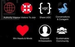
5 Web Design Implications Evolution Of Web Design Our @Curagami Evolution of Web Design Infographic (http://sco.lt/74Nvsn_ broke daily view records for our startup. Here are 5 Web Design Implications implied by that infographic:
What about you? What design changes do you see ahead? As we move to "community" how can our design support and create trust?

Explore Kevin Regenrek's hand-picked collection of Pins about Webdesign Inspiration 2014 on Pinterest. | See more about website designs, web design and landing pages.
|
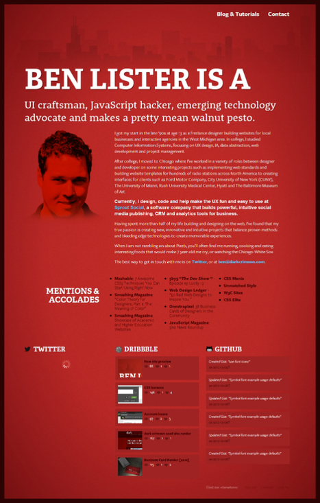
Marty Note Ashley Pajak Comment I find that red can very easily become too overpowering. Even though some of these are running into that, others display the color proudly and cleverly, such as the Venkat Portfolio and Svizra.

From
lyemium

Color & Texture
Nonprofit Websites
|


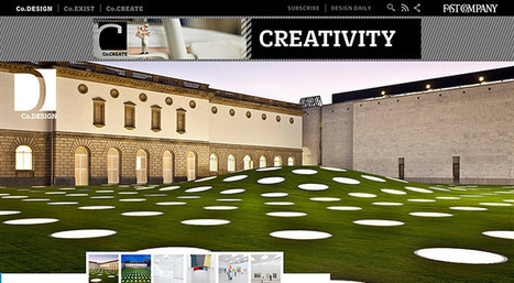
Great tips in this "beautiful content heavy websites" post. The Verge has always been one of our favorites and we like the WIRED example too.