Your new post is loading...
Social Mobile Web Blowing Up Web Design
The boxy unidirectional web design controlled by wireframes (boxes within boxes) is gone. The social mobile web is crushing, spinning and recreating web design as we write this sentence.
Don't let old "web design thinking" enslave. Help create a revolution in web design by sharing your favorite story of website PAIN. Every shopper, web designer or marketer has a favorite Website PAIN story.
SHARE YOUR STORY to help change the story :).M
http://www.curagami.com/featured/burn-your-website-down/
What do waiting tables and UX design have in common? One UX director weighs in on how we can learn how to handle design problems from the physical world.
This holiday selling season (2014) will happen as close to real time as any thanks to the social / mobile web. Listening and curating are going to be important, but so is tapping the nostalgia and spirit of the season in creative and collaborative ways.
For a while now, designers have been absolutely infatuated with all things subtle. We love subtle patterned backgrounds and intricate decorative elements; we
Learn why flat design responsive sites are so popular, and get 11 resources for getting the design elements you need to create your own.
Marty Note
Flat and responsive are the two 2014 pillars your website should be designed or re-designed with. This post shares 11 great resources to help with Flat & Responsive (most of these 11 resources were new to me).
There are a many aspects of good web design, and whitespace is certainly one of them. Whitespace is the empty space around design elements such as images, text,
It almost seems that this year flat designs have taken over the world of graphic design by force, but especially in the arena of mobile apps with the first industry-shaking flat design being for the iPhone5. Reality is that flat design has been around longer than the emergence of the iPhone5, but of course it was Apple that helped to bring such cross-industry awareness to the design style.
Engage website visitors better by designing your site to match how people's eyes move on the page. Here are some surprising eye tracking stats to help. Putting together a great looking website is a great start, but it is just a start. True web design requires you to venture beyond the aesthetic and into the worlds of User Experience and Conversion Rate Optimization. Knowing how the viewers of your site really see it can help to shine light on new and/or missed opportunities within your current design. It may also bring out the need for new elements or changes. While there are plenty of options for improving CRO, eye tracking analysis provides some of the most useful information for optimizing your biggest digital marketing asset, your website. A good design will catch people’s eye, but a great design will keep people on your site and get them engaged with your content. And while you shouldn’tunderestimate the power of good copy, your design is what people notice first. We teamed up with our friends over at Single Grain to put together the infographic below in hopes that it will help everyone get a better, basic understanding of what eye tracking is and what it can do.
Via massimo facchinetti, Mike Power
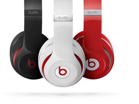
Beats By Dre Web Design Lessons
A friend shared the impressive NEWSJACK Dr. Dre and his Internet markeing team pulled off last week. Beats By Dre (http://www.beatsbydre.com ) has some cool web design tricks to steal too such as:
* Consistent images across channels (the Richard Sherman image rode the crest of the wave created by his "controversial" statements after last Sunday's game).
* HUGE RED BUY NOW Call To Action on the home page.
* Hero moves but does so SLOWLY so it isn't jarring.
* They've programmed their Richard Sherman page so his picture matches to every style, something I bet the site does for all celebrity endorsements (cool and NEW).
* Their social buttons are a little low for my taste, but they are well labeled as the "Beats Army" and every major social net is there and they are robust and fresh on all social nets.
* I like how they handle the colors too via the small swatches.
All in all a great ecommerce site in support of one of the best NEWSJACKS I've seen (see my notes on Dr. Dre's multi-channel attack of the web here: http://sco.lt/8bJiDJ
Buy and sell handcrafted, mousemade design content like vector patterns, icons, photoshop brushes, fonts and more at Creative Market.
It's been about five years since the last redesign of my website, Hitched. A lot has changed since then, most particularly the rise of mobile.
istock approached creatives from around the world and collected the strongest trends in colour and design: Pantone's Color of the Year and Top 10 Hot or Not.
Apple's clear navigation, romantic heroes (largest images on the page) and easy to understand information heirarchy (based on a grid) are design tactics any website should steal as this excellent post about websites who've stolen direclty from Apple's design shares.
|
We asked several developers what their favorite sources are for web design and code inspiration, and they pointed to these 17 wide-ranging sites.
Marty Note
I like several of these designs including Web Design Ledger and The Source for their creative balance between images, copy and headlines. There are so many things dancing on the head of a pin on any homepage such as:
* Your desire to SHARE everything. * Their (visitor's) desire to find what they want. * Navigation.
* Images.
* Headlines & Copy.
Getting all of these dancers to tell a coherent story in 9 seconds is the challenge. Usually as content being shared increases understand decreases. Several of these designs manage to present a lot of options intelligently.
Which one is your fav?
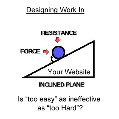
Should Our Web Designs Be Harder? Adding DEMANDS Back Into Our Web Designs
Making Demands Again & Designing Design In
At our Startup Factory funded startup Curagami we've been asking questions about how online communities are built and sustained. We are beginning to connect some important ideas from great thinkers:
Dan Ariely TED Talk on Meaning, Work and Motivation
http://www.ted.com/talks/dan_ariely_what_makes_us_feel_good_about_our_work
Trendwatching Report on "Demanding Brands"
http://trendwatching.com/trends/demandingbrands/
Daniel Pink's book Drive: Surprising Truth Behind What Motivates Us
http://www.danpink.com/books/drive
Content Marketing Triptych
http://sco.lt/4iT0xl
Web Design & "Work"
Yes, we now realize, you can make your website too easy. You can also make it too hard. Perceptions of "hard" and "easy" are highly relative judgements. An experts will find things easy the novice find very difficult.
SO one of the most important ideas for designing "work" into a website is finding a way to put people of similar levels of understanding in the same bus. We thinking of all visitors in 3 cohorts or tribes:
* Novice or new to whatever the site is sharing.
* Learning and so exposed to and thinking about the subject. * Expert able to teach the Novice and Learning group.
At first we thought we should cluster members of each of these tribes into their own paths. All novices together, all learners together. After listening to Malcolm Gladwell and refining some of our testing conditions we realize such artificial selection harms rather than helps.
Community Is The Key
The key is creation of online community where peer to peer interaction is possible, supported, encouraged and rewarded. We, as website designers, can't combine our Lego blocks in as many variations as possible given the real creativity and engagement of our customers.
The ONLY thing we can do as web designers is clearly communicate OUR creation story, provide access to our Lego-blocks and CURATE the cool creations of our tribe.
The rub comes in at the "provide access to our Lego-blocks" web design stage. If your blocks encourage creativity and just the right amount of work your customers will want to SHOW YOU their creations as we learned from our friends at Haiku Deck.
Our interaction with Haiku Deck helped us create the Content Marketing Triptych:
* Tool that engages the BUILDER in us.
* Gallery where tool users share their creations (their work).
* Personal Profile (their content on your site).
The missing "magic box" for web designers is knowing WHO to ASK what. These ideas are "live ammunition" for ecommerce merchants. Too much work and you lose money. Too little and you lose the opportunity to win hearts and minds through just the right amount of work on top of the perfect contextually relevant ask.
What IS clear is finding ways to make demands and reward what our customers and advocates do with those demands is a CSF (Critical Success Factor) to winning web design. What are your experiences with building work back into your marketing?
We've had a HUGE Day over on GPlus today. I wrote a post about why G+ is magical thinking (https://plus.google.com/102639884404823294558/posts/F5fXyrkTPCr ) and my post got picked up by my friend Mark Traphagen (@MarkTraphagen) and it BLEW up into an amazing conversation.
Given the MONSTER day we've had I thought it would be a great idea to share some of the most successful G+ Brand pages. GPlus is a massive Blue Ocean for most. Blue Oceans are where your content gets MORE traction with less work. Red Oceans are where your content requires more investment to generate LESS return.
GPlus is really a set of TOOLS. Incorporating Hangouts, maps, communities and other widget-like tools. The first website or agency to figure out how to combine those powerful tools in unique combinations is going to WIN big. Some of these examples approach the top of the mountain, but G+ has more power than even anyone here captures.
A blog about ecommerce marketing, running an online business and updates to Shopify's ecommerce community.
Marty Note
Ecommerce is hard to make "BEAUTIFUL". The conventions are well established now such as hero, underneath or to the right of the hero is a line of products, nav leads to category pages then to product pages, big search box and so on.
Here are 30 cool takes on convention that don't spill conversions all over the floor, the danger of modifying ecommerce convention, but do create intelligent and NEW feeling ecom web design.
My favorite is Norwegian Rain because their hero tells such a amazing story with so few words. Very difficult to do a group shot like that without looking too exclusive. Like a club that would never have YOU (the visitor) for a member.
I don't get that feel from their image and design. Very cool and NOTHING I would have considered before seeing that a group shot of that magnitude can be accomplished. Norwegian Rain
Flat design is a concept that was pretty popular a couple years ago and it's back with full strength this year, causing some interesting buzz around the so
2014 We Design Trends
1. Grid Layouts - Agree & Is Good!
Yes visual marketing + pinterest + mobile is making the grid ubiquitous. I created a Mondrian grid in 1999 when we launched FoundObjects.com (not gone sadly). Grids help share MORE information faster and in the same space than any other design element.
2. Image Captions - Agree and is GREAT
The area immediately under an image is HOT. Everyone looks there but few designers use captions to reinforce or explain the image. Paying more attention to keywords under images is a great idea.
3. Extended Form Elements with JQuery - Don't Know? Does anyone?
Can't comment on this trend as it is new to me and I don't program so its potential benefits are fuzzy at the moment.
4. Deeply Focused Landing Pages thanks to Mobile - Agree & Is Cool
Don't understand this trend except enough to say COOL and WANT ONE.
5. HTML5 Video Players - Agree and GLAD
Don't play your videos on YouTube only since you just make the rich get richer. Figuring out how to play videos "in your stack" is important and having your own HTML5 player is cool.
6. 3D vs. 7. Flat Design - I come down on Flat Design as the winner due to mobile.
8. Personal Portraits - Agree and Like
9. SVG Vector sweeps web as browser support escalates. Agree & Glad.
10. Fonts get cool thanks to server advance - cool and like but not a religion or anything lol.
11. Lazy Loading Animations - cool and can think of several uses.
12. Customized Image Galleries - cool and we need.
13. Mega Navigation Menus - Don't know but don't like idea, seems confusing where confusion can really hurt.
14. Expanding Search Bars - cool and will use.
15. Featured Detail List - LIKE and is cool and new to me.
16. Mobile First Design - Agree and am doing my first now with CrowdFunde.
17. HTML5 Canvas - cool and new to me.
18, Pixel Sprites and Browser Games - New to me but COOL!
19. Quick Registration via social - AGREE!
20, CSS3 Keyframe Animation - Cool, want one.
Infographic: Planning, Design, and Optimizing a Website by Douglas Karr on Marketing Technology Blog
Visual language Lab: Researching the structure and cognition of the visual language of comics Marty Visual Language Important For Internet Marketing One undeniable trend is Lean Visual Marketing. We want videos and pictures and we want to understand complex ideas FAST. Scooplit is riding the crest of the lean visual marketing wave and exploding. We know that there are some core ideas in this new "visual marketing revolution" including: * Surprise helps but is had to create. * Smashing expected visuals into unexpected can create surprise. * Humor works. * Arresting visuals only work once UNLESS aligned to their content. * Without arresting visuals content marketing is doomed. * The "visual language" of your marketing must be consistent with all other marketing or dissonance results. I like the idea of studying comics to help achieve a sense of visual tone and for ways to connect images seamlessly with copy, tone ane theme.
Via Bucky Dodd
Cloud computing is one of the latest technologies that have come to change the way people interact with the web. Cloud computing accords you the chance to
HOW Design Live 2014 speaker Seth Godin writes in "The Icarus Deception" that creativity, seeing connections between disconnected things and recognizing novelty are keys to success in the new economy.
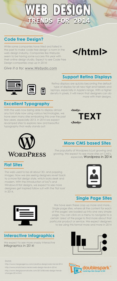
What do we predict will be the web design trends in 2014? Here is an infographic with our predictions
Marty Note
Here are my thoughts on web design in 2014.
1. Code Free = Disagree, not in 2014, I have tried Webydo and it is as hard to master as code so why bother, until there is a tool that is EASIER than code we will continue to code.
2. More CMS based site - Agree and this is another way of saying more blogs acting like websites. Good idea to read my Websites vs. Blog post on Curatti.com earlier in the week to know how to keep the things that matter from a "website" as your blog fills both shoes: Websites vs. Blogs Which One Is Better and Why http://curatti.com/websites-vs-blogs/ .
3. Single Page Sites - Disagree - I GUESS you could have a robust enough social presence that a single page site would be fine, but you give up a lot and you are asking a single page to accomplish a lot. Google doesn't rank websites they rank web pages, so pagespread (# of pages in Google) can help build traffic via SEO (that is left of it anyway).
A single page website is only viable for strong mobile or social players and somewhere there has to be an engine generating NEW out into the world. If you use a single page, push NEW out and then wipe it clean that is simply CRAZY with the way traffic is parsed and how we gain authority today. Oprah could have a single page site, how an average website could achieve all that is needed with a single page is beyond me.
4. Interactive Infographics - Agree with this one. The Infographic has legs, or should say the idea of visualizing content has legs. The infographic is an expression of a larger movement - our desire to understand things FAST.
Other 2014 Web Design Trends I see include:
* Lean Design - This movement plays off of #4 and the strength of the marketing visualization movement. Creating more understanding faster is a trending trend.
* Social Net Tapestry - Website designs MUST be social and agnostic about social nets. Including Facebook, Twitter, GPlus, YouTube, Scoop.it, StumbleUpon and 10 more I can't think of right now in ways that make sharing easy, rewarding and not overwhelming is a trend no one has figured out all that well yet, but we will begin to see novel ideas that build on the social media "widget" idea in 2014 (only much better let's hope).
* Content Curation - we must build websites in 2014 that are focused on KEY CONVERSATIONS and become agnostic about where those conversations happen. Own the conversation, own the traffic.
Curating content INTO a website (or blog) is an important trend no one has quite figured out yet either. Start with traditional ORM (Online Reputation Management) tools. Use ORM to crack some APIs so when something relevant happens to your company, brands or products out there in social media's north forty you
- Know about it.
- Filter it into your content by having ways (filters) to attach curated content into existing themes.
- Gamify contributors so reward is generous, immediate and competitive.
* Appification of Everything - the Mobile Revolution is not about the phone. It is about redesigning our THINKING about how information creates interaction, engagement and conversion (so a small thing lol). Thinking of everything we do online as an app we will be improving is a very "Mobile First" way to think. Those who understand the "Appification" of everything will win BIG as the rest of the world catches up in 2014.
* Gamification - If your website design doesn't find ways to profile, reward and share (curate) content from contributors you will fall hopelessly behind in 2014. The social web is here, despite few understanding the breadth of that that means, and websites need to promote an ever increasing amount of User Generated Content (UGC). Best way to do that is by using game theory to create web design.

|
Suggested by
SmilingAnny
|
The purpose of this post is not just to present the state of today's web design - it’s more pragmatic. Seven basic principles of a good web design are presented here.
Marty Note
This is a great post about what web design IS and IS NOT. I'm going to include my notes here so they follow the post since the writing, though brilliant, is not as direct as I like. Here are my much more direct interpretations of the 7 Basics of Great Website Design:
1. Website Design Can’t Win, But You Can Sure LOSE Due to It.
We've past the period when shinny websites work. Every website has seconds before a visitor clicks off to find what they are looking for on some other website.
2. Create Website Surfaces For Scanners and Skimmers since Readers will work for what they want.
Key to know not all information is great for "scanning" and "skimming". Tease the click don't drown it is another way to think of this idea. Also, content such as news, Q&A and testimonials have more attention hooks than sharing complex or highly detailed material. If your website depends on sharing complex and highly detailed content tease it with snippets and with graphics firs. Stay with simple, clean and useable as your guide.
3. Avoid NEW until it is UNDERSTOOD.
You don't have to wait until some new thing is old hat, but avoid using The New simply because it is new. New hurts conversion because it requires explanation and is hard to tease since visitors don't have "made to stick" context. If you must present "new" present with an "old" analogy.
Read Made To Stick by Heath brothers for more. 4. Confused customers do many things, BUYING and CONVERTING and never among them.
5. Hierarchy of information and navigation is LIFE online.
People know there is a YOU or a team behind your design. They want to know what YOU want them to DO and why they should do it with YOU. Sites that make the curator's hand visible via navigation, images and copy win. Those who challenge visitors to figure everything out for them selves lose.
This is NOT to say some mystery can't work in a web designer's favor, but make sure the mystery is immediately solved before posing another one. Daisy chain one mystery on another and visitors get frustrated and leave since benefit doesn't equal the work to realize it.
6. Colors can ruin a website.
Colors have so many overt and covert signals they should be used sparingly and consistently with the brand. If you use RED for a Zen website do so in accents and carefully since red is an ALERT color and so may be inconsistent with the brand. 7. Devil is in the web design details.
In my almost 15 years of experience NOTHING on this list is more true. Once you make a website simple and clean any small dissonance becomes LARGE because it sticks out like the proverbial "sore thumb". Make sure your site is a smooth surface with a clear message.
|


![Burn Down Your Website via @Curagami [& Share Your Web Pain Story] | Must Design | Scoop.it](https://img.scoop.it/wYZ47r2tXnou2lD-EhG2WDl72eJkfbmt4t8yenImKBVvK0kTmF0xjctABnaLJIm9)


![EYES and How They MOVE Around A Website [infographic] | Must Design | Scoop.it](https://img.scoop.it/hq4_dMRx6ZSnPz9l40RoQzl72eJkfbmt4t8yenImKBVvK0kTmF0xjctABnaLJIm9)


![Web Design: 20 Hottest 2014 Trends [+ Scenttrail Take On Each] | Must Design | Scoop.it](https://img.scoop.it/2CPaOyrABsNo3A6WtHo9yDl72eJkfbmt4t8yenImKBVvK0kTmF0xjctABnaLJIm9)

![Planning, Design, and Optimizing a Website Simplified [Infographic] - Marketing Technology Blog | Must Design | Scoop.it](https://img.scoop.it/zjmiQrejQyhlAZ_HYIxMpDl72eJkfbmt4t8yenImKBVvK0kTmF0xjctABnaLJIm9)

![What is Visual Language & How Comics Can Help Create It [graphic] | Must Design | Scoop.it](https://img.scoop.it/0RICjgYtoNqjfMSoHL5udjl72eJkfbmt4t8yenImKBVvK0kTmF0xjctABnaLJIm9)