 Your new post is loading...
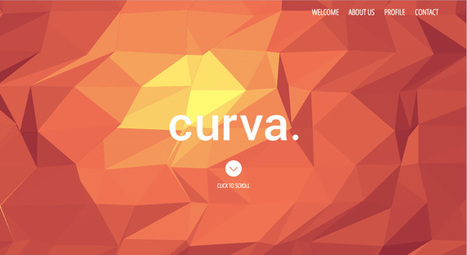
Typography is an important but often under-represented part of a website's layout. With so much focus being placed on the presentational aspects of CSS and the use of large images and media that choke bandwidth restraints; it’s nice to occasionally remember that textual content can also make an impact on users and their experience. Content remains king, and a few good fonts can make even the simplest of sites look smart - though not so many that you have to wait for ages for the text to be visible.
Because of this, I’m going to show you a few handpicked examples of sites that make their content look terrific, and why you should consider following their example in your own work. We’re going to take a journey of how elegant typography can make a site shine; looking at the bold, creative, navigational, simplistic and interactive content that makes the designer's voice speak volumes - so let’s get started!...
Via Jeff Domansky, Os Ishmael
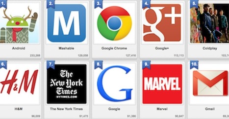
We've had a HUGE Day over on GPlus today. I wrote a post about why G+ is magical thinking (https://plus.google.com/102639884404823294558/posts/F5fXyrkTPCr ) and my post got picked up by my friend Mark Traphagen (@MarkTraphagen) and it BLEW up into an amazing conversation.
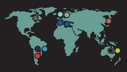
Given the MONSTER day we've had I thought it would be a great idea to share some of the most successful G+ Brand pages. GPlus is a massive Blue Ocean for most. Blue Oceans are where your content gets MORE traction with less work. Red Oceans are where your content requires more investment to generate LESS return.
GPlus is really a set of TOOLS. Incorporating Hangouts, maps, communities and other widget-like tools. The first website or agency to figure out how to combine those powerful tools in unique combinations is going to WIN big. Some of these examples approach the top of the mountain, but G+ has more power than even anyone here captures.
Storytelling Web Design
How can a website tell a story? By rethinking websites as related content capable of telling a story in either direction and on their own we see the difficulty we face when telling stories using websites.
Websites go forward and backward in time because any page can become a "homepage" based on links or search. A webpage needs to be self sufficient - telling a story on their own - and connected in a dasiy chain where each step along the chain reinforces the chain's connections and "storyline".
This post discusses ways to use tools such as videos and arresting visuals. Graphics are a HUGE and helpful device online. If your story includes icons you've created a navigational language teaching readers to look for symbols when they want to move through the deck.
This is one of the reasons I love icons. Icons aren't fixed in space or time and their connection to each other can be strong or weak. The key is to keep readers reading. The challenge is thinking about information architecture that can easily pay off on its own and point in different directions based on how readers consume the content.
Best storytelling sites I've discovered include:
http://www.robinhood.org/
http://www.redcross.org/
http://www.ihadcancer.com/
Notice a trend? Nonprofits tell better stories in general and their websites function more as great story telling aids than most for profit companies. If you have favorite storytelling websites please share and we will curate in.
There are a many aspects of good web design, and whitespace is certainly one of them. Whitespace is the empty space around design elements such as images, text,
Buy and sell handcrafted, mousemade design content like vector patterns, icons, photoshop brushes, fonts and more at Creative Market.
This great infographic takes you through the initial engagement stages for new website design work, through research, landing page design, coding, validation onto final launch and search engine optimi
It's been about five years since the last redesign of my website, Hitched. A lot has changed since then, most particularly the rise of mobile.
istock approached creatives from around the world and collected the strongest trends in colour and design: Pantone's Color of the Year and Top 10 Hot or Not.
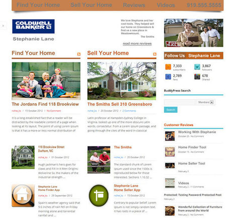
My real estate agent Stephanie Lane just sold my home in Durham so I could move funds into my nonprofit Story of Cancer Foundation. I was thinking about how I would help redesign StephanieLane.com even as friends such as Phil Buckley (@1918), Mark Traphagen (@MarkTraphagen) and Bill Gassett (@MassRealty) have been thinking about creating a new real estate online design revolution.
This post is about that revolution and about why the old print based real estate model, something still exerting pull, doesn't and will never work online.
Wrote a companion piece to this titled, "5 Could Tell You, But Then Would Need To Tell You Internet Marketing Secrets SHARED" about the "inside baseball" reasons I made the decisions I made in this design sketch.
http://sco.lt/54ZJmj
Top 10 Design Revolution Scoops of All Time
5 Jazz Influenced Website Designs
5 Cool Jazz Website Designs
Hero Roll Static Text http://www.jetztzeitclub.de/ Love this idea of rolling the hero image while keeping a single textural idea. The impact is to EPHASIZE the text while allowing the visual field to create interest and calm. The problem with heroes that roll and bring new messages is the website can become ADD. You never know where or what to look at. Here the roll reinforces a single message. Cool.
Color & Texture Shock http://www.austynweiner.com/ Same image shift with single text here but an explosion of color and texture. This is an example of going to an extreme to create a sense of visual shock. The only liability with this technique is showing your visitors where to go next FAST since the shock needs to work FOR not AGAINST you.
Hero with Insert http://thecarcrush.com/blog/2013/8/y3uaah5ojl6zi4iia95h10iircb8o0 Love the lush images with inserts here. The cars are seductive and romantic, but the insert allows the text and descriptions to add instead of distract from the hero images. Magazine Like http://boompa.ca/ This waterfall, the infinite scroll, magazine shows how you can build a visual and copy story with large hero images water falling on top of one another. There is real visual organization here. Very cool.
Radically Simple Ecom http://www.lushtype.com/
Love tis ide of radical simplicity in ecommerce. Big icons sell icons. By selling one thing the page is easy to understand, easy to buy yet very cool and engaging too.
Website design is about to change about as much as something can change and email marketing is already half way there. Email marketers such as @Bronto move massive amounts of information in real time.
Welcome to the future.
The future of web design will happen in real time, be logic based and require a mountain of creative controlled by predictive analytics in real time. If that sounds like email marketers are sitting pretty you win a cookie.
Bronto became Cure Cancer Starter's (http://www.curecancerstarter.org) email marketing and marketing automation partner today (http://sco.lt/55jx1F ). Bronto joins Atlantic BT and the Story of Cancer Foundation (501c3) in the Tech Cures Cancer Movement.
This deck is about where web design is headed (at light speed) and why thinking like an email-marketer is a good idea.
Folllowedbthisvdeck up with Future of web Design 2: http://sco.lt/61eqNF
#TechCuresCancer @CureCancerStart
Could redesigned Web sites be the starchitecture for museums? We pick our favorite museum Web site designs, including the Whitney's kids-only digital playground.
|
What do waiting tables and UX design have in common? One UX director weighs in on how we can learn how to handle design problems from the physical world.
For a while now, designers have been absolutely infatuated with all things subtle. We love subtle patterned backgrounds and intricate decorative elements; we
There are many of content heavy websites out there, but very few seem to take good design into account. We take a look at those that do.
Marty Note
Content can KILL a website design. Content needs to be well thought out. How can you tease the click without frustrating your visitors and readers? How can you share all the content you need to share without wrecking your design? Here are 25 examples of how to use content as a helpful design element instead of ending up on content's rocky shores.
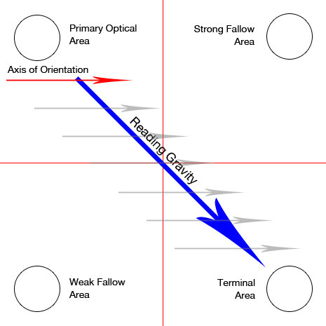
An article on Banner Blindness which explains the physcology behind it and enlists common techniques to reduce it and improve ad revenues.
Marty Note Interesting post and definitions that is true to my experience designing high converting ecommerce websites. There are ways to manipulate eye tracking with images and call-to-actions, but that area on the right the "strong fallow area" was a GUTTER.
REI is my favorite example at how to manipulate the "gutter" tendency to be a black hole or a roach motel (visitors check in but never out). REI takes a link they know everyone is looking for, their SALE link, they color it different than the rest of their menu (red).
REI defeats the "roach motel" aspects of the right gutter with intelligence and design. In my experience the SALE area shopper will ferret that link out no matter where you put it.
By taking an area that is normally a dead end and putting something the sale shopper will surely find they kill the proverbial two birds -
* Their SALE shoppers can beeline right to their favorite place to check BEFORE they do anything else.
* The SALE curios can easily find the link too so they lose nothing and gain an active link in an area that is typically weak. Just one reason why REI is one of the best-crafted ecommerce website:
http://www.rei.com
Check out these 10 gorgeous websites to see what makes them so critically acclaimed.
Marty Note
Solid work here if somewhat on the heavy side for my taste. I do like Rdio. M
Engage website visitors better by designing your site to match how people's eyes move on the page. Here are some surprising eye tracking stats to help. Putting together a great looking website is a great start, but it is just a start. True web design requires you to venture beyond the aesthetic and into the worlds of User Experience and Conversion Rate Optimization. Knowing how the viewers of your site really see it can help to shine light on new and/or missed opportunities within your current design. It may also bring out the need for new elements or changes. While there are plenty of options for improving CRO, eye tracking analysis provides some of the most useful information for optimizing your biggest digital marketing asset, your website. A good design will catch people’s eye, but a great design will keep people on your site and get them engaged with your content. And while you shouldn’tunderestimate the power of good copy, your design is what people notice first. We teamed up with our friends over at Single Grain to put together the infographic below in hopes that it will help everyone get a better, basic understanding of what eye tracking is and what it can do.
Via massimo facchinetti, Mike Power
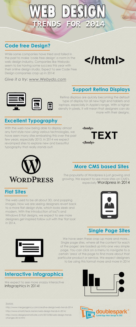
What do we predict will be the web design trends in 2014? Here is an infographic with our predictions
Marty Note
Here are my thoughts on web design in 2014.
1. Code Free = Disagree, not in 2014, I have tried Webydo and it is as hard to master as code so why bother, until there is a tool that is EASIER than code we will continue to code.
2. More CMS based site - Agree and this is another way of saying more blogs acting like websites. Good idea to read my Websites vs. Blog post on Curatti.com earlier in the week to know how to keep the things that matter from a "website" as your blog fills both shoes: Websites vs. Blogs Which One Is Better and Why http://curatti.com/websites-vs-blogs/ .
3. Single Page Sites - Disagree - I GUESS you could have a robust enough social presence that a single page site would be fine, but you give up a lot and you are asking a single page to accomplish a lot. Google doesn't rank websites they rank web pages, so pagespread (# of pages in Google) can help build traffic via SEO (that is left of it anyway).
A single page website is only viable for strong mobile or social players and somewhere there has to be an engine generating NEW out into the world. If you use a single page, push NEW out and then wipe it clean that is simply CRAZY with the way traffic is parsed and how we gain authority today. Oprah could have a single page site, how an average website could achieve all that is needed with a single page is beyond me.
4. Interactive Infographics - Agree with this one. The Infographic has legs, or should say the idea of visualizing content has legs. The infographic is an expression of a larger movement - our desire to understand things FAST.
Other 2014 Web Design Trends I see include:
* Lean Design - This movement plays off of #4 and the strength of the marketing visualization movement. Creating more understanding faster is a trending trend.
* Social Net Tapestry - Website designs MUST be social and agnostic about social nets. Including Facebook, Twitter, GPlus, YouTube, Scoop.it, StumbleUpon and 10 more I can't think of right now in ways that make sharing easy, rewarding and not overwhelming is a trend no one has figured out all that well yet, but we will begin to see novel ideas that build on the social media "widget" idea in 2014 (only much better let's hope).
* Content Curation - we must build websites in 2014 that are focused on KEY CONVERSATIONS and become agnostic about where those conversations happen. Own the conversation, own the traffic.
Curating content INTO a website (or blog) is an important trend no one has quite figured out yet either. Start with traditional ORM (Online Reputation Management) tools. Use ORM to crack some APIs so when something relevant happens to your company, brands or products out there in social media's north forty you
- Know about it.
- Filter it into your content by having ways (filters) to attach curated content into existing themes.
- Gamify contributors so reward is generous, immediate and competitive.
* Appification of Everything - the Mobile Revolution is not about the phone. It is about redesigning our THINKING about how information creates interaction, engagement and conversion (so a small thing lol). Thinking of everything we do online as an app we will be improving is a very "Mobile First" way to think. Those who understand the "Appification" of everything will win BIG as the rest of the world catches up in 2014.
* Gamification - If your website design doesn't find ways to profile, reward and share (curate) content from contributors you will fall hopelessly behind in 2014. The social web is here, despite few understanding the breadth of that that means, and websites need to promote an ever increasing amount of User Generated Content (UGC). Best way to do that is by using game theory to create web design.
If you’re looking forward to changes that come with starting a new year, you may also be excited to learn what sorts of trends are emerging in the web design
The social web is about conversation. This is a fascinating post about exactly what is a conversation and how we can design an environ,ent that supports them.
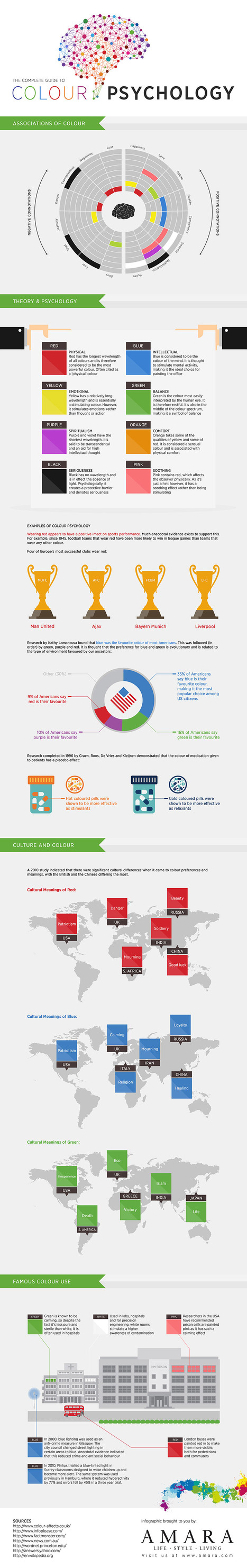
Amara presents the complete infographic guide to colour psychology. Covering the theory behind different colour psychology, cultural meanings, connota
Showcase of web 3.0 web sites (html5, css3, parallax, ecc...)
Marty
Great board from @Pupixel (an Italian web designer) sharing examples of web design leading the way to Web 3.0 - a semantic real time web.
In web design there are a lot of combinations that deliver a beautiful page, including the image + text duo. Combining beautiful images and nice/readable text
|


![Website Design Projects Timeline From Research To Testing [infographic] | Must Design | Scoop.it](https://img.scoop.it/KmYc6GekuduKzrZ_joBL7zl72eJkfbmt4t8yenImKBVvK0kTmF0xjctABnaLJIm9)


![EYES and How They MOVE Around A Website [infographic] | Must Design | Scoop.it](https://img.scoop.it/hq4_dMRx6ZSnPz9l40RoQzl72eJkfbmt4t8yenImKBVvK0kTmF0xjctABnaLJIm9)


Here's to the power of typography in website and landing page design.
Headings grab our attention, but the body of content is what makes us stay.
Remember, content is king!