Must Design
75.6K views | +2 today
Follow
Must Design
Design Is Revolutionary
Your new post is loading...
Scooped by Martin (Marty) Smith
Scoop.it!

5 Simple Rules To Know Your Site's Navigational Taxonomy via @Curagami

5 Simple Rules To Know Your Site's Navigational Taxonomy via @Curagami | Must Design | Scoop.it

Knowing your website's navigational taxonomy can mean the difference between millions in traffic and money. Here are 5 Simple Navigational Taxonomy Rules.

* It's About THEM not YOU.
* Create A Commons.
* It's FREE and EASY.

* Srart with Brands & Work OUT.

* Find Engagement & Work IN.

Easy to follow rules so your site's nav WINS traffic, hearts, minds, SEO and loyalty needed to be around for a bit.

No comment yet.
Scooped by Martin (Marty) Smith
Scoop.it!

Design G+ In For The Win via @Curagami

Design G+ In For The Win via @Curagami | Must Design | Scoop.it

Designing G+ In
Crazy to suggest using G+ as a tool to power your online marketing right? Maybe not. Greatest return always comes from the least understood ideas. GooglePlus is a "least understood" idea these days.

Their leader left and TechCrunch said G+ the social net is dead. They may be right, but that is beside the point. G+ has always been more than a social net. G+ is a suite of tools marketers can use to find blue oceans.

Blue oceans are the as yet unspoiled places where marketers can still swim without fear of a herd of sharks. Oceans where sharks eat themselves are "red oceans" such as Facebook.

We suggest designing G+ into your marketing and site. Hold weekly hangouts, you don't need a G+ profile to use hangouts now, and created a branded community if only so you rule your name in #seo. Finally we suggest curating the great comments you will receive on G+ as a source of future content.

We've never been able to figure out how to use circles in a unique way, but they too beckon with possibility. By creating weekly content based on Hangouts and Community you get lots of GoogleJuice, the least expensive #videomarketing we know about and great community development tools that cost you NOTHING.

The linked post discusses Mark Traphagen's call to use G+ as a hub of your marketing. That's a great call since the price is RIGHT (free though you may spend some making G+ play the way you want it in your design). Designing G+ tools INTO your community creates the cheapest, biggest and best online win we can think of.

So the death of G+ is greatly exaggerated and, if you are smart, you will find a way to design the tool's many possibilities into your marketing.

No comment yet.
Scooped by Martin (Marty) Smith
Scoop.it!

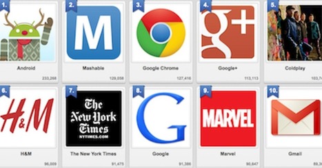
Designing For GooglePlus: Top 10 Brand Pages on Google+

Designing For GooglePlus: Top 10 Brand Pages on Google+ | Must Design | Scoop.it

We've had a HUGE Day over on GPlus today. I wrote a post about why G+ is magical thinking (https://plus.google.com/102639884404823294558/posts/F5fXyrkTPCr ) and my post got picked up by my friend Mark Traphagen (@MarkTraphagen) and it BLEW up into an amazing conversation.

Given the MONSTER day we've had I thought it would be a great idea to share some of the most successful G+ Brand pages. GPlus is a massive Blue Ocean for most.  Blue Oceans are where your content gets MORE traction with less work. Red Oceans are where your content requires more investment to generate LESS return.

GPlus is really a set of TOOLS. Incorporating Hangouts, maps, communities and other widget-like tools. The first website or agency to figure out how to combine those powerful tools in unique combinations is going to WIN big. Some of these examples approach the top of the mountain, but G+ has more power than even anyone here captures.

No comment yet.
Scooped by Martin (Marty) Smith
Scoop.it!

Web design trends for 2014 | Infographic + @ScentTrail Trend Predictions

Web design trends for 2014 | Infographic + @ScentTrail Trend Predictions | Must Design | Scoop.it

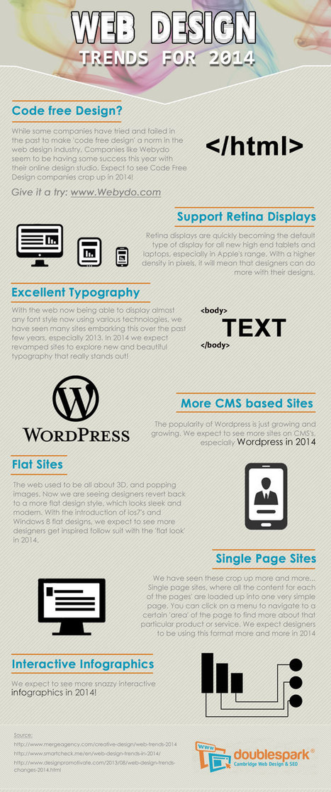
What do we predict will be the web design trends in 2014? Here is an infographic with our predictions

Marty Note
Here are my thoughts on web design in 2014.

1. Code Free = Disagree, not in 2014, I have tried Webydo and it is as hard to master as code so why bother, until there is a tool that is EASIER than code we will continue to code.

2. More CMS based site - Agree and this is another way of saying more blogs acting like websites. Good idea to read my Websites vs. Blog post on Curatti.com earlier in the week to know how to keep the things that matter from a "website" as your blog fills both shoes: Websites vs. Blogs Which One Is Better and Why http://curatti.com/websites-vs-blogs/ .

3. Single Page Sites - Disagree - I GUESS you could have a robust enough social presence that a single page site would be fine, but you give up a lot and you are asking a single page to accomplish a lot. Google doesn't rank websites they rank web pages, so pagespread (# of pages in Google) can help build traffic via SEO (that is left of it anyway).

A single page website is only viable for strong mobile or social players and somewhere there has to be an engine generating NEW out into the world. If you use a single page, push NEW out and then wipe it clean that is simply CRAZY with the way traffic is parsed and how we gain authority today. Oprah could have a single page site, how an average website could achieve all that is needed with a single page is beyond me.

4. Interactive Infographics - Agree with this one. The Infographic has legs, or should say the idea of visualizing content has legs. The infographic is an expression of a larger movement - our desire to understand things FAST.

Other 2014 Web Design Trends I see include:

* Lean Design - This movement plays off of #4 and the strength of the marketing visualization movement. Creating more understanding faster is a trending trend.

* Social Net Tapestry - Website designs MUST be social and agnostic about social nets. Including Facebook, Twitter, GPlus, YouTube, Scoop.it, StumbleUpon and 10 more I can't think of right now in ways that make sharing easy, rewarding and not overwhelming is a trend no one has figured out all that well yet, but we will begin to see novel ideas that build on the social media  "widget" idea in 2014 (only much better let's hope).

* Content Curation - we must build websites in 2014 that are focused on KEY CONVERSATIONS and become agnostic about where those conversations happen. Own the conversation, own the traffic.


Curating content INTO a website (or blog) is an important trend no one has quite figured out yet either. Start with traditional ORM (Online Reputation Management) tools. Use ORM to crack some APIs so when something relevant happens to your company, brands or products out there in social media's north forty you

  1. Know about it.
  2. Filter it into your content by having ways (filters) to attach curated content into existing themes. 
  3. Gamify contributors so reward is generous, immediate and competitive.


* Appification of Everything - the Mobile Revolution is not about the phone. It is about redesigning our THINKING about how information creates interaction, engagement and conversion (so a small thing lol). Thinking of everything we do online as an app we will be improving is a very "Mobile First" way to think. Those who understand the "Appification" of everything will win BIG as the rest of the world catches up in 2014.

* Gamification - If your website design doesn't find ways to profile, reward and share (curate) content from contributors you will fall hopelessly behind in 2014. The social web is here, despite few understanding the breadth of that that means, and websites need to promote an ever increasing amount of User Generated Content (UGC). Best way to do that is by using game theory to create web design.


No comment yet.
Scooped by Martin (Marty) Smith
Scoop.it!

Deigning Tomorrow's Ecommerce Today

Deigning Tomorrow's Ecommerce Today | Must Design | Scoop.it

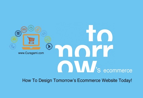
Designing Tomorrow's Ecommerce
I'm writing a blog post for Curatti that will go live at midnight tonight that discusses the "best practices" of "Tomorrow's Ecommerce". I'm also writing a Curagami blog post (also published at midnight) about how social shopping will change Tomorrow's Ecommerce.

Tomorrow's Ecom Current Best Practices (Curatti tonight)
Tomorrow's Ecom Social & Mobile Web (on Curagami now)

The Haiku Deck that bridges both of these posts is linked above and here:
http://shar.es/1nkJef

As we publish each post we will link them here.


Martin (Marty) Smith's insight:

add your insight...


No comment yet.
Scooped by Martin (Marty) Smith
Scoop.it!

Time To Go Pageless? 8 Reasons Why Pageless Design is Future of Web Design

Time To Go Pageless? 8 Reasons Why Pageless Design is Future of Web Design | Must Design | Scoop.it

Pageless design frees websites from the outdated conventions of print design and fully utilizes the digital platform they’re built on. 

8 Compelling Reasons Why "Pageless' Web Design Wins (in the end):


* Tells a better story.

* Easier to "digest" or understand what to do.

* Emotionally more powerful.

* Higher Conversion Rates!!!
* Makes updating faster & easier.

* Lowers BOUNCE & encourages sharing.

* Looks great on all devices (mobile included).

* Lower cost to develop.

Marty Note
I confess to not being in love with the "infinite scroll" just yet. One modification we worked out for @Curagami, our Startup Factory funded startup, is to include a Call-To-Action at the top & Bottom.

CTAs help prepare the scroll. Remember "open book" tests? Putting a CTA on top of a waterfall of content helps prep a visitors mind. It "opens the book" for them. With this many impressive benefits I'm going to have to figure out how to start loving "pageless" design (lol).

I bet there are 5 (or so) similar modifications we can make to help us know how to create the paths and conversion we want by going "pageless".  

Scooped by Martin (Marty) Smith
Scoop.it!

25 Beautiful Content Heavy Website Designs Inspire

25 Beautiful Content Heavy Website Designs Inspire | Must Design | Scoop.it
There are many of content heavy websites out there, but very few seem to take good design into account. We take a look at those that do.


Marty Note
Content can KILL a website design. Content needs to be well thought out. How can you tease the click without frustrating your visitors and readers? How can you share all the content you need to share without wrecking your design? Here are 25 examples of how to use content as a helpful design element instead of ending up on content's rocky shores.

No comment yet.