Must Design
75.5K views | +0 today
Follow
Must Design
Design Is Revolutionary
Your new post is loading...
Scooped by Martin (Marty) Smith
Scoop.it!

Learn Web Design From Video Game Design: 20 Best Video Game Websites via @whatculture

Learn Web Design From Video Game Design: 20 Best Video Game Websites via @whatculture | Must Design | Scoop.it

Learning From Video Game Designers
Video game designers can teach you a lot about how to great great ecommerce and B2B websites. Video games are gamified, social and understand the stimulus - response nature of online interaction in a fluid and must imitate ways.  

Here are WhatCulture.com's picks for the 20 best video game websites in the world. We like Gamers With Jobs and Kotaku (though we don't understand a lot of it).  

No comment yet.
Scooped by Martin (Marty) Smith
Scoop.it!

SEO, Canonical URLs, Rel=Canonical & Meaning of Ecommerce Life

SEO, Canonical URLs, Rel=Canonical & Meaning of Ecommerce Life | Must Design | Scoop.it

Canonical URLs Explained
The Yoast post provides an easy way to understand why rel=canonical is a powerful new SEO tag. Yoast has a dog in the hunt. They make a Magento plugin that easily writes the rel=canonical tag into a product page's head.

The explanation about WHY canonical URLs are so important is only half right. We have a million ways of expressing and sharing URLs these days. Without rel=canonical we end up duping content to distraction.

Here's the rub. All ecommerce sites dupe content. They must. When I was a Director of Ecommerce a single product accounted for 50% of our profits. You better believe I merchandised that product into every nook and cranny our site offered. I duped that product and it's content to distraction.

There are other ways to limit duplication including:

* Use of your Robots.txt file.
* Locking content behind a firewall.  

* Use of blockquotes & rel=canonical tags. 
* Rewrite duplicated content so it's not as duplicated (lol). 

We included our email output into a folder with a "no follow" line in our robots.txt. You may think such a move is enough. It isn't. Be sure NOT to drive links from spiderable content INTO that folder or you eliminate the effectiveness of the robots.txt.

In the end every ecom site worth it's salt MUST duplicate content. Rewriting sounds like a good strategy, but it isn't. Content = time and time = money when managing million dollar commercial sites. You will be duping content.

Best to use rel=canonical because it shows Google you aren't trying to STEAL anything. Reminds me of what a friend shared about the disavow tool (used to deny inbound links or signal they may be untrusted).

 My friend was using the disavow tool daily on his clients accounts. "So you are brown-nosing Google," I kidded him. "Exactly," was his answer. Rel=canonical tells Google you are TRYING to do the right thing and sometimes that is enough. 

No comment yet.
Scooped by Martin (Marty) Smith
Scoop.it!

Wiki-ization Of Marketing: Here, There, Everywhere A Wiki

Wiki-ization Of Marketing: Here, There, Everywhere A Wiki | Must Design | Scoop.it

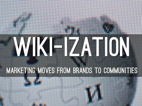
Here A Wiki, There A Wiki, Everywhere A Wiki
What is a Wiki if not an invitation to create online community. The "open source" like collaboration Wiki's provide is a blueprint for creation of online community. After months working on http://www.Curagmai.com we've discovered how close Wikis are to...well everything.

Wiki Ideas To Steal Include:


* Open Source Like Content Collaboration.

* Use community to steer and de-spam ecosystem.
* Depend mostly on social reward.
* A healthy and competitive contest never hurts.

* Feature and thank contributors.
* Provide ways for contributors to know where they stand vis-à-vis other contributors.
* Create ways contributors can follow and communicate with each other.
* Include ways for contributors to create mini-tribes.

* Make sure "rules of the road" are understood and published.

* Communication with sponsoring agents must be easy too.
* Normalize greatness by sharing across ecosystem.
* Role of sponsors becomes more curators than creators.
* Ask for help.
* Provide social rewards (such as features) to contributors.
* Create ways to identify contributors in the world (t-shirts, stickers).
* Appreciate, be nice and thankful (always no matter what).

Following a few simple rules will dramatically increase the most important content you can't buy (User Generated Content or #UGC) and build sustainable online community. Sustainable online community means costs go DOWN even as other material rewards (UGC, followers, traffic, money) go UP.

This Haiku Deck is about why we are all in the Wiki business whether we realize it or not AND how to design for the Wiki-ization of marketing, brands and online community.

No comment yet.
Scooped by Martin (Marty) Smith
Scoop.it!

Best-in-Class eCommerce Web Designs via @conversioniq

Best-in-Class eCommerce Web Designs via @conversioniq | Must Design | Scoop.it

Best In Class From Conversion IQ
The other day I complained about "pretty picture' ecommerce sites that make conversion harder. So much of ecom is ditch digging. Ditch digging to make sure you have things such as:

* Email subscription form (prefer presence to popunders).
* Clearly ECOM - looks like a store with things to sell not content to read.
* Social (easy to find theirs and easy to contribute).
* Content Curation from social / comments / reviews (should feel like a party with people who share love / interests).

* Offers, deadlines and a sense of time (of the year today is Columbus Day for example).

These examples from Conversion IQ are closer to "ditch digging" ecommerce websites. Conversion either BUYING or into a list are easier, more clear and so these designs make more money than the pretty picture websites I shared last (http://sco.lt/4ijZIH ),

No comment yet.
Scooped by Martin (Marty) Smith
Scoop.it!

17 Content Rich Sites for Web Design Inspiration

17 Content Rich Sites for Web Design Inspiration | Must Design | Scoop.it

We asked several developers what their favorite sources are for web design and code inspiration, and they pointed to these 17 wide-ranging sites.

Marty Note
I like several of these designs including Web Design Ledger and The Source for their creative balance between images, copy and headlines. There are so many things dancing on the head of a pin on any homepage such as:

* Your desire to SHARE everything.

* Their (visitor's) desire to find what they want.

* Navigation.
* Images.
* Headlines & Copy.

Getting all of these dancers to tell a coherent story in 9 seconds is the challenge. Usually as content being shared increases understand decreases. Several of these designs manage to present a lot of options intelligently.

Which one is your fav?

Martin (Marty) Smith's insight:

BTW, YES I am breaking a rule here and sharing content from a "Big Boy" blog (Mashable). Point I made about NOT curating content from the big boys anymore has exceptions.

Why I Stopped Curating Content From Big Blogs
http://sco.lt/6QV7ib


I used BuzzSumo to find this design post and it has been shared at a moderate level for Mashabale. Design in general is an exception. I don't care WHERE great design content exists I will curate it (lol).

In this case I put a different spin on the Mashable take. They looked at these 17 examples as "good web design". They are that, but they are also great examples of how content can dance with its "tease elements" such as headlines and images.

Design content has to be some of the most READ content on the web  and we learn first and foremost from pictures and, once our attention is fully gained, words.

This was an excellent post and it was 3 levels deep in Mashable now. If this content ever appeared on the "celebrity obsessed" homepage I noted yesterday it was below the fold and a short homepage stay (I'm betting).

This content fits into the "contrary" exception I discussed on G_. I'm riffing solid content in a way they didn't so who cares who created it there is VALUE to be added (i.e. something they didn't see, something important to my readers who try to create sites balanced between content and commerce daily). M

No comment yet.
Scooped by Martin (Marty) Smith
Scoop.it!

Design G+ In For The Win via @Curagami

Design G+ In For The Win via @Curagami | Must Design | Scoop.it

Designing G+ In
Crazy to suggest using G+ as a tool to power your online marketing right? Maybe not. Greatest return always comes from the least understood ideas. GooglePlus is a "least understood" idea these days.

Their leader left and TechCrunch said G+ the social net is dead. They may be right, but that is beside the point. G+ has always been more than a social net. G+ is a suite of tools marketers can use to find blue oceans.

Blue oceans are the as yet unspoiled places where marketers can still swim without fear of a herd of sharks. Oceans where sharks eat themselves are "red oceans" such as Facebook.

We suggest designing G+ into your marketing and site. Hold weekly hangouts, you don't need a G+ profile to use hangouts now, and created a branded community if only so you rule your name in #seo. Finally we suggest curating the great comments you will receive on G+ as a source of future content.

We've never been able to figure out how to use circles in a unique way, but they too beckon with possibility. By creating weekly content based on Hangouts and Community you get lots of GoogleJuice, the least expensive #videomarketing we know about and great community development tools that cost you NOTHING.

The linked post discusses Mark Traphagen's call to use G+ as a hub of your marketing. That's a great call since the price is RIGHT (free though you may spend some making G+ play the way you want it in your design). Designing G+ tools INTO your community creates the cheapest, biggest and best online win we can think of.

So the death of G+ is greatly exaggerated and, if you are smart, you will find a way to design the tool's many possibilities into your marketing.

No comment yet.
Scooped by Martin (Marty) Smith
Scoop.it!

Time To Go Pageless? 8 Reasons Why Pageless Design is Future of Web Design

Time To Go Pageless? 8 Reasons Why Pageless Design is Future of Web Design | Must Design | Scoop.it

Pageless design frees websites from the outdated conventions of print design and fully utilizes the digital platform they’re built on. 

8 Compelling Reasons Why "Pageless' Web Design Wins (in the end):


* Tells a better story.

* Easier to "digest" or understand what to do.

* Emotionally more powerful.

* Higher Conversion Rates!!!
* Makes updating faster & easier.

* Lowers BOUNCE & encourages sharing.

* Looks great on all devices (mobile included).

* Lower cost to develop.

Marty Note
I confess to not being in love with the "infinite scroll" just yet. One modification we worked out for @Curagami, our Startup Factory funded startup, is to include a Call-To-Action at the top & Bottom.

CTAs help prepare the scroll. Remember "open book" tests? Putting a CTA on top of a waterfall of content helps prep a visitors mind. It "opens the book" for them. With this many impressive benefits I'm going to have to figure out how to start loving "pageless" design (lol).

I bet there are 5 (or so) similar modifications we can make to help us know how to create the paths and conversion we want by going "pageless".  

Scooped by Martin (Marty) Smith
Scoop.it!

20 Long Form Content Examples with Great UX Design Inspire & Help With the "#newseo"

20 Long Form Content Examples with Great UX Design Inspire & Help With the "#newseo" | Must Design | Scoop.it
Here’s a fun fact: Over the last 10 years, our attention spans have decreased from 12 minutes to 5 minutes. Our ability (and our desire) to read lots of c
Martin (Marty) Smith's insight:

My favorite is the NYT's Home and Garden in depth look at 4 square blocks in Philly. Great content daisy chained well so it never overwhelms and keeps readers moving. Great use of anchor links (from the sidebar) makes the piece feel more interactive than it really is. 

Long form content has many #newseo benefits. The more engagement your content creates the greater chances for conversion. Web heuristic measures such as time on site, pages viewed and returning visitors help with the "new seo" too.


Steal some of these easy tricks from NYT and make your content feel more interactive than it is and read faster and more fun so your metrics go up and readers love you enough to become buyers or subscribers.  

No comment yet.
Scooped by Martin (Marty) Smith
Scoop.it!

Why The Bauhaus Is Our House As Web Design Moves Into The Future

The Bauhaus ethic applied principles such as "honesty of construction", "truth to ma...

Martin (Marty) Smith's insight:

Great work by Simon Collision (@Colly). Picks up for me on slide 17.

1. Acknowledge the machine.

2. Standardize production.

3. Experiment and synthesize. 

4. Form follows function.

5. Economy and simplicity.

Those values drove designers at the Bauhaus to create a new approach. How will those values influence our web design going forward?

1. Honesty of construction truth to materials.

2. Develop systems.

3. Holistic web design approach (slide 32 what's golden important). .

4. Mass production and individual expression.

5. Adapt and respond to an evolving world.


Here are points I would make about how Bauhaus values will play an important role in what is next online:

* The machine is increasingly SOCIAL and MOBILE.

* Smart Phones & Apps gamify routine (boring) tasks.

* Holistic design will increasingly mean Mobile Fist design.

* We are all in the community building business (whether we know it or not) & community creates mass production OUT OF individual expression.
* Our adaptations will be social & mobile, gamified & curated.

No comment yet.
Scooped by Martin (Marty) Smith
Scoop.it!

"Snowfall" Interative Web Design Storytelling 20 Examples | Web Directions

"Snowfall"  Interative Web Design Storytelling 20 Examples | Web Directions | Must Design | Scoop.it
Yesterday an article on Medium, Snowfallen, caught my eye. It's about a technique for presenting longform writing online, by embellishing it with integrated
Martin (Marty) Smith's insight:

Not sure how I feel about "snowfall" design. My favorite is the Buzzfeed History of Pong. My concerns are:

* Gets boring to scroll that much.
* Pagespread - is it better SEO to have a single long page or many pages?

The issue of pagespread is tricky. The new Google cherishings engagement and long pages create longer engagement assuming people don't click off.

But Google also likes pagespread (more pages about a topic with social shares and links confirming their importance). I don't know the RIGHT answer her since each approach - long pages or many pages - have distinct SEO benefits.

I find the experience of that long page offputting and wonder how snowfall will play on mobile devices. Mobile may be easier because of the swipe.

In fact, snowfall design may have its roots in mobile (sure feels that way). Whether your website should be 100% snowfall designed is above my pay grade (lol). M  

No comment yet.
Scooped by Martin (Marty) Smith
Scoop.it!

Why SEO for Web Designers Went Boom - Curagami

Why SEO for Web Designers Went Boom - Curagami | Must Design | Scoop.it
With 22,000+ views SEO for Web Designers blew up thanks to a defined tribal audiences, advocates and luck. Discover tips on how to blow your content up too.
No comment yet.
Scooped by Martin (Marty) Smith
Scoop.it!

SEO For Web Designers via @HaikuDeck

SEO For Web Designers via @HaikuDeck | Must Design | Scoop.it

Web Designer SEO
Our SEO Tips for Web Designers hit a nerve. It is heading to 13,000 views (probably today). We hit a nerve because web Designers are where SEO rubber meets the road. This Haiku Deck is full of SEO tips for web designer including:

* Know who has the banana and why.
* Know how much SEO you need to know.

* Learn what is MIST vs what is Gorilla.
* Listen Digitally.
* Understand how SEO & Content marketing work together.

* Design to Win Hearts, Minds and Loyalty. 

And More SEO tips designed for designers.  

No comment yet.
Scooped by Martin (Marty) Smith
Scoop.it!

The Hottest Web Design Trends of 2014: Updated | JUST™ Creative

The Hottest Web Design Trends of 2014: Updated | JUST™ Creative | Must Design | Scoop.it

An updated look at the hottest best web design trends of 2014 including a showcase of modern web design inspiration.

Marty Note
This @justcreative post hit many nails on the head when it was initially published and Jacob's update of Helga Moreno's post doesn't disappoint either. Things I REALLY agree with:

See Less of (PLEASE):

* Stock photography (no photos? ASK your employees / followers for help but please no more Stepford people in pics on websites).
* Flash (has killed more #seo and sites than you can shake a stick at and fact it is still alive is amazing).
* Capcha - spam sucks but so do capcha forms.

More of PLEASE:

* Content First (implied in Responsive or Mobile First Design is a new way of thinking about, tagging and presenting content).
* Interactive Exploring (BIG AGREEMENT see my post about Time is Money Online https://plus.google.com/+MartinWSmith/posts/RdjAjWoJTHw and tag this next to #gamification).
* Arresting pictures and Video (YES, your great content will be ignored or under-shared UNLESS it is paired with strong visual hooks and supports).

Great post by Helga for Just Creative and so TRUE to our experience of web dev in 2014 for leading ecommerce clients such as Moon Audio.com.

No comment yet.
Rescooped by Martin (Marty) Smith from Tracking Transmedia
Scoop.it!

Future of Storytelling Online? Convergence & Mashups as Illustrated By Unknown Spring

Future of Storytelling Online? Convergence & Mashups as Illustrated By Unknown Spring | Must Design | Scoop.it

Unknown Spring

In March 2011 Jake Price, a freelance producer for the BBC, journeyed to Tohoku, Japan to document the devastation left in the wake of the Pacific tsunami.


The  result of his trip is evident in his powerful and beautiful immersive web documentary, "Unknown Spring," which was awarded the World Press Photo Multimedia Awards...'


Via siobhan-o-flynn
Martin (Marty) Smith's insight:

Agree with the @Art Jones note. The mashup of many channels into an immersive environment as illustrated by Unknown Spring is a fascinating and a sign of things to come. The execution on my mac was a tad bumpy, but the convergence of media, narration, navigation, image and "hero's journey" storytelling is powerful.

Here is the link to the Unknown Spring site:
http://www.unknownspring.com


Article about the "new" convergence storytelling:
http://www.indiewire.com/article/whats-the-future-of-storytelling-unknown-spring-provides-some-answers-20140927

No comment yet.
Scooped by Martin (Marty) Smith
Scoop.it!

Picasso At The Beach and The NEW Art of Web Design

Picasso At The Beach and The NEW Art of Web Design | Must Design | Scoop.it

PicassoHead App
Sharing this cool "draw a "Picasso Head" app (my PicassoHead http://www.picassohead.com/?id=5290a28#.VBCfth1bqjo.twitter ) to illustrate a few of our favorite web design concepts such as:

* DO LESS and let them DO MORE (them = customers, visitors, advocates_.
* GALLERIES ROCK - especially when your gallery is chock a block full of User Generated Content (UGC).
* Engagement Rocks - do you have a tool that is fun to use AND promotes positive site heuristics such as time on site, pages viewed, lower bounce?
* Every product, idea or website starts about the creators and must become about those who visit and love it.
* People love what THEY create and contribute more than what you do.
* This means all web design is or will be about collaboration.

We love the simplicity of this little app, but the even COOLER riff came from our confirming email. This is the email that shares the link where my Picasso At The Beach drawing lives (linked from this post http://www.picassohead.com/?id=5290a28#.VBCSuy4Lksk.twitter ) and where this little pitch lived:

"This summer check out Picasso Looks at Degas at the Clark in Williamstown, MA. You won’t want to miss this groundbreaking, Clark-exclusive exhibition that is the first to look at Pablo Picasso’s deep fascination with Edgar Degas.

http://www.clarkart.edu/exhibitions/picasso-degas/ "

Wow, cool idea. Create a little art based app and sell related links in the confirmation email. That's brilliant marketing, subtle marketing and the art of web design. Kudos to Picassohead creators RFI Studios, http://www.rfistudios.com.

#toogood


Martin (Marty) Smith's insight:

add your insight...


No comment yet.
Scooped by Martin (Marty) Smith
Scoop.it!

Hero Marketing: Heroes Write Like This 40 Great Headlines

Hero Marketing: Heroes Write Like This 40 Great Headlines | Must Design | Scoop.it
Depending on your brand and message some can be very professional and straight to the point, and others a bit more relaxed and playful. Here is a collection of taglines and intro messages from freelance designers and design agencies around the world for your inspiration.

Martin (Marty) Smith's insight:

Tomorrow is Hero Marketing Day. Writing a post for http://www.curagami.com about discovering hero marketing the ahrd way, creating lists of favorite hero curators and gurus and asking YOU  to share your hero stories as Phil Buckley, Curagami Co-Founder did on G+ https://plus.google.com/102639884404823294558/posts/C9tZjo658L7 ).

Whose Your Hero?

No comment yet.
Scooped by Martin (Marty) Smith
Scoop.it!

HOT or NOT? Top 10 Summer Web Designs, Vote Now & Magic of List.ly - Curagami

HOT or NOT? Top 10 Summer Web Designs, Vote Now & Magic of List.ly - Curagami | Must Design | Scoop.it
Seasonality creates relevance & relevance creates community. Every website's hero should change at least 4x a year: Summer, Fall, Winter & Spring.
Martin (Marty) Smith's insight:

This Curagami post shares our favorite Top 10 Summer Web Designs in the hope people will VOTE for theirs and share ones we missed. The post also shares a link from @Mike_Alton about the magic of List.ly (the Digg-like tool that runs the social voting engine that's free and easy to embed).

No comment yet.
Scooped by Martin (Marty) Smith
Scoop.it!

Picasso Trigger Learning To Think & Create Websites Like A Child

Picasso Trigger Learning To Think & Create Websites Like A Child | Must Design | Scoop.it

"I spent a lifetime learning to draw like a child." Picasso

This is an interesting post from Thomas King about the complex nature of simplicity. Picasso's point about spending a lifetime learning to draw like a child seems important for web designers too.

The hardest thing to do is do less. The hardest mind to recover is the exploratory mind, the mind before judgement. When we recover the playful mind, the simple easily rewarding routine of play, our designs run free like Picasso's bull. 

No comment yet.
Scooped by Martin (Marty) Smith
Scoop.it!

25 Beautiful Content Heavy Website Designs Inspire

25 Beautiful Content Heavy Website Designs Inspire | Must Design | Scoop.it
There are many of content heavy websites out there, but very few seem to take good design into account. We take a look at those that do.


Marty Note
Content can KILL a website design. Content needs to be well thought out. How can you tease the click without frustrating your visitors and readers? How can you share all the content you need to share without wrecking your design? Here are 25 examples of how to use content as a helpful design element instead of ending up on content's rocky shores.

No comment yet.
Scooped by Martin (Marty) Smith
Scoop.it!

Responsive Web Design At Artifact Conference : Slow Loading & Bloated As Design Flaws

Responsive Web Design At Artifact Conference : Slow Loading & Bloated As Design Flaws | Must Design | Scoop.it

Last week, Jeremy Osborn, Academic Director for Aquent Gymnasium, had the chance to attend the Artifact Conference. Here are his key takeaways.

Marty Note
This Artifact Conference looks interesting and worth checkout out (http://artifactconf.com/ ). I love this quote from the Responsive panel at the conference in Providence, RI:

"On the other hand, responsive design is forcing companies to prioritize site performance. The consensus is that slow-loading and bloated sites are just as much of a “design” flaw as confusing layout, clashing colors, and the rampant proliferation of typefaces on page. "

Most designers focus on how to accordion a website so it looks good on any device. The real challenge is deeper. How do we architect "less bloat"? How do we design information to be lean and responsive?

Couple of things I've noticed include:

* Building stories via visuals and rich snippets.
* Taking advantage of the swipe and spin options on mobile devices.
* Creating easier to understand backend functionality.
* Using a LEAN or MEAN filter forcing messaging to get to the point FAST.

The SEO and engagement benefits of the second half of responsive design - the information architecture half - are enormous. We know that as engagement goes up so do our site's heuristics and the "new Google" loves more time on site, lower bounce rates and other "engagement metrics".

The "Responsive Challenge" for designers is to realize more is involved than look and feel. The very core of our communication must be reviewed, reevaluated and changed to be leander and more responsive too or we design dissonance in. Confused customers do many things converting is never one of them.  

No comment yet.