

![Top 8 Web Design Tips [Marty Note] | Must Design | Scoop.it](https://img.scoop.it/jzuwZnVMzPZiLDZ8QGw0oTl72eJkfbmt4t8yenImKBVvK0kTmF0xjctABnaLJIm9)

Solid tips here with the exception of #4 and #6. My note explains why Internet type is more tricky than the tip in this post explains and why full screen photos should only be used by the most skilled.
Get Started for FREE
Sign up with Facebook Sign up with X
I don't have a Facebook or a X account


 Your new post is loading... Your new post is loading...
Solid tips here with the exception of #4 and #6. My note explains why Internet type is more tricky than the tip in this post explains and why full screen photos should only be used by the most skilled. 
No comment yet.
Sign up to comment
|
They say a picture is worth a thousand words. True or not, images are an important part of any website we create. Since it is so easy to embed an image in a website (even the process of creating your Via Robin Good, John van den Brink
Martin (Marty) Smith's insight:
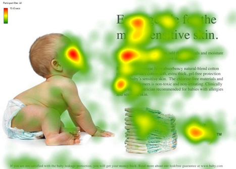
Confessions of A Director of Ecommerce 2. Gaze directly at a Call To Action - promotes clicks. 3. Gaze at other people in same picture - promotes connection.
We used #1 for pages with broad reach such as our homepage and category top-level pages. Websites communicate SO MUCH in covert ways. Balancing what you say with one image such as the people looking at each other with another image to promote engagement is the game you play, the inside baseball "secrets" that separate teams capable of making millions in profits online from those who won't and wonder why :).M

Robin Good's curator insight,
March 6, 2013 5:40 AM
If you want to learn how to use images effectively inside your website or blog here is a truly excellent guide by Chistian Vasile on 1WD. In the guide you will find rational and fact-supported advice on how to choose, place and test image use inside web-based content as well as lots of extremely relevant examples of effective image use online. From the original article: "...if you manage to find the right pictures and insert them in the right places, they can do wonders for you, as they did for some others." Well written. Informative. Resourceful. 8/10 Full guide: http://www.1stwebdesigner.com/design/images-on-web-design-usability-guide/ |


Top 10 Minus 2
This is an excellent post, but I removed two of the top 10 tips. I removed #4 Type because it isn't clear. Unique type in an image is fine since you know how it will render. Unique type in body text can be a disaster because you don't know how it will render.
The Internet is a billion computers all with different setups for type. When you render an exotic type in HTML text the receiving computer must have that same exotic type or it renders as a more common type (Arial, Veranda).
Let's call this "type roulette" and it is to be avoided. Exotic type in .JPGs or .PNGs or .GIFs (best format for type only images) render exactly as you see them. Type in body text is dependent on the receiving device so I tend to use non-serif universal type (easier to read non-serif type online).
There are ways to select how your type will render when it isn't available on the receiving computer, but I don't like the variability of playing font roulette. Type plays an important but floating point role in website design. I pick a type that will WORK, look pretty much the same on all receiving computers and be easy to read. Don't play font roulette.
I also removed #6 - Drop In Full Screen Photos
Yes this idea can be done well, but your designer better be VERY good. I prefer lots of white space on a website design. White space creates spacing and so highlights design elements NEXT to it. Strange to think of creating highlights by using negative space, but if you think of every great picture or painting you love there is always the use of negative space.
Warhol was famous for using BLACK to create his negative space. Great photographers such as Annie Leibovitz frame negative space in like huge arrows getting your eyes to go where they want them.
You may be the one in 100 designer who can use full screen photos and still create design tension and navigational hierarchy, but odds are better to say USE WHITE SPACE than full screen photos.