Must Design
75.6K views | +3 today
Follow
Must Design
Design Is Revolutionary
Your new post is loading...
Scooped by Martin (Marty) Smith
Scoop.it!

Content Marketing & Web Design Lessons from HBO's Westworld

Content Marketing & Web Design Lessons from HBO's Westworld | Must Design | Scoop.it

Web Design Lessons from Westworld

This Curagami post shares Five Content Marketing Lessons from HBO's Westworld such as:

  • Show Don't Tell
  • Tease Never Bore
  • Beauty is half the Battle
  • Believe and MOVE
  • Create Another Loop


http://www.curagami.com/content-marketing-five-lessons-from-hbo-westworld/ 

Lessons don't end there. HBO's Westworld uses design in ways web developers and designers should steal including: 

  • Design should speak to and deepen your story lines
  • There is not half measures in design, all in or nothing
  • Create space around your designs, don't overwhelm
  • A few little things done very well often work better than many things done poorly


Design & Web Stories

Websites must tell stories, stories consistent with and supporting brands represented. Look at the examples in our YouTube video (https://youtu.be/IC4KHAIZKWM ) and particularly REI.com for ways to blend your brand's message and site design. 

No Half Measures

You either believe in your designs, copy, website and brand or you don't. There are no half measures online. Half measures are like fear. Visitors can smell fear and know when they are being manipulated. Every webpage is s statement and you either believe in what you are doing or you don't. See the Red Bull example in the video for the impact BELIEF can have on marketing and movement creation. 

Space
Great Designs need SPACE to breathe. White space may be the most important part of web design few think about. In our rush to crowd everything in we violate HBO's brilliant use of space, time and an unhurried process. HBO isn't trying to overwhelm or flood us into submission.


HBO would rather create one incomplete thread after another and leave them and us hanging. Space is confidence. When you're confident in your product, brand or site you do what you believe and learn from every interaction. When you keep throwing things at customers hoping they will comply, they never do btw, your marketing looks chaotic and confusing. Confused customers do many things buying and advocating are rarely among them. 

Brilliant Little Things
Have you noticed how DARK the Westworld lab is? If you're wondering why Westworld's titles are so amazing look no further than the dark lab. Creating the CGI needed to have a cool lab is expensive. Better to create a great title sequence and leave the lab a little seedy and rundown since doing so saves money and helps the plot. 

Websites can't look "seedy" so much these days, but they can do a few things brilliantly and let the credit spread. When asked how teams I've managed made over $30M in online sales I often explain it was what we DIDN'T do that mattered most. 

The list of things we needed to do was always infinite, so we were strict in the very few things we did and could do. HBO proves the point. Spending millions on the lab would rob the show of it's seedy underbelly. Better to create a great title sequence with a few brilliant pieces like the robot dipper and the "world overview" than try and do it all. 

Find our Content Marketing tips from Westworld on Curagami:


No comment yet.
Scooped by Martin (Marty) Smith
Scoop.it!

SEO For Web Designers via @HaikuDeck

SEO For Web Designers via @HaikuDeck | Must Design | Scoop.it

Web Designer SEO
Our SEO Tips for Web Designers hit a nerve. It is heading to 13,000 views (probably today). We hit a nerve because web Designers are where SEO rubber meets the road. This Haiku Deck is full of SEO tips for web designer including:

* Know who has the banana and why.
* Know how much SEO you need to know.

* Learn what is MIST vs what is Gorilla.
* Listen Digitally.
* Understand how SEO & Content marketing work together.

* Design to Win Hearts, Minds and Loyalty. 

And More SEO tips designed for designers.  

No comment yet.
Scooped by Martin (Marty) Smith
Scoop.it!

J E N N Y O D E L L Cool Website via @RedBulletinUSA

J E N N Y O D E L L Cool Website via @RedBulletinUSA | Must Design | Scoop.it

Jenny Odell is a gifted artist, web designer, writer. The icon page in the Red Bulletin with a tiny name was intriguing enough to prompt a Google search. The Red Bull Bulletin is one of my favorite publications. 

The Bulletin is visually stunning but that's not all. The Odell page is a great example of the intelligent and very NOW sensibility Red Bull's Bulletin uses with such grace.

To intrigue, take advantage of how the world is not how it was and engage is so important in today's social / mobile / connected world. Red Bull's publication and core branding GETS IT.

The Jenny Odell page of tiny icons such as the Eiffel Tower, Spiral Jetty and squiggly lines requires WORK to see and decipher. Work to find out what the page is al about. Red Bull GETS that their customers are connected so they build in hooks to those capabilities.

Brilliant marketing I wrote about for Curatti in Red Bull's Branding Lessons: Why We Are All Media Companies Now:
http://curatti.com/red-bulls-branding-lesson-media-companies-now/ 

Jenny Odell's site
http://www.jennyodell.com/  

No comment yet.
Scooped by Martin (Marty) Smith
Scoop.it!

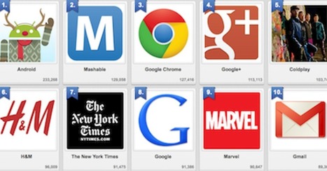
Designing For GooglePlus: Top 10 Brand Pages on Google+

Designing For GooglePlus: Top 10 Brand Pages on Google+ | Must Design | Scoop.it

We've had a HUGE Day over on GPlus today. I wrote a post about why G+ is magical thinking (https://plus.google.com/102639884404823294558/posts/F5fXyrkTPCr ) and my post got picked up by my friend Mark Traphagen (@MarkTraphagen) and it BLEW up into an amazing conversation.

Given the MONSTER day we've had I thought it would be a great idea to share some of the most successful G+ Brand pages. GPlus is a massive Blue Ocean for most.  Blue Oceans are where your content gets MORE traction with less work. Red Oceans are where your content requires more investment to generate LESS return.

GPlus is really a set of TOOLS. Incorporating Hangouts, maps, communities and other widget-like tools. The first website or agency to figure out how to combine those powerful tools in unique combinations is going to WIN big. Some of these examples approach the top of the mountain, but G+ has more power than even anyone here captures.

No comment yet.
Scooped by Martin (Marty) Smith
Scoop.it!

Scoop.it CEO's 12 Step Program To Know If You're Content Marketing Matters

Scoop.it CEO's 12 Step Program To Know If You're Content Marketing Matters | Must Design | Scoop.it

Content Marketing Is Key
Important post from Scoop.it CEO @Guillaume Decugis because the 12 step program he outlines clearly cleaves content marketing pros from everyone else. We share this post in our Design Revolution Scoop.it feed because we would add 2 more items to a solid list:

13. You aren't designing for content curation and content marketing. 14. You are building community in

Designing for content curation means incorporating the automated feeds Guilluame discusses and leaving room for community and collaboration.  

Community's pillars such as user profiles, timeliens, following, comments, wikis and blogging have to be fuilt into a design or you are talking to yourself about yourself even if you follow many of Guillaume edicts. Guillaume's 12 Step Progam: 


1. You’re not tracking your results.

2. You’re not repurposing your content.

3. You aren’t automating at least part of your social media activity.

4. You aren’t automating some of your email marketing.

5. You’re only sharing your own content – you’re not adding any content curation to the mix.

6. You aren’t testing.

7. You don’t have a content strategy that’s tied to business goals and your buyers’ journey.

8. You haven’t defined your buyers’ personas or their typical journey.

9. You aren’t creating content strategically.

10. You don’t have a centralized “vault” of all your company’s content assets.

11. You aren’t promoting your content, either via social sharing or by making it visible to the search engines.

12. You have nothing to show for your work.

No comment yet.
Scooped by Martin (Marty) Smith
Scoop.it!

5 Simple Rules To Know Your Site's Navigational Taxonomy via @Curagami

5 Simple Rules To Know Your Site's Navigational Taxonomy via @Curagami | Must Design | Scoop.it

Knowing your website's navigational taxonomy can mean the difference between millions in traffic and money. Here are 5 Simple Navigational Taxonomy Rules.

* It's About THEM not YOU.
* Create A Commons.
* It's FREE and EASY.

* Srart with Brands & Work OUT.

* Find Engagement & Work IN.

Easy to follow rules so your site's nav WINS traffic, hearts, minds, SEO and loyalty needed to be around for a bit.

No comment yet.
Scooped by Martin (Marty) Smith
Scoop.it!

17 Content Rich Sites for Web Design Inspiration

17 Content Rich Sites for Web Design Inspiration | Must Design | Scoop.it

We asked several developers what their favorite sources are for web design and code inspiration, and they pointed to these 17 wide-ranging sites.

Marty Note
I like several of these designs including Web Design Ledger and The Source for their creative balance between images, copy and headlines. There are so many things dancing on the head of a pin on any homepage such as:

* Your desire to SHARE everything.

* Their (visitor's) desire to find what they want.

* Navigation.
* Images.
* Headlines & Copy.

Getting all of these dancers to tell a coherent story in 9 seconds is the challenge. Usually as content being shared increases understand decreases. Several of these designs manage to present a lot of options intelligently.

Which one is your fav?

Martin (Marty) Smith's insight:

BTW, YES I am breaking a rule here and sharing content from a "Big Boy" blog (Mashable). Point I made about NOT curating content from the big boys anymore has exceptions.

Why I Stopped Curating Content From Big Blogs
http://sco.lt/6QV7ib


I used BuzzSumo to find this design post and it has been shared at a moderate level for Mashabale. Design in general is an exception. I don't care WHERE great design content exists I will curate it (lol).

In this case I put a different spin on the Mashable take. They looked at these 17 examples as "good web design". They are that, but they are also great examples of how content can dance with its "tease elements" such as headlines and images.

Design content has to be some of the most READ content on the web  and we learn first and foremost from pictures and, once our attention is fully gained, words.

This was an excellent post and it was 3 levels deep in Mashable now. If this content ever appeared on the "celebrity obsessed" homepage I noted yesterday it was below the fold and a short homepage stay (I'm betting).

This content fits into the "contrary" exception I discussed on G_. I'm riffing solid content in a way they didn't so who cares who created it there is VALUE to be added (i.e. something they didn't see, something important to my readers who try to create sites balanced between content and commerce daily). M

No comment yet.
Scooped by Martin (Marty) Smith
Scoop.it!

Why The Bauhaus Is Our House As Web Design Moves Into The Future

The Bauhaus ethic applied principles such as "honesty of construction", "truth to ma...

Martin (Marty) Smith's insight:

Great work by Simon Collision (@Colly). Picks up for me on slide 17.

1. Acknowledge the machine.

2. Standardize production.

3. Experiment and synthesize. 

4. Form follows function.

5. Economy and simplicity.

Those values drove designers at the Bauhaus to create a new approach. How will those values influence our web design going forward?

1. Honesty of construction truth to materials.

2. Develop systems.

3. Holistic web design approach (slide 32 what's golden important). .

4. Mass production and individual expression.

5. Adapt and respond to an evolving world.


Here are points I would make about how Bauhaus values will play an important role in what is next online:

* The machine is increasingly SOCIAL and MOBILE.

* Smart Phones & Apps gamify routine (boring) tasks.

* Holistic design will increasingly mean Mobile Fist design.

* We are all in the community building business (whether we know it or not) & community creates mass production OUT OF individual expression.
* Our adaptations will be social & mobile, gamified & curated.

No comment yet.