Must Design
75.6K views | +0 today
Follow
Must Design
Design Is Revolutionary
Your new post is loading...
Scooped by Martin (Marty) Smith
Scoop.it!

Best of Indian Web Design with Zomato.com A Clear Standout

Best of Indian Web Design with Zomato.com A Clear Standout | Must Design | Scoop.it


Indian web design is marked by innovation, clear Calls-To-Action and graceful use of current and future technology. "In India my generation," my friend Ravi told me the other day, "went right to mobile skipping laptops and desktops altogether".

I was looking at these sites with my laptop and expect they look great on smart phones too. Nothing like having must of your customers using mobile tech to make mobile first in both responsive templates and impressive data architecture (easy to see how these sites would accordion in mobile.

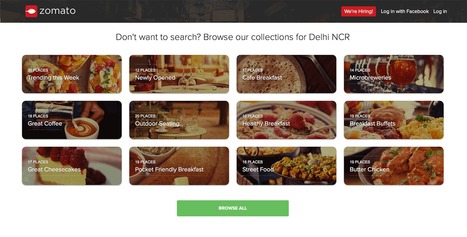
The foodie site Zomato.com lives up to its great name. The content, despite their not being "here" yet, is fresh, beautiful to look at and engaging. Zomato is about FOOD and, much like India herself, has few preconceived notions about what that means. .

Instead they curate with clear passion and grace. Every Indian site we studied had a clear sense of GET TO IT many American sites could learn from. Indian web designers know how to "tease", charm and win clicks by providing just the right information at the right time.

Many American designers seek to overwhelm and thus end up speaking to themselves about themselves. Better to box not look for the haymakers we seem to love so much here these great Indian web designed sites illustrate.

No comment yet.
Scooped by Martin (Marty) Smith
Scoop.it!

65 Best Responsive Web Designs 2014 via SocialDriver.com

65 Best Responsive Web Designs 2014 via SocialDriver.com | Must Design | Scoop.it

Responsive Web Designs
Responsive design, forming a website's information so it looks great on any device, is becoming mission critical. Here are 65 of the best responsive designs in 2014 via SocialDriver.com.

Martin (Marty) Smith's insight:

I like Salesforce and SquareSpace and was surprised I didn't hate the Microsoft design.

Helen Stark's curator insight, September 30, 2014 3:53 AM

Unusual and creative responsive designs that look great on a huge monitor and a tiny smartphone screen - that's great

Scooped by Martin (Marty) Smith
Scoop.it!

Your 2014 Website Can't Be Too RICH, THIN or FLAT - 40 Web Design Examples

Your 2014 Website Can't Be Too RICH, THIN or FLAT - 40 Web Design Examples | Must Design | Scoop.it
Flat web design has been a huge topic in the web, even Apple is adopting flat web design style and you need to make sure you upgrade your site too!
Martin (Marty) Smith's insight:

Why so FLAT?
Mobile is the single word answer to why most websites are flattening out their designs. As phones outnumber desktops one of the manifestations of "mobile first" is we are adopting designs that look better on our phones and pads - FLAT designs.

Amazing how quickly this worm turned, but you won't have trouble finding hundreds of examples of great flat website design like these 40. My favorite is http://madebyfibb.com/ for its cascading windows feel and images that engage and point at CTAs.

Marty

No comment yet.
Scooped by Martin (Marty) Smith
Scoop.it!

Hot, Flat, Colorful: 33 Examples of Ultra-Hot Flat Web Design Trend

Hot, Flat, Colorful: 33 Examples of Ultra-Hot Flat Web Design Trend | Must Design | Scoop.it
Currently, one of the biggest trends in the web design industry is the flat design style. In case you are not yet familiar with the term, flat design is essentially design without the drop shadows, gradients, and textures that have been common in web design for some time. Flat design uses solid colors and often typography figures prominently into the design. In this post we'll showcase 33 excellent examples of the flat web design trend. Hopefully they can provide some inspiration that can be put to use in your own work. Buffalo
Martin (Marty) Smith's insight:

Mobile is the secret driver of many of 2014's hottest web design trends. One of the hottest is flattening out web design. Small screens can't handle shading and three dimensionality as well as bigger screens, so flat is one of the HOTTEST web design trends as these 33 examples share. .

Alaina Duty's curator insight, September 25, 2015 1:45 PM

Here are some great examples of some bold, attention-grabbing color combinations incorporated in flat design.

Scooped by Martin (Marty) Smith
Scoop.it!

25 Examples of Flat Design Inspire | Vandelay Design

25 Examples of Flat Design Inspire | Vandelay Design | Must Design | Scoop.it

It almost seems that this year flat designs have taken over the world of graphic design by force, but especially in the arena of mobile apps with the first industry-shaking flat design being for the iPhone5. Reality is that flat design has been around longer than the emergence of the iPhone5, but of course it was Apple that helped to bring such cross-industry awareness to the design style. 

Martin (Marty) Smith's insight:

I was wrestling with why we are suddenly awash in "flat design". My first thought was flat design is more lean, easier to figure out where to go and what do do. Nope.

Flat design is upon us because of mobile as this excellent post and 25 examples shares flat transfers beautifully between desktop and mobile. Flat is the new black, so wear it well and find inspiration in these 25 examples.

No comment yet.
Scooped by Martin (Marty) Smith
Scoop.it!

60 Top Parallax Scrolling Examples Inspire

60 Top Parallax Scrolling Examples Inspire | Must Design | Scoop.it

Parallax scrolling is a popular design technique used on websites in order to create an illusion of movement on the screen, to help engage website visitors and move visitor yes where you want them AND parallax scrolling plays beautifully on mobile devices!.

Here are 60 examples of great parallax scrolling.

No comment yet.
Scooped by Martin (Marty) Smith
Scoop.it!

RETHINK Web Design: Unusual Web Navigations Inspire | AWWWARDS

RETHINK Web Design: Unusual Web Navigations Inspire | AWWWARDS | Must Design | Scoop.it
Beautiful Unusual Navigation Designs for Inspiration. Selection of Awwwards websites with a strong presence of unusual navigation. An effective navigation design is crucial for a website
Martin (Marty) Smith's insight:

Navigation feels old and moldy. There are few things MORE critical than navigation. We've moved from left nav sitting firmly in the "golden triangle" to horizontal top navigation.

Neither of these options inspire and both are feeling long in the tooth and stupid. The social / mobile web requires a RETHINK about navigation. Can we find ways to make very page a homepage?

Can navigation be more relevant and less middle of the road boring? Here are some navigation examples from AWWWARDS.com that don't solve the problem...yet. But the dialogue helps begin the process of reducing our dependency on static, boring, "has-been" ideas like left or horizontal nav.

Are you as surprised that navigation hasn't been on the "top changes" list for web design in 2014? Has to be on our 2015 list because every current option is BAD and getting worse.

BOUTELOUP Jean-Paul's curator insight, June 27, 2014 2:21 AM

Merci ! il est bon de repenser aussi le webdesign pour une nouvelle expérience utilisateur

Scooped by Martin (Marty) Smith
Scoop.it!

65 Responsive Website Design Examples of 2014 Inspire

65 Responsive Website Design Examples of 2014 Inspire | Must Design | Scoop.it
Martin (Marty) Smith's insight:

Love the breakout by category. Great examples in each category. My favs are:

ClearLeft.com and SalesForce.com

M

No comment yet.
Scooped by Martin (Marty) Smith
Scoop.it!

Four Days In Paris and 14 Other Flat Design Examples Inspire

Four Days In Paris and 14 Other Flat Design Examples Inspire | Must Design | Scoop.it
Martin (Marty) Smith's insight:

Flat design is amazing. Looks good on mobile, is clean and easy to understand and hard to create. Here are 23 great examples.

cees de roij's curator insight, April 7, 2014 9:31 AM

On this website you can learn a lot and that is very good.

RDV Weekly's curator insight, July 11, 2014 2:48 PM

To meet modern design demands, flat design must be mobile-functional, clean, and user friendly. Some examples here.

Scooped by Martin (Marty) Smith
Scoop.it!

70 Stunning Responsive Sites For Inspiration Before A Mobile Holiday

70 Stunning Responsive Sites For Inspiration Before A Mobile Holiday | Must Design | Scoop.it

This holiday season will be the Christmas of MOBILE devices. Here are some amazing examples of the art and science of responsive design.


Martin (Marty) Smith's insight:

This holiday selling season will be all about MOBILE. Responsive websites look great no matter what device is lookign at them. Here are 70 examples of how to do responsive web design right.

No comment yet.