Must Design
75.6K views | +0 today
Follow
Must Design
Design Is Revolutionary
Your new post is loading...
Rescooped by Martin (Marty) Smith from Learning Environment Modeling
Scoop.it!

What is Visual Language & How Comics Can Help Create It [graphic]

What is Visual Language & How Comics Can Help Create It [graphic] | Must Design | Scoop.it
Visual language Lab: Researching the structure and cognition of the visual language of comics

Marty
Visual Language Important For Internet Marketing
One undeniable trend is Lean Visual Marketing. We want videos and pictures and we want to understand complex ideas FAST. Scooplit is riding the crest of the lean visual marketing wave and exploding.

We know that there are some core ideas in this new "visual marketing revolution" including:

* Surprise helps but is had to create.
* Smashing expected visuals into unexpected can create surprise.
* Humor works.
* Arresting visuals only work once UNLESS aligned to their content.
* Without arresting visuals content marketing is doomed.
* The "visual language" of your marketing must be consistent with all other marketing or dissonance results.

I like the idea of studying comics to help achieve a sense of visual tone and for ways to connect images seamlessly with copy, tone ane theme.

Via Bucky Dodd
No comment yet.
Scooped by Martin (Marty) Smith
Scoop.it!

What Cloud Computing Means For Web Designers • Inspired Magazine

What Cloud Computing Means For Web Designers • Inspired Magazine | Must Design | Scoop.it
Cloud computing is one of the latest technologies that have come to change the way people interact with the web. Cloud computing accords you the chance to
Martin (Marty) Smith's insight:

Solid post by Inspired Magazine on what the cloud means for web design. I got a first hand lesson when we created http://www.curecancerstarter.org.

The sophisticated file management of cloud computing allows more file size without crushing network performance. This means we won't have to create "lowest common denominator" designs that bore everyone to tears but load fast anymore (or that is the theory :). M

No comment yet.
Suggested by SmilingAnny
Scoop.it!

7 Basics of Great Website Design Are NOT What You Think

7 Basics of Great Website Design Are NOT What You Think | Must Design | Scoop.it

The purpose of this post is not just to present the state of today's web design - it’s more pragmatic. Seven basic principles of a good web design are presented here.

Marty Note
This is a great post about what web design IS and IS NOT. I'm going to include my notes here so they follow the post since the writing, though brilliant, is not as direct as I like. Here are my much more direct interpretations of the 7 Basics of Great Website Design:


1. Website Design Can’t Win, But You Can Sure LOSE Due to It.
We've past the period when shinny websites work. Every website has seconds before a visitor clicks off to find what they are looking for on some other website.

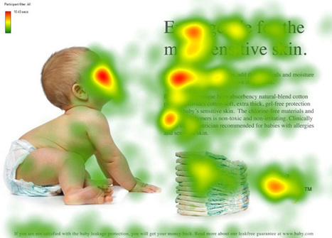
2. Create Website Surfaces For Scanners and Skimmers since Readers will work for what they want.
Key to know not all information is great for "scanning" and "skimming". Tease the click don't drown it is another way to think of this idea. Also, content such as news, Q&A and testimonials have more attention hooks than sharing complex or highly detailed material. If your website depends on sharing complex and highly detailed content tease it with snippets and with graphics firs.


Stay with simple, clean and useable as your guide.

3. Avoid NEW until it is UNDERSTOOD.
You don't have to wait until some new thing is old hat, but avoid using The New simply because it is new. New hurts conversion because it requires explanation and is hard to tease since visitors don't have "made to stick" context. If you must present "new" present with an "old" analogy.

Read Made To Stick by Heath brothers for more.


4. Confused customers do many things, BUYING and CONVERTING and never among them.

5. Hierarchy of information and navigation is LIFE online.
People know there is a YOU or a team behind your design. They want to know what YOU want them to DO and why they should do it with YOU. Sites that make the curator's hand visible via navigation, images and copy win. Those who challenge visitors to figure everything out for them selves lose.

This is NOT to say some mystery can't work in a web designer's favor, but make sure the mystery is immediately solved before posing another one. Daisy chain one mystery on another and visitors get frustrated and leave since benefit doesn't equal the work to realize it.

6. Colors can ruin a website.
Colors have so many overt and covert signals they should be used sparingly and consistently with the brand. If you use RED for a Zen website do so in accents and carefully since red is an ALERT color and so may be inconsistent with the brand.


7. Devil is in the web design details.
In my almost 15 years of experience NOTHING on this list is more true. Once you make a website simple and clean any small dissonance becomes LARGE because it sticks out like the proverbial "sore thumb". Make sure your site is a smooth surface with a clear message.


Martin (Marty) Smith's insight:

One of the best posts about website design I've read in a long time. So much of what WE think is "website design" either "was website design" or is more an expression of someone's ego than what is happening NOW. This post is one of the best "what is happening now" in website design articles I've read. M

No comment yet.
Scooped by Martin (Marty) Smith
Scoop.it!

Avoid These 8 Deadly Sins of Site Design | Infographic

Avoid These 8 Deadly Sins of Site Design | Infographic | Must Design | Scoop.it
Attracting a potential customer is hard enough. Grabbing their interest and retaining them is even more difficult. It's important to design your site
Martin (Marty) Smith's insight:

Of these 8 very deadly sins the most deadly in my experience is the first one. When customers don't know where you want them to go and what you want them to do or where they came from (within you site) they get confused. Confused customers do many things buying is never one of them.

Michael Allenberg's curator insight, November 13, 2013 7:36 PM

An info graphic about UX... WIN WIN!!!

Louise Robinson-Lay's curator insight, November 15, 2013 3:53 PM

More on great design for maximum impact. This time, websites.

Scooped by Martin (Marty) Smith
Scoop.it!

70 Stunning Responsive Sites For Inspiration Before A Mobile Holiday

70 Stunning Responsive Sites For Inspiration Before A Mobile Holiday | Must Design | Scoop.it

This holiday season will be the Christmas of MOBILE devices. Here are some amazing examples of the art and science of responsive design.


Martin (Marty) Smith's insight:

This holiday selling season will be all about MOBILE. Responsive websites look great no matter what device is lookign at them. Here are 70 examples of how to do responsive web design right.

No comment yet.
Scooped by Martin (Marty) Smith
Scoop.it!

5 Quick and Easy Holiday Website Design Tips

5 Quick and Easy Holiday Website Design Tips | Must Design | Scoop.it

How To Have A Happy Holidays
Easy to get caught up in holiday planning and forget some simple tips to maximize customer engagement and sales. Here are 5 Holiday Website Design Tips NOT to let fall through the cracks:

Holiday Website Design Tip #1: Relevant Images
Make sure your heroes (largest image on any webpage is a "hero") project holiday spirit. Snow if you sell snowboards is a good thing less so if you sell surfboards. Remember PEOPLE sell more effectively than things, so be sure your images communicate holiday spirit and include engaged people (try to avoid canned photographs if possible). 

Holiday Website Design Tip 2: People In Images
Using people in your hero images can be tricky. If people are talking amongst themselves in your images the feeling can be off-putting. Here are my favorite ways to use people in images during the holidays:

* Looking out at viewers (promotes engagement, welcoming).
* Looking directly at a Call-To-Action (CTA - increases conversion).

* One looking out on left of two or more talking together. 

* Baby looking at a CTA. 

Babies can be TOUGH. We all MUST look at babies but they can be distracting too, so I like to have them looking at something that matters. Why all of this attention to where model's eyes are looking? Viewers’ eyes follow the path of where your models look, so make sure they are looking where you want your customers' eyes to go. 

Holiday Website Design Tip #3: Less Copy
During the holidays we made a sale with only 1.1 visits (on average). During the summer it took just over 3 visits to make a sale. The holidays are about getting 'er done so cut your copy, lower the number of clicks (to links that have tested well) and rock images. 

Holiday Website Design Tip #4: Vox Populi, Vox Dei
The voice of the people is the voice of God during the holidays. Curate great ideas and comments from your social channels to make sure all customers have a chance to hear them and LISTEN more than you talk this holidays. If your social plan doesn't leave about a third of the time for RESPONSE it is wrong and you should change it. Social is about PRESENCE and you win by showing up, listening and responding. 

Build LISTENING into your website design with customer quotes, a "social corner" where you curate great riffs from your social channels, polls, surveys, contests and games. 

Holiday Website Design Tip #5: Integration
Create an "umbrella theme" this holiday and support your theme with consistent visuals across all channels. The more consistent, cool and fun your Internet marketing is this holidays the more shoppers you convert to buyers. 

Make sure your umbrella is good for 8 to 12 weeks, used in your mobile, email and social sites and when in doubt open YOUR marketing up to THEM (create ways for customers to use those ever present cameras and smart phones). 


nadiva olivier's curator insight, August 24, 2013 1:58 PM

Big advantagens come from hollidays websites. Try them.

Scooped by Martin (Marty) Smith
Scoop.it!

Design For Designers - Story of Cancer Foundation First Look & Website Design Tips

Design For Designers - Story of Cancer Foundation First Look & Website Design Tips | Must Design | Scoop.it
Story of Cancer Website First Look
Thought it would be interesting to share a very early design for Story of Cancer. I am NOT a graphic designer, but I…
Martin (Marty) Smith's insight:

The G+ post explains why I expose my amateur design skills to the pros (usually to a little condescension and derision :). I don't attach EGO to copy or website design anymore. EGO and GREAT aren't compatible when TEAM is required to do anything online.

This rough beta design for Story of Cancer Foundation is giving the great design team at WTE.net (my friends Eric and Cynthia Garrison) some ideas about what I'm thinkng. I "design for designers" because doing so makes sure my vision is in there (somewhat) and the process is FASTER.

Huge shout out to @HaikuDeck again (just wrote about why it ROCKS the other day on ScentTrail http://bit.ly/14xEvW1 and using it today to find royalty free images (really royalty free not the bait and switch most boards play) saved HOURS of image searching. THANK YOU HK.

We are going to have to ROCK and ROLL to get everything done by October, so "designing for designers" helps save time and they will be comfortable letting me handle filling in their designs if they see I can manipulate images and understand some design basics (and we all should).

You may think, "Wow this design sucks," and it may (only actual use can determine if a design is working or not), but its is FAST and EASY and it will help get the feedback needed to become great. Can't make money now (locked up in my head lol).


Be sure to share your ideas, thoughts, comments and we hope you will join and support Story of Cancer and the Tech Cures Cancer movement. Together we cure cancer in OUR lifetime (and remember I already have cancer so needs to be SOON please :). M

Link to the tips on G+
https://plus.google.com/u/0/102639884404823294558/posts/8KTyg2GwAbA


No comment yet.
Scooped by Martin (Marty) Smith
Scoop.it!

5 Common SEO Design Mistakes

5 Common SEO Design Mistakes | Must Design | Scoop.it
Martin (Marty) Smith's insight:

Website Design SEO Mistakes
It is easy to make unintended SEO mistakes during the design phase. Here are 5 common SEO mistakes to avoid during the design phase of your website.

5 Common SEO Mistakes During Design
1. Junk (JavaScript or too much code) In The Head.

2. Not using HTML5 or CSS3.

3. Tables not CSS.

4. Code doesn't W3C validate.

5. Not responsive & No Social Shares. 


Design is NOT a neutral act. Choices are being made daily that can and will impact a search engine spider's ability to understand how to categorize your information,

In a recent post about how Internet marketing isn't what you think it is (http://www.atlanticbt.com/blog/why-internet-marketing-isnt-what-you-think-it-is/) I discussed the importance of the "backend" or the behind the curtain elements that play such a major role in your website's success or failure.

The best designers understand that creating elegant beautiful pictures is only half the battle. If those pictures obstruct, delay or otherwise confuse search engine spiders all the good the design does with people can be undone.

Undone because if no one SEES your design its elegance can't be appreciated. This is why designers must understand basic SEO concepts such as keyword density and code efficiency.

As an Ecommerce Directors I encouraged our designer to use keywords in all things including file-naming conventions. Many designers will call files image3 or something equally nondescript. The file name may or may not play a role in SEO, but the discipline of using keywords is important.

It was rumored Steve Jobs wanted even the parts of his products that couldn't be seen looked great. Same concept here with file names. Naming image files with business intelligence makes it easier for those who follow behind AND the discipline reinforces the designer’s important role in SEO.


Avoid these common design SEO mistakes and your website will perform better.

No comment yet.
Scooped by Martin (Marty) Smith
Scoop.it!

#StealThis: 14 Essential Magazines for Graphic Designers Inspire

#StealThis: 14 Essential Magazines for Graphic Designers Inspire | Must Design | Scoop.it
In spite of the tremendous expansion of the Internet, the power of the printed word remains strong and popular. Print media is where it all began and today w
Martin (Marty) Smith's insight:

I've always used magazines for quick hits, for ways to shake up my visual thinking. How, Print and Communication Arts are design magazines I've used. Some of the magazines (now websites) on this list are new to me.

Good rule of thumb is consistently look at OPD (Other People's Designs) because yours get better and you find ideas you couldn’t have thought of any other way.

No comment yet.
Scooped by Martin (Marty) Smith
Scoop.it!

2013 Color Trends In Web Design

2013 Color Trends In Web Design | Must Design | Scoop.it
Just like every other element of web design, color palettes follow fads that are constantly evolving. This year’s color trends are as diverse as they are
Martin (Marty) Smith's insight:

Great summary of evolving "color" best practices in web design.

No comment yet.
Scooped by Martin (Marty) Smith
Scoop.it!

Great Design Q&A with Allen Wyke - Ripple Group Founder

Great Design Q&A with Allen Wyke - Ripple Group Founder | Must Design | Scoop.it
Allen Wyke is a digital media and technology consultant and the founder of Ripple Group.   He has over 15 years of direct operational experience in digital media, online advertising, software and e...
Martin (Marty) Smith's insight:

Design & Business Q&A
Love these excellent design tips via @Alignsales interview with 

Allen Wyke such as:

* Listen and learn first, design and sell second.

* Product Managers = center of any company's ecosystem.

* Agile Marketing cool idea, hard to execute in reality.

* How create great design? Hire great designers.


Fantastic interview with a down to earth visionary.  

No comment yet.
Scooped by Martin (Marty) Smith
Scoop.it!

Dr. Dre's Web Design Tips

Dr. Dre's Web Design Tips | Must Design | Scoop.it

Beats By Dre Web Design Lessons
A friend shared the impressive NEWSJACK Dr. Dre and his Internet markeing team pulled off last week. Beats By Dre (http://www.beatsbydre.com ) has some cool web design tricks to steal too such as:

* Consistent images across channels (the Richard Sherman image rode the crest of the wave created by his "controversial" statements after last Sunday's game).
* HUGE RED BUY NOW Call To Action on the home page.
* Hero moves but does so SLOWLY so it isn't jarring.
* They've programmed their Richard Sherman page so his picture matches to every style, something I bet the site does for all celebrity endorsements (cool and NEW).
* Their social buttons are a little low for my taste, but they are well labeled as the "Beats Army" and every major social net is there and they are robust and fresh on all social nets.
* I like how they handle the colors too via the small swatches.

All in all a great ecommerce site in support of one of the best NEWSJACKS I've seen (see my notes on Dr. Dre's multi-channel attack of the web here:   http://sco.lt/8bJiDJ

No comment yet.
Scooped by Martin (Marty) Smith
Scoop.it!

Seth Godin on Art, Making a Difference, Settling for Less - HOW Design

Seth Godin on Art, Making a Difference, Settling for Less - HOW Design | Must Design | Scoop.it
HOW Design Live 2014 speaker Seth Godin writes in "The Icarus Deception" that creativity, seeing connections between disconnected things and recognizing novelty are keys to success in the new economy.
Martin (Marty) Smith's insight:

How Design's take on Seth's latest book, Icarus Deception, is fascinating and focused on the creatives they serve. 

No comment yet.
Scooped by Martin (Marty) Smith
Scoop.it!

Why "Apple Design" Works and 60 Apple Inspired Websites

Why "Apple Design" Works and 60 Apple Inspired Websites | Must Design | Scoop.it

Apple's clear navigation, romantic heroes (largest images on the page) and easy to understand information heirarchy (based on a grid) are design tactics any website should steal as this excellent post about websites who've stolen direclty from Apple's design shares.

No comment yet.
Scooped by Martin (Marty) Smith
Scoop.it!

Build Great SEO Friendly Mobile Websites

Build Great SEO Friendly Mobile Websites | Must Design | Scoop.it
15% of internet usage is done on a mobile device, and that's expected to climb to 20% by the end of 2013. Review the facts to build the best mobile site you can, whether it's a separate mobile site, a responsive site, or a combination of the two.
Martin (Marty) Smith's insight:

Great SEO Moz tips here about a tricky subject - how to build SEO friendly mobile websites.

No comment yet.
Scooped by Martin (Marty) Smith
Scoop.it!

10 Best Food Packaging Designs - A #StealThis

10 Best Food Packaging Designs - A #StealThis | Must Design | Scoop.it
Looking for inspiration for your food packaging design project? We've scouted 10 top food package designs to get your creativity going.
Martin (Marty) Smith's insight:

Food packaging is TOUGH. Little room and three dimensions means creating great food packaging is a bear. Here are 10 examples of great food packaging with #StealThis ideas for websiite design including:

* Present the essence of the brand (see the chocolate).
* Keep it simple.
* Pictures beat words (most of the time).

* Words can be pictures (some of the time).
* Find colors that look like what you are packaging (selling).

Great lessons for any designer. 

No comment yet.
Scooped by Martin (Marty) Smith
Scoop.it!

5 Jazz Influenced Website Designs

5 Jazz Influenced Website Designs | Must Design | Scoop.it

5 Cool Jazz Website Designs


Hero Roll Static Text

http://www.jetztzeitclub.de/


Love this idea of rolling the hero image while keeping a single textural idea. The impact is to EPHASIZE the text while allowing the visual field to create interest and calm. The problem with heroes that roll and bring new messages is the website can become ADD. You never know where or what to look at. Here the roll reinforces a single message. Cool. 


Color & Texture Shock 

http://www.austynweiner.com/


Same image shift with single text here but an explosion of color and texture. This is an example of going to an extreme to create a sense of visual shock. The only liability with this technique is showing your visitors where to go next FAST since the shock needs to work FOR not AGAINST you. 


Hero with Insert

http://thecarcrush.com/blog/2013/8/y3uaah5ojl6zi4iia95h10iircb8o0


Love the lush images with inserts here. The cars are seductive and romantic, but the insert allows the text and descriptions to add instead of distract from the hero images. 


 Magazine Like

http://boompa.ca/


This waterfall, the infinite scroll, magazine shows how you can build a visual and copy story with large hero images water falling on top of one another. There is real visual organization here. Very cool. 

 
Radically Simple Ecom 

http://www.lushtype.com/


Love tis ide of radical simplicity in ecommerce. Big icons sell icons. By selling one thing the page is easy to understand, easy to buy yet very cool and engaging too. 


No comment yet.
Scooped by Martin (Marty) Smith
Scoop.it!

Future of Web Design 3: Semantic Web Is A Game

Future of Web Design 3: Semantic Web Is A Game | Must Design | Scoop.it

Future Of Web Design In 3 Parts
What does the future of web design look like? So much is up in the air this Haiku Deck is my third and the topic is far from exhausted:

Future of Web Design 1: Web design in a SoLoMo world.

http://sco.lt/61eqNF 

Future of Web Design 2: Web  design when THEY and US &  OUT THERE and IN HERE are the same. 
http://sco.lt/7r6zkf 

Future of Web Design 3: How does a semantic and mobile web change design, marketing and sales. 

What happens when TIME becomes a perpetual now, sales happens in real time and marketing is about curation? Web design as we've known it is about to change as much as something can change. 

Why? I scratched the surface of why in How Entropy Is Creating Web 3.0 Right Under Our Noses:
http://scenttrail.blogspot.com/2012/11/how-entropy-is-creating-web-30-right.html  

Bottom line is everything is changing FAST so rewards go to the quick and flexible. If you have the courage to throw out almost everything you believe about everything once again you may just WIN BIG.  


No comment yet.
Scooped by Martin (Marty) Smith
Scoop.it!

Museum Websites Inspire Great Design Ideas: Top 10 Art Museum Sites

Museum Websites Inspire Great Design Ideas: Top 10 Art Museum Sites | Must Design | Scoop.it
Could redesigned Web sites be the starchitecture for museums? We pick our favorite museum Web site designs, including the Whitney's kids-only digital playground.
Martin (Marty) Smith's insight:

Steal From These Top 10 Art Museum Websites
FoundObjects.com, now RIP sadly, sold cool gifts to museum stores. Even after leaving the specialty gift business for the B2B web dev agency biz I still use several of the sources I found back then including art museum websites.

This post highlights ten of the best art museum website designs. I agree with most of them especially the Walker in Minneapolis. They rock. When in doubt visit an art museum website such as these ten and #STEALTHIS.

No comment yet.
Scooped by Martin (Marty) Smith
Scoop.it!

Old School vs. New School: Teaching Design

Old School vs. New School: Teaching Design | Must Design | Scoop.it
In an effort to pull students away from the confines of a screen, they were tasked to design a poster by hand (using hand lettering) and also by computer.
Martin (Marty) Smith's insight:

Closing The Computer
Design is about LIFE, LOVE and PASSION. Online and computers are part of our lives, but only part. This fascinating throw back exercise, design by hand, forces students to THINK in an old way, a good way (at least as long as the computer is still available :).

No comment yet.
Scooped by Martin (Marty) Smith
Scoop.it!

8 UI, UX Tips For Amazing Software or Website Development

8 UI, UX Tips For Amazing Software or Website Development | Must Design | Scoop.it
UI & UX are key factors that influence on user behavior. UI & UX solutions can lead to a successful tandem between software development and end-usage experience.
Martin (Marty) Smith's insight:

Design Tips
These tips rock. Very specific and several are new to me. For example, despite my Director of Ecommerce roots I did not know that 40% of purchases on an ecommerce website are impulse buys. These tips help you maximize the impulse and convert visitors to buyers and advocates.

No comment yet.
Rescooped by Martin (Marty) Smith from AtDotCom Social media
Scoop.it!

Want To Make MILLIONS Online? Use Images Like This In Your Website Designs

Want To Make MILLIONS Online? Use Images Like This In Your Website Designs | Must Design | Scoop.it
They say a picture is worth a thousand words. True or not, images are an important part of any website we create. Since it is so easy to embed an image in a website (even the process of creating your

Via Robin Good, John van den Brink
Martin (Marty) Smith's insight:

Confessions of A Director of Ecommerce
I've spent the last few years trying to share as many "secrets" as I learned as a Director of Ecommerce. I don't run an ecommerce website anymore so can afford to be generous (lol). 

One of my pet peeves was directing the eye sight line of people in our images. I wanted the eyes pointed at something that mattered. People follow the eye line of those they are looking at. We had three tactics:

1. Gaze straight at visitor - promotes engagement.

2. Gaze directly at a Call To Action - promotes clicks.

3. Gaze at other people in same picture - promotes connection.


 We used #1 for pages with broad reach such as our homepage and category top-level pages. 

We used #2 in 4Q on the home page and bending the sight lines of any people in images on a product page works well (our product pages tended to make the PRODUCTS the heroes so few people). 

We used #3 when connection was one of the benefits of a product. If you sell wine, travel or family cars you may want to have pictures of people looking at each other. I would never ONLY have this picture on a webpage since it can make the viewer feel left out. 

The natural companion to the "connection" picture is a picture of a single person gazing out at the viewer. This says, "Yes, we see you, value your visit and want to be friends". 


Websites communicate SO MUCH in covert ways. Balancing what you say with one image such as the people looking at each other with another image to promote engagement is the game you play, the inside baseball "secrets" that separate teams capable of making millions in profits online from those who won't and wonder why :).M 


Robin Good's curator insight, March 6, 2013 5:40 AM


If you want to learn how to use images effectively inside your website or blog here is a truly excellent guide by Chistian Vasile on 1WD.


In the guide you will find rational and fact-supported advice on how to choose, place and test image use inside web-based content as well as lots of extremely relevant examples of effective image use online.


From the original article: "...if you manage to find the right pictures and insert them in the right places, they can do wonders for you, as they did for some others."


Well written. Informative. Resourceful. 8/10


Full guide: http://www.1stwebdesigner.com/design/images-on-web-design-usability-guide/


Peter Zalman's curator insight, March 10, 2013 8:06 AM

#cro