 Your new post is loading...
If you were to ask me what’s the best way to showcase your creativity, then I would definitely say that it is in designing a website.
Marty Note
I love the "behind the scenes" honesty and accuracy of this Smashing Magazine post. Smashing Magazine is a trusted source for me and this post is true to my experience of creating hundreds of websites and helping Curagami.com clients to create thousands more.
The article I was looking for was how to design for constant change, for the smaller iterations we take now. If you now of a post like that please share. If I can't find it after more searching I will just write it since it feels like content marketing and web design have changed.
Content marketing is about QDF now (discussed recently here: http://www.curagami.com/featured/how-quality-deserves-freshness-changes-content-marketing/
If you have insight or resources that help explain how to design a web environment for maximum flexibility and an ease with the constant change we labor within these days please share. Thanks, Marty
Unknown Spring In March 2011 Jake Price, a freelance producer for the BBC, journeyed to Tohoku, Japan to document the devastation left in the wake of the Pacific tsunami.
The result of his trip is evident in his powerful and beautiful immersive web documentary, "Unknown Spring," which was awarded the World Press Photo Multimedia Awards...'
Via siobhan-o-flynn
Riffing Ascent Internet (Marty Note)
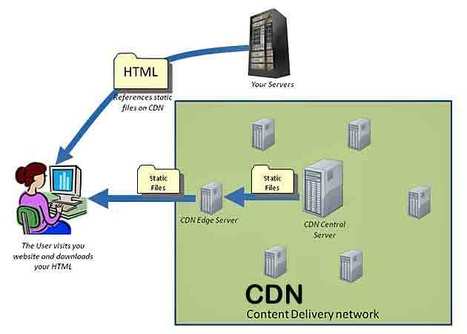
Jason Nelson from Ascent Internet just helped with a great guest blog post for Curagami about why "free websites" aren't so free (goes live tomorrow). Today I noticed he was sharing information about Content Delivery Networks, CDNs. I shared my experience with loading Akamai on the site my team and I managed back in the day.
CDNs are great, but there are issue you need to know about I share in the G+ post that riffed on Jason's original. I'm including this post in Web Design Revolution because its VERY important for graphic designers to understand CDN basics and potential issues.
The issues are confusing enough you can run around for a long time not realizing its your CDN installation causing that "page not found" problem. Great share by Jason and Ascent Internet and don't be so scared by my post you DON'T use an important tool in a social / mobile / connected time.
My note about CDN's & Ascent Internet's Share Is Here
https://plus.google.com/102639884404823294558/posts/ioYuNU7VJSL
PicassoHead App
Sharing this cool "draw a "Picasso Head" app (my PicassoHead http://www.picassohead.com/?id=5290a28#.VBCfth1bqjo.twitter ) to illustrate a few of our favorite web design concepts such as:
* DO LESS and let them DO MORE (them = customers, visitors, advocates_.
* GALLERIES ROCK - especially when your gallery is chock a block full of User Generated Content (UGC).
* Engagement Rocks - do you have a tool that is fun to use AND promotes positive site heuristics such as time on site, pages viewed, lower bounce?
* Every product, idea or website starts about the creators and must become about those who visit and love it.
* People love what THEY create and contribute more than what you do.
* This means all web design is or will be about collaboration.
We love the simplicity of this little app, but the even COOLER riff came from our confirming email. This is the email that shares the link where my Picasso At The Beach drawing lives (linked from this post http://www.picassohead.com/?id=5290a28#.VBCSuy4Lksk.twitter ) and where this little pitch lived:
"This summer check out Picasso Looks at Degas at the Clark in Williamstown, MA. You won’t want to miss this groundbreaking, Clark-exclusive exhibition that is the first to look at Pablo Picasso’s deep fascination with Edgar Degas.
http://www.clarkart.edu/exhibitions/picasso-degas/ "
Wow, cool idea. Create a little art based app and sell related links in the confirmation email. That's brilliant marketing, subtle marketing and the art of web design. Kudos to Picassohead creators RFI Studios, http://www.rfistudios.com. #toogood
Designing Tomorrow's Ecommerce
I'm writing a blog post for Curatti that will go live at midnight tonight that discusses the "best practices" of "Tomorrow's Ecommerce". I'm also writing a Curagami blog post (also published at midnight) about how social shopping will change Tomorrow's Ecommerce.
Tomorrow's Ecom Current Best Practices (Curatti tonight)
Tomorrow's Ecom Social & Mobile Web (on Curagami now)
The Haiku Deck that bridges both of these posts is linked above and here:
http://shar.es/1nkJef
As we publish each post we will link them here.
Designing G+ In
Crazy to suggest using G+ as a tool to power your online marketing right? Maybe not. Greatest return always comes from the least understood ideas. GooglePlus is a "least understood" idea these days.
Their leader left and TechCrunch said G+ the social net is dead. They may be right, but that is beside the point. G+ has always been more than a social net. G+ is a suite of tools marketers can use to find blue oceans.
Blue oceans are the as yet unspoiled places where marketers can still swim without fear of a herd of sharks. Oceans where sharks eat themselves are "red oceans" such as Facebook.
We suggest designing G+ into your marketing and site. Hold weekly hangouts, you don't need a G+ profile to use hangouts now, and created a branded community if only so you rule your name in #seo. Finally we suggest curating the great comments you will receive on G+ as a source of future content.
We've never been able to figure out how to use circles in a unique way, but they too beckon with possibility. By creating weekly content based on Hangouts and Community you get lots of GoogleJuice, the least expensive #videomarketing we know about and great community development tools that cost you NOTHING.
The linked post discusses Mark Traphagen's call to use G+ as a hub of your marketing. That's a great call since the price is RIGHT (free though you may spend some making G+ play the way you want it in your design). Designing G+ tools INTO your community creates the cheapest, biggest and best online win we can think of.
So the death of G+ is greatly exaggerated and, if you are smart, you will find a way to design the tool's many possibilities into your marketing.
Pageless design frees websites from the outdated conventions of print design and fully utilizes the digital platform they’re built on.
8 Compelling Reasons Why "Pageless' Web Design Wins (in the end):
* Tells a better story. * Easier to "digest" or understand what to do. * Emotionally more powerful. * Higher Conversion Rates!!!
* Makes updating faster & easier. * Lowers BOUNCE & encourages sharing. * Looks great on all devices (mobile included). * Lower cost to develop.
Marty Note
I confess to not being in love with the "infinite scroll" just yet. One modification we worked out for @Curagami, our Startup Factory funded startup, is to include a Call-To-Action at the top & Bottom.
CTAs help prepare the scroll. Remember "open book" tests? Putting a CTA on top of a waterfall of content helps prep a visitors mind. It "opens the book" for them. With this many impressive benefits I'm going to have to figure out how to start loving "pageless" design (lol).
I bet there are 5 (or so) similar modifications we can make to help us know how to create the paths and conversion we want by going "pageless".
Here’s a fun fact: Over the last 10 years, our attention spans have decreased from 12 minutes to 5 minutes. Our ability (and our desire) to read lots of c
The Bauhaus ethic applied principles such as "honesty of construction", "truth to ma...
There are many of content heavy websites out there, but very few seem to take good design into account. We take a look at those that do.
Marty Note
Content can KILL a website design. Content needs to be well thought out. How can you tease the click without frustrating your visitors and readers? How can you share all the content you need to share without wrecking your design? Here are 25 examples of how to use content as a helpful design element instead of ending up on content's rocky shores.
I’ve compiled a list of websites that produce great content, each of which has its own unique qualities. I’ll break them down and explain why they’re good and what you can take away.
KISSMetrics Misses The Mark 2 out of 3
I was looking for a great content/design mix and KISSmetrics got it right one out of the three times here. CopyBlogger is the only site in this group that both has great content and a great design.
The other two blogs may have great content, but their design is so off putting who is going to wade through their content? What makes Copyblogger work well?
* Snowfall design (long page scrolls down).
* Clear and LARGE Call-to-Actions (bet they've tested those big green buttons).
* Good use of icons that mask ads (very non-disruptive).
* Flat responsive design (probably looks great on mobile too). * Big headline with interesting sophisticated font treatment. * Video on homepage.
Ignore the other two suggestions here and focus on Copyblogger. Do you know a great content website? We are looking for great examples of DESIGN in content marketing. Share your favs and we will curate in.
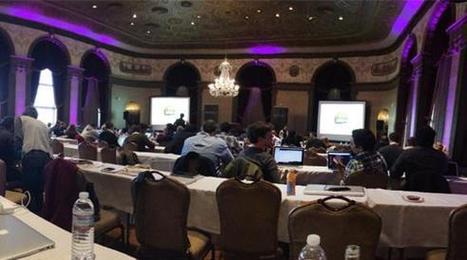
Last week, Jeremy Osborn, Academic Director for Aquent Gymnasium, had the chance to attend the Artifact Conference. Here are his key takeaways.
Marty Note
This Artifact Conference looks interesting and worth checkout out (http://artifactconf.com/ ). I love this quote from the Responsive panel at the conference in Providence, RI:
"On the other hand, responsive design is forcing companies to prioritize site performance. The consensus is that slow-loading and bloated sites are just as much of a “design” flaw as confusing layout, clashing colors, and the rampant proliferation of typefaces on page. "
Most designers focus on how to accordion a website so it looks good on any device. The real challenge is deeper. How do we architect "less bloat"? How do we design information to be lean and responsive?
Couple of things I've noticed include:
* Building stories via visuals and rich snippets.
* Taking advantage of the swipe and spin options on mobile devices.
* Creating easier to understand backend functionality.
* Using a LEAN or MEAN filter forcing messaging to get to the point FAST.
The SEO and engagement benefits of the second half of responsive design - the information architecture half - are enormous. We know that as engagement goes up so do our site's heuristics and the "new Google" loves more time on site, lower bounce rates and other "engagement metrics".
The "Responsive Challenge" for designers is to realize more is involved than look and feel. The very core of our communication must be reviewed, reevaluated and changed to be leander and more responsive too or we design dissonance in. Confused customers do many things converting is never one of them.
|
Best In Class From Conversion IQ
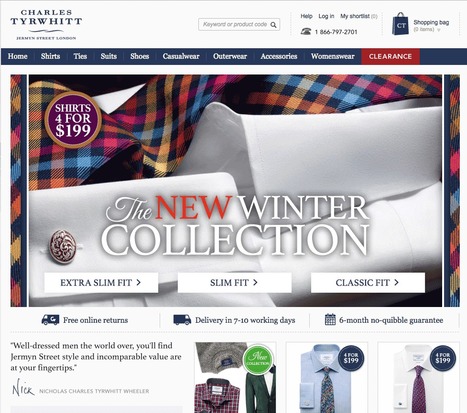
The other day I complained about "pretty picture' ecommerce sites that make conversion harder. So much of ecom is ditch digging. Ditch digging to make sure you have things such as:
* Email subscription form (prefer presence to popunders).
* Clearly ECOM - looks like a store with things to sell not content to read.
* Social (easy to find theirs and easy to contribute).
* Content Curation from social / comments / reviews (should feel like a party with people who share love / interests). * Offers, deadlines and a sense of time (of the year today is Columbus Day for example).
These examples from Conversion IQ are closer to "ditch digging" ecommerce websites. Conversion either BUYING or into a list are easier, more clear and so these designs make more money than the pretty picture websites I shared last (http://sco.lt/4ijZIH ),
Jenny Odell is a gifted artist, web designer, writer. The icon page in the Red Bulletin with a tiny name was intriguing enough to prompt a Google search. The Red Bull Bulletin is one of my favorite publications.
The Bulletin is visually stunning but that's not all. The Odell page is a great example of the intelligent and very NOW sensibility Red Bull's Bulletin uses with such grace.
To intrigue, take advantage of how the world is not how it was and engage is so important in today's social / mobile / connected world. Red Bull's publication and core branding GETS IT.
The Jenny Odell page of tiny icons such as the Eiffel Tower, Spiral Jetty and squiggly lines requires WORK to see and decipher. Work to find out what the page is al about. Red Bull GETS that their customers are connected so they build in hooks to those capabilities.
Brilliant marketing I wrote about for Curatti in Red Bull's Branding Lessons: Why We Are All Media Companies Now:
http://curatti.com/red-bulls-branding-lesson-media-companies-now/
Jenny Odell's site
http://www.jennyodell.com/
We asked several developers what their favorite sources are for web design and code inspiration, and they pointed to these 17 wide-ranging sites.
Marty Note
I like several of these designs including Web Design Ledger and The Source for their creative balance between images, copy and headlines. There are so many things dancing on the head of a pin on any homepage such as:
* Your desire to SHARE everything. * Their (visitor's) desire to find what they want. * Navigation.
* Images.
* Headlines & Copy.
Getting all of these dancers to tell a coherent story in 9 seconds is the challenge. Usually as content being shared increases understand decreases. Several of these designs manage to present a lot of options intelligently.
Which one is your fav?
How strong is your content marketing strategy? What is SEO, anyway? Read 6 SEO tips and tricks to help you boost the visibility of your web content.
1. Strong Copy Trumps SEO.
2. Do Keyword Research.
3. Share Link Love (i.e. create great content).
Marty Note
Interesting to see how How Design explains SEO to graphic designers. I would take a slightly different tack. Let's reframe SEO in ways graphic designers can understand and adapt.
I create content daily and am learning SLOWLY how to make headlines sing and links flow in. As competition for links goes UP with the rising tide of content publishers are the right side of the bell curve where more than average links reside will learn a few tricks from graphic designers such as:
* ARRESTING Images.
* Demand hierarchy.
* Clear Calls To Action (CTAs).
* Headlines that GRAB and HOLD.
Content that doesn't get read doesn't help. The first rule of getting your content read is find an ARRESTING related image you won't get sued to use. Haiku Deck (http://www.haikudeck.com) is one of my favorite visual marketing tools. Need lawsuit free arresting images? Use Haiku Deck.
Demand Hierarchy is keeping demands on your visitors LOW. When I was a Director of Ecommerce we did extensive analysis of our 40+ homepage links and 5 mattered. Vicious 90%/10% rule in links. Key is to lower choice and eliminate the superfluous.
CTAs don't have to be "buy now" anymore. We love asking a question with the link between the present page and the answer. Want To Be A Great Internet Marketer? Highlight and underline that sentence and it will get clicked because it is an IMPLIED CTA.
This doesn't mean we are above a good "Learn More", but too many "old style" CTAs can get boring and lose their punch.
Finally your HEADLINE or subheads matter. Headlines should set a hook. Subheads should organize the answer so readers can scan and skip sections. I try to live by the 7 word rule.
I read this rule about roadside billboards. Billboard creators limit their copy to 7 words because who can read more zipping buy at 60 mph. We all zip by at 100 mph on the web these days so short, punchy headlines that align with your arresting image and plant a hook work best.
We like KEYWORDS, Brands and questions in headlines too. Questions create curiosity. Keywords create scenttrail and brands create comfort and "like me" feelings of trust and security.
Toward A New Ecommerce
The new #ecommerce is beginning to emerge. Curagami, our Durham, NC based startup, is working hard to create new community, merchandising and social media tools to bridge the gap between content and commerce.
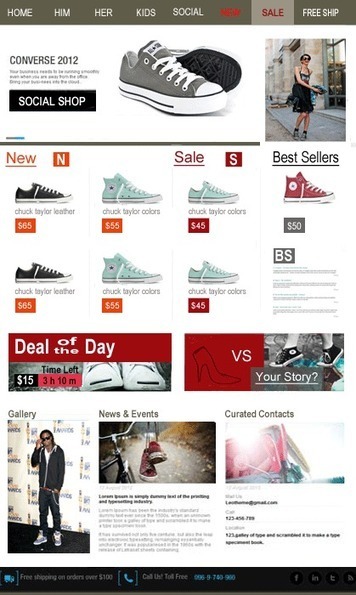
This post outlines things every commerce site needs to show quickly such as:
* Is this site SHOPPING or INFORMATION (getting harder and harder to know this right off so want to make SHOPPING obvious).
* Where's my easy to get free shipping?
* Quickly find expected merchandising such as NEW, SALE and BEST SELLERS.
* Are they (the website) open to MY (customer) input (one reason why the sneakers vs. high heels image asks for a story share).
Explain how I used the 8 tips I learned from Vogue (http://shar.es/1nlE2l on http://www.haikudeck.com). Things like the surprise juxtaposition of a women in chuck taylors and picking a fight to support #movementmarkeing are right out of the Vogue playbook.
As always feel free to jump in. Sure we will have a great running conversation on G+: https://plus.google.com/102639884404823294558/posts/fnFpMLkss4k
Depending on your brand and message some can be very professional and straight to the point, and others a bit more relaxed and playful. Here is a collection of taglines and intro messages from freelance designers and design agencies around the world for your inspiration.
Seasonality creates relevance & relevance creates community. Every website's hero should change at least 4x a year: Summer, Fall, Winter & Spring.
"I spent a lifetime learning to draw like a child." Picasso
This is an interesting post from Thomas King about the complex nature of simplicity. Picasso's point about spending a lifetime learning to draw like a child seems important for web designers too.
The hardest thing to do is do less. The hardest mind to recover is the exploratory mind, the mind before judgement. When we recover the playful mind, the simple easily rewarding routine of play, our designs run free like Picasso's bull.
We've had a HUGE Day over on GPlus today. I wrote a post about why G+ is magical thinking (https://plus.google.com/102639884404823294558/posts/F5fXyrkTPCr ) and my post got picked up by my friend Mark Traphagen (@MarkTraphagen) and it BLEW up into an amazing conversation.
Given the MONSTER day we've had I thought it would be a great idea to share some of the most successful G+ Brand pages. GPlus is a massive Blue Ocean for most. Blue Oceans are where your content gets MORE traction with less work. Red Oceans are where your content requires more investment to generate LESS return.
GPlus is really a set of TOOLS. Incorporating Hangouts, maps, communities and other widget-like tools. The first website or agency to figure out how to combine those powerful tools in unique combinations is going to WIN big. Some of these examples approach the top of the mountain, but G+ has more power than even anyone here captures.
If you know how to curate information we need to talk. Many content curators work for little recognition and no money. CrowdFunde, a Durham, NC based startup, wants to find the 10 best curators in the world.
If you are amazing with G+, Pinterest or Scoop.it we need to talk. We need help creating a revolution. CrowdFunde helps websites, brands and businesses tap wisdom of crowds.
Great curators are a CSF (Critical Success Factor) for our business model. So if you love thinking about information architecture, curating content and using cool tools you need to apply to work with CrowdFunde.
http://www.crowdfunde.com/top-curator-contest-crowdfunde-hiring/
Awesome Responsive Design Website Designs for Inspiration. Selection of Awwwards winning Responsive Design websites. Fluid grids, flexible images and media queries are the three technical ingredients for responsive web design
Yesterday an article on Medium, Snowfallen, caught my eye. It's about a technique for presenting longform writing online, by embellishing it with integrated
|

 Your new post is loading...












![15 Best Responsive Design Websites | Web Design Inspiration [@PeterShamN is Great] | Must Design | Scoop.it](https://img.scoop.it/8aFuuxRsqzsrJbqggGQEMzl72eJkfbmt4t8yenImKBVvK0kTmF0xjctABnaLJIm9)


