


Research and publish the best content.
Get Started for FREE
Sign up with Facebook Sign up with X
I don't have a Facebook or a X account
Already have an account: Login

Must Design
75.6K views |
+0 today
 Your new post is loading... Your new post is loading...
 Scoop.it!
View full lesson: http://ed.ted.com/lessons/david-mccandless-the-beauty-of-data-visualization David McCandless turns complex data sets, like worldwide milita... Marty's Take On Web Design & Data Visualization * Ability to read and translate metrics into meaningful images (i.e. data visualization). * Even more CSS as everything is floating in a variable galaxy. 
Scoop.it!
Beautiful Unusual Navigation Designs for Inspiration. Selection of Awwwards websites with a strong presence of unusual navigation. An effective navigation design is crucial for a website
Martin (Marty) Smith's insight:
Navigation feels old and moldy. There are few things MORE critical than navigation. We've moved from left nav sitting firmly in the "golden triangle" to horizontal top navigation.

BOUTELOUP Jean-Paul's curator insight,
June 27, 2014 2:21 AM
Merci ! il est bon de repenser aussi le webdesign pour une nouvelle expérience utilisateur
Scoop.it!

From
visual

Apple In Numbers
Martin (Marty) Smith's insight:
Amazing.
Scoop.it!
2014 Web Design Trends - Marty Note
Scoop.it!
Flat web design has been a huge topic in the web, even Apple is adopting flat web design style and you need to make sure you upgrade your site too!
Martin (Marty) Smith's insight:
Why so FLAT?
Scoop.it!
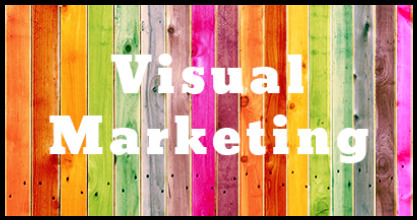
10 Reasons Visual Content will Dominate 2014 What marketing strategies will we focus on in 2014? What will we leave behind? This article takes a look at the rise of visual content - and why 2014 will dominate in 2014: 1. 90% of information transmitted to the brain is visual. Visuals are processed 60,000X faster in the brain than text.
Martin (Marty) Smith's insight:
I can think of a few more reasons visual marketing will dominate in 2014 including: * Mobile LOVES visuals and everything is going mobile * Visual marketing is more viral, more "shareable".
Grat Monica S Mcfeeters Comment: This is one of the best reasons for art education. A visually or media illiterate citizen or consumer is very apt to be manipulated or make unwise choices. From Wikipedia: Visual literacy includes in addition the ability to understand visual forms of communication such as body language, pictures, maps, and video.Evolving definitions of literacy often include all the symbol systems relevant to a particular community. Literacy encompasses a complex set of abilities to understand and use the dominant symbol systems of a culture for personal and community development. In a technological society, the concept of literacy is expanding to include the media and electronic text, in addition to reading and writing.

Lynn Pineda's curator insight,
March 14, 2014 11:25 PM
All I can say, is thank goodness for Visuals in content! I've always been a visual person being a visual learner. Information is easier to retain and comprehend when visuals are employed as it pulls you in. The article's statistics further supports the importance of visuals. I love visuals! 
Carlos Bisbal's curator insight,
March 16, 2014 10:15 AM
10 Razones por las que los contenidos visuales dominarán el 2014
¿En qué estrategias de marketing nos vamos a centrar en el 2014? ¿Qué vamos a dejar atrás?
Este artículo echa un vistazo al ascenso del contenido visual y por qué 2014 será el año de los elementos visuales. .
Scoop.it!
![12 Web Features To Disappear in 2014 [+ Scenttrail Notes] | Must Design | Scoop.it](https://img.scoop.it/YJ-ST4A1q3ndTi4dmfcyTzl72eJkfbmt4t8yenImKBVvK0kTmF0xjctABnaLJIm9)
We asked 12 entrepreneurs which website features small businesses should avoid (or get rid of) at all costs.
Martin (Marty) Smith's insight:
Marty Notes:

Mike Power's comment,
March 9, 2014 3:29 PM
Agree with it all except the sidebars. It's not about whether there are sidebars or not, it's about how they areexecuted, just as it is for the rest of the page. And sidebars don't have to be narrow. And responsive designs have no problem placing the sidebar content below the main content. I love good single-column webpages but it's not the only game in town.
Scoop.it!

Yesterday an article on Medium, Snowfallen, caught my eye. It's about a technique for presenting longform writing online, by embellishing it with integrated
Martin (Marty) Smith's insight:
Not sure how I feel about "snowfall" design. My favorite is the Buzzfeed History of Pong. My concerns are:
Scoop.it!
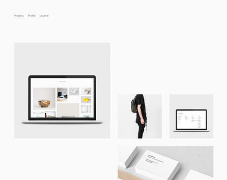
There are a many aspects of good web design, and whitespace is certainly one of them. Whitespace is the empty space around design elements such as images, text,
Martin (Marty) Smith's insight:
White space can be the most defining design element of any website. Hard to use well though. Here are 13 examples of how to use whitespace in your website designs.
Scoop.it!

Buy and sell handcrafted, mousemade design content like vector patterns, icons, photoshop brushes, fonts and more at Creative Market.
Martin (Marty) Smith's insight:
Flat website design is a major 2014 web design trend. Here are 12 examples of the art of flat website design. My favorite is the last example http://wistia.com/ . Wondering why flat design is all the rage in 2014? Easy to answer in a single word - MOBILE.

Cezame conseil's curator insight,
April 28, 2014 3:06 PM
Quelques exemples de sites Internet dans la tendance du "Flat design"
Scoop.it!
It almost seems that this year flat designs have taken over the world of graphic design by force, but especially in the arena of mobile apps with the first industry-shaking flat design being for the iPhone5. Reality is that flat design has been around longer than the emergence of the iPhone5, but of course it was Apple that helped to bring such cross-industry awareness to the design style.
Martin (Marty) Smith's insight:
I was wrestling with why we are suddenly awash in "flat design". My first thought was flat design is more lean, easier to figure out where to go and what do do. Nope.
Scoop.it!

Buy and sell handcrafted, mousemade design content like vector patterns, icons, photoshop brushes, fonts and more at Creative Market.
Martin (Marty) Smith's insight:
Easy agreement here: 5. Pop Overs - Maybe, but pop unders are all the rage and they are gross and obnoxious, predict they will wane in 2014 too. Look at Rocketbolt.com's much less offensive triggered, subtle popunder instead.

Rita Jordan's curator insight,
January 15, 2014 10:43 AM
check out the additional links at the end of the article. |
Scoop.it!

Martin (Marty) Smith's insight:
Attending Search Exchange in Charlotte and MOBILE seems to be the dominant theme so here are 70 examples of responsive web design. On a laptop or desktop and want to see "responsive" design? Shrink your window and watch as the content adjusts to tablet and then phone size.
Scoop.it!
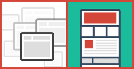
Pageless design frees websites from the outdated conventions of print design and fully utilizes the digital platform they’re built on. 8 Compelling Reasons Why "Pageless' Web Design Wins (in the end): * Tells a better story. * Easier to "digest" or understand what to do. * Emotionally more powerful. * Higher Conversion Rates!!! * Lowers BOUNCE & encourages sharing. * Looks great on all devices (mobile included). * Lower cost to develop.
Scoop.it!
What are two of the coolest colors in web site design? And do you think we've assembled a collection for you that will knock your socks off? Take a peek >>
Martin (Marty) Smith's insight:
Mobile is forcing some good design upon us including:
Scoop.it!
A common misconception is that black is thought of as a color in the same way that red, blue, purple or even green are. In actual fact, black is the complete absence of all color...
Martin (Marty) Smith's insight:
This post reminds me of something I read about Andy Warhol.. "With Warhol there is always BLACK," the author said and went on to explain that it was Warhol's awesome use of black that made him a great artist.
Scoop.it!
Fantastic CSS3 Website Designs for Inspiration. Selection of Awwwards winning CSS3 websites. CSS3 is a powerful tool for web designers to enhance the appearance of a website.
Martin (Marty) Smith's insight:
Strong first few pages of examples here. My favs include True - don't like blocking the face, but works here. * Limit color palette.
Scoop.it!
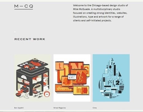
Currently, one of the biggest trends in the web design industry is the flat design style. In case you are not yet familiar with the term, flat design is essentially design without the drop shadows, gradients, and textures that have been common in web design for some time. Flat design uses solid colors and often typography figures prominently into the design. In this post we'll showcase 33 excellent examples of the flat web design trend. Hopefully they can provide some inspiration that can be put to use in your own work. Buffalo
Martin (Marty) Smith's insight:
Mobile is the secret driver of many of 2014's hottest web design trends. One of the hottest is flattening out web design. Small screens can't handle shading and three dimensionality as well as bigger screens, so flat is one of the HOTTEST web design trends as these 33 examples share. .

Alaina Duty's curator insight,
September 25, 2015 1:45 PM
Here are some great examples of some bold, attention-grabbing color combinations incorporated in flat design.
Scoop.it!

This collection consist best of website design inspiration that mainly have flat website design examples like headlines, images or content areas. In this
Martin (Marty) Smith's insight:
My favorite is Heather Lynn.
Scoop.it!

Flat design is a concept that was pretty popular a couple years ago and it's back with full strength this year, causing some interesting buzz around the so
Martin (Marty) Smith's insight:
Mobile is changing web design in many ways. One way is we are flattening out design. Flat designs look better on mobile so they are now winning across the web as these 23 examples show. My fav is William Leeks.
Scoop.it!

Marty Note
Scoop.it!
![18 Pivotal 2014 Web Design Trends [+ Scenttrail take] | Must Design | Scoop.it](https://img.scoop.it/IWQ-gbOJ3_0fBW422fhBnzl72eJkfbmt4t8yenImKBVvK0kTmF0xjctABnaLJIm9)
What web design trends do you think we'll see in 2014? I'm betting on more simplicity, more cleanliness, and more focus on smaller screen sizes, among other things. 1. Flat UI - AGREE and general agreement.2. 'Mobile first' - AGREE! & trying to wrestle that pig to ground now with CrowdFunde.3. Yet more scrolling - Agree and coming from mobile too. .8. Minimalist navigation - Agree and this is coming from MOBILE (working CrowdFunde's "mobile first" design right now and navigation is expensive in mobile. 9. CSS replaces images - Agree CSS Canvas is going to make many images needless weight on the page. 10. Video / moving backgrounds - AGREE! 11. Richer content experiences - Agree especially video. 12. Making the most of one page - Agree, but don't agree with single page sites (we aren't there yet). 13. Varied typography - Agree there is a lot happening on the server side with type. 14. Monochromatic design - New to me, but more likely than 15. Hypercolour - Not Sure color is easy to do BAD online and more color can make a mess. 16. Cards / tiles - Fascinating and new to me, read why cards are future of the web http://insideintercom.io/why-cards-are-the-future-of-the-web/ 17. Bigger, better imagery (Agree, cloud caching and CDNs making this possible). 18. Fixed position content / navigation - Agree as social widgets already doing this

Tyler Richendollar's curator insight,
March 6, 2014 10:38 AM
Some seriously great design ideas and trends for 2014 and forward. Really a solid summary of what the web looks like today, and will evolve through.
Scoop.it!
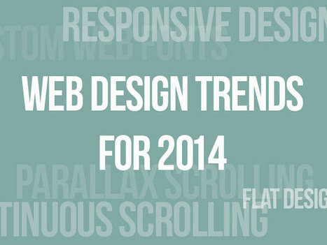
![Web Design: 20 Hottest 2014 Trends [+ Scenttrail Take On Each] | Must Design | Scoop.it](https://img.scoop.it/2CPaOyrABsNo3A6WtHo9yDl72eJkfbmt4t8yenImKBVvK0kTmF0xjctABnaLJIm9)
2014 We Design Trends

Monica S Mcfeeters's curator insight,
February 22, 2014 10:05 AM
Here are some current WEB designing programs.
Scoop.it!

Just as we did a year ago, I'm kicking off 2014 with a list of design trends I expect to gain ground over the next twelve months.
Martin (Marty) Smith's insight:
This great Gizmodo post had me at Theming Apps. 10 very cool and "out there" web and mobile design trends for 2014. 3. Layers and Depth Within Apps4.

Annica Widlert's curator insight,
January 17, 2014 1:39 PM
14 trends to keep an eye out for. Relating to web design, to app design, and some to ideas over visual elements. |


En el momento en que me lo estoy planteando