Must Design
75.6K views | +0 today
Follow
Must Design
Design Is Revolutionary
Your new post is loading...
Scooped by Martin (Marty) Smith
Scoop.it!

30 Beautiful and Creative Ecommerce Website Designs – Shopify

30 Beautiful and Creative Ecommerce Website Designs – Shopify | Must Design | Scoop.it

A blog about ecommerce marketing, running an online business and updates to Shopify's ecommerce community.

Marty Note
Ecommerce is hard to make "BEAUTIFUL". The conventions are well established now such as hero, underneath or to the right of the hero is a line of products, nav leads to category pages then to product pages, big search box and so on.

Here are 30 cool takes on convention that don't spill conversions all over the floor, the danger of modifying ecommerce convention, but do create intelligent and NEW feeling ecom web design.

My favorite is Norwegian Rain because their hero tells such a amazing story with so few words. Very difficult to do a group shot like that without looking too exclusive. Like a club that would never have YOU (the visitor) for a member.


I don't get that feel from their image and design. Very cool and NOTHING I would have considered before seeing that a group shot of that magnitude can be accomplished.

Norwegian Rain
No comment yet.
Scooped by Martin (Marty) Smith
Scoop.it!

Your 2014 Website Can't Be Too RICH, THIN or FLAT - 40 Web Design Examples

Your 2014 Website Can't Be Too RICH, THIN or FLAT - 40 Web Design Examples | Must Design | Scoop.it
Flat web design has been a huge topic in the web, even Apple is adopting flat web design style and you need to make sure you upgrade your site too!
Martin (Marty) Smith's insight:

Why so FLAT?
Mobile is the single word answer to why most websites are flattening out their designs. As phones outnumber desktops one of the manifestations of "mobile first" is we are adopting designs that look better on our phones and pads - FLAT designs.

Amazing how quickly this worm turned, but you won't have trouble finding hundreds of examples of great flat website design like these 40. My favorite is http://madebyfibb.com/ for its cascading windows feel and images that engage and point at CTAs.

Marty

No comment yet.
Scooped by Martin (Marty) Smith
Scoop.it!

65 Responsive Website Design Examples of 2014 Inspire

65 Responsive Website Design Examples of 2014 Inspire | Must Design | Scoop.it
Martin (Marty) Smith's insight:

Love the breakout by category. Great examples in each category. My favs are:

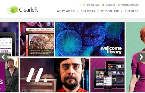
ClearLeft.com and SalesForce.com

M

No comment yet.
Suggested by cssmatter
Scoop.it!

Going Beyond Convention In Website Design - Examples

Going Beyond Convention In Website Design - Examples | Must Design | Scoop.it
Over the past few years, we have gotten used to certain standards in web design. In order to make a lasting impression on your visitors, you need to build experiences that go beyond those of a plain, usable website. This does not mean usability has become any less important. It just takes on a different role in web design, now forming the basis for a great user experience for examples of great usability website.
Martin (Marty) Smith's insight:

Agree, some conventions are needed and expected others can be broken down and twisted into new shapes. Trick is knowing what you must do like everyone else and what you can afford to take some risks with in your website design.

massimo scalzo's curator insight, April 12, 2014 3:19 AM

Developing a website goes beyond the simple usability. "Experience" needs also the right attire.... Appearance.  Ease of use is not the only thing important, aesthetics counts too!

Scooped by Martin (Marty) Smith
Scoop.it!

Does Your Web Design SING? New Neuromarketing Research Suggests It Should

Does Your Web Design SING? New Neuromarketing Research Suggests It Should | Must Design | Scoop.it

How does your web design SOUND? Strange question, but new neuromarketing research suggests we mentally sound out words we read. Implications for web designers are significant and new.

Most web designers care about how their design LOOKS, but maybe we should worry about how our sites SOUND too. Sound is a HUGE learning aid and one easy to overlook as we focus on colors, font and line.

Adds weight to how VOGUE uses alliteration to create powerful marketing as discussed in 8 Visual Marketing Tips from Vogue
https://www.haikudeck.com/visual-marketing-8-tips-from-vogue-art-and-design-presentation-QPRubvrcT8

and on Scoop.it
http://sco.lt/8qjz7Z


No comment yet.
Scooped by Martin (Marty) Smith
Scoop.it!

10 Visual Web Design Mistakes To Avoid

10 Visual Web Design Mistakes To Avoid | Must Design | Scoop.it

Don't Make These 10 Web Design Mistakes

1. Don't Use Flash.
2. Careful with fonts easy to do bad.
3. Text over images - Not So Much.
4. Too Many Ads.
5. No Clear Call To Action.

6. Too much text (break up with graphics or multiple pages).

7. Bad link colors.

8. Popups suck (don't do it).

9. Tiny font size.

10. Long paragraphs especially problem longer the post.  

Monica S Mcfeeters's curator insight, April 6, 2014 6:08 PM

Quick list to refer to and avoid some Web Design mistakes.

Scooped by Martin (Marty) Smith
Scoop.it!

25 Beautiful Content Heavy Website Designs Inspire

25 Beautiful Content Heavy Website Designs Inspire | Must Design | Scoop.it
There are many of content heavy websites out there, but very few seem to take good design into account. We take a look at those that do.


Marty Note
Content can KILL a website design. Content needs to be well thought out. How can you tease the click without frustrating your visitors and readers? How can you share all the content you need to share without wrecking your design? Here are 25 examples of how to use content as a helpful design element instead of ending up on content's rocky shores.

No comment yet.
Rescooped by Martin (Marty) Smith from Print still a design force
Scoop.it!

Graphic Design – Does it Matter? | Abstrakt Marketing Group

Graphic Design – Does it Matter? | Abstrakt Marketing Group | Must Design | Scoop.it

Art as a form of creative expression has been around centuries. While the mediums artists use to create have changed, their work has remained important. Through advertisement, graphic design has been making its way into our lives since we were born.

Marty Note
As marketing becomes more visual with pressure to explain more detail in less time and space (can you say mobile) graphic design becomes of critical importance.


Via Dennis Staples
Dennis Staples's curator insight, April 2, 2014 5:31 PM

Graphic design shapes your marketing message!

Scooped by Martin (Marty) Smith
Scoop.it!

11 Resources Help You Create a Flat & Responsive WebSite Design

11 Resources Help You Create a Flat & Responsive WebSite Design | Must Design | Scoop.it

Learn why flat design responsive sites are so popular, and get 11 resources for getting the design elements you need to create your own.

Marty Note
Flat and responsive are the two 2014 pillars your website should be designed or re-designed with. This post shares 11 great resources to help with Flat & Responsive (most of these 11 resources were new to me).

No comment yet.
Scooped by Martin (Marty) Smith
Scoop.it!

Four Days In Paris and 14 Other Flat Design Examples Inspire

Four Days In Paris and 14 Other Flat Design Examples Inspire | Must Design | Scoop.it
Martin (Marty) Smith's insight:

Flat design is amazing. Looks good on mobile, is clean and easy to understand and hard to create. Here are 23 great examples.

cees de roij's curator insight, April 7, 2014 9:31 AM

On this website you can learn a lot and that is very good.

RDV Weekly's curator insight, July 11, 2014 2:48 PM

To meet modern design demands, flat design must be mobile-functional, clean, and user friendly. Some examples here.

Scooped by Martin (Marty) Smith
Scoop.it!

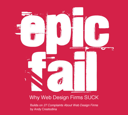
Epic Fail: Why Web Design Firms SUCK

Epic Fail: Why Web Design Firms SUCK | Must Design | Scoop.it

EPIC FAIL: Why Web Design Firms SUCK (in 2 parts)
This post builds on Andy Crestodina excellent 27 Complaints About Web Design Firms. This is really a story in two parts and one I know well.

I purchased web design services for seven years as a Director of Ecommerce and then sold them as Marketing Director for one of the largest web design firms in the southeast (Atlantic BT). 

Scoop.it Notes are Here
http://sco.lt/9K9Ukj  

Epic Fail notes are on Gplus
https://plus.google.com/102639884404823294558/posts/PocGtr2UaFh  

No comment yet.
Scooped by Martin (Marty) Smith
Scoop.it!

15 Best Responsive Design Websites | Web Design Inspiration [@PeterShamN is Great]

15 Best Responsive Design Websites | Web Design Inspiration [@PeterShamN is Great] | Must Design | Scoop.it
Awesome Responsive Design Website Designs for Inspiration. Selection of Awwwards winning Responsive Design websites. Fluid grids, flexible images and media queries are the three technical ingredients for responsive web design
Martin (Marty) Smith's insight:

My favorite is Petersham Nuseries @PetershamN. Peter Sham may be the best content / commerce site I've encountered. Social is a tad hard to find, but the smooth synergy between storytelling content and commercial selling is elegant, well architected and seamless.

Love this (great, intimate content):

"The teahouse has evolved to now offer a seasonally inspired, Italianate lunch menu, as well as daily homemade cakes, loose whole leaf teas and filter coffee. Horticulturally, the nurseries expanded with the reopening of the Greenhouse III to extend the onsite propagation alongside the expansion of the cutting and kitchen gardens directed by Lucy Boyd, whilst the development of the community and education based Petersham Platform sees the Nurseries' fundamental ethos central to the growth within our walls opened up to those outside it.
 

The success and ripening can be attributed to the ideas and determination of eldest daughter Lara Boglione. Since 2011 Lara has been the driving force behind the development of the Nurseries. Her passion lies in sustainability, gastronomy, agriculture and education, an ethos that is spread across all business functions. Lara explains: “We hope to have created a place of calm, away from the bustle of London, somewhere that respects and is in tune with nature and positive living."


Peter Sham is more than just an amazing responsive site. The site is a great example of how content and commerce can live in harmony. 
 

No comment yet.
Scooped by Martin (Marty) Smith
Scoop.it!

"Snowfall" Interative Web Design Storytelling 20 Examples | Web Directions

"Snowfall"  Interative Web Design Storytelling 20 Examples | Web Directions | Must Design | Scoop.it
Yesterday an article on Medium, Snowfallen, caught my eye. It's about a technique for presenting longform writing online, by embellishing it with integrated
Martin (Marty) Smith's insight:

Not sure how I feel about "snowfall" design. My favorite is the Buzzfeed History of Pong. My concerns are:

* Gets boring to scroll that much.
* Pagespread - is it better SEO to have a single long page or many pages?

The issue of pagespread is tricky. The new Google cherishings engagement and long pages create longer engagement assuming people don't click off.

But Google also likes pagespread (more pages about a topic with social shares and links confirming their importance). I don't know the RIGHT answer her since each approach - long pages or many pages - have distinct SEO benefits.

I find the experience of that long page offputting and wonder how snowfall will play on mobile devices. Mobile may be easier because of the swipe.

In fact, snowfall design may have its roots in mobile (sure feels that way). Whether your website should be 100% snowfall designed is above my pay grade (lol). M  

No comment yet.
Scooped by Martin (Marty) Smith
Scoop.it!

Why The Bauhaus Is Our House As Web Design Moves Into The Future

The Bauhaus ethic applied principles such as "honesty of construction", "truth to ma...

Martin (Marty) Smith's insight:

Great work by Simon Collision (@Colly). Picks up for me on slide 17.

1. Acknowledge the machine.

2. Standardize production.

3. Experiment and synthesize. 

4. Form follows function.

5. Economy and simplicity.

Those values drove designers at the Bauhaus to create a new approach. How will those values influence our web design going forward?

1. Honesty of construction truth to materials.

2. Develop systems.

3. Holistic web design approach (slide 32 what's golden important). .

4. Mass production and individual expression.

5. Adapt and respond to an evolving world.


Here are points I would make about how Bauhaus values will play an important role in what is next online:

* The machine is increasingly SOCIAL and MOBILE.

* Smart Phones & Apps gamify routine (boring) tasks.

* Holistic design will increasingly mean Mobile Fist design.

* We are all in the community building business (whether we know it or not) & community creates mass production OUT OF individual expression.
* Our adaptations will be social & mobile, gamified & curated.

No comment yet.
Scooped by Martin (Marty) Smith
Scoop.it!

30 Fresh Examples of Web Design via @1918| Graphic Design Junction

30 Fresh Examples of Web Design  via @1918| Graphic Design Junction | Must Design | Scoop.it
There are hundreds of websites launched in every day and mostly web design are available in CSS Website Galleries for awards, reviews and inspiration for web
No comment yet.
Scooped by Martin (Marty) Smith
Scoop.it!

Responsive vs. Adaptive Website Design: Similarities and Differences

Responsive vs. Adaptive Website Design: Similarities and Differences | Must Design | Scoop.it
The hot topic for web developers and website owners is the way that websites can now automatically respond and adapt to any device with any screen size. There is huge dilemma in proposing best web design method for Mobile responsive project to clients. There we are to help you. 
Lets discuss in detail about these two options for web design:
                   A) Responsive Web Design (RWD) 
                   B) Adaptive Web Design (AWD)
malek's curator insight, April 11, 2014 10:18 AM

t can be hard to explain RWD. Per usual, Marty  hit it on the head, along with the reasons

massimo scalzo's curator insight, April 12, 2014 3:12 AM

Please, let your audience see your presence on the Internet regardless of what device they use to access the Network !

Scooped by Martin (Marty) Smith
Scoop.it!

Designing A Social Media Savvy Website | @smexaminer & @Scenttrail

Designing A Social Media Savvy Website | @smexaminer & @Scenttrail | Must Design | Scoop.it

Marty Note
Social Media is a CSF (Critical Success Factor) for the future of any website. Why then are social buttons done so poorly on so many websites? Because not everyone believes the TRUTH of my first sentence.

In addition to these 9 excellent Social Media Examiner tips I would add a few:

* Don't change the COLORS of the buttons. Those brands are established now and changing their colors mutes their impact.

* Remember you have 2 kinds of needs - Social SHARES of your content and social shares of your site. Those are two different ideas easily confused. Look at Mashable for some of the best social media button design on the web. Clear buttons on posts with the "SHARES" total number and then buttons on the fiar right for Mashable.com.

Some publishers may have 3 or 4 button groups such as: post, site, author and special content such as polls or Infographics.

* LARGE and IN CHARGE and if your programmers are talented create the total number like Mashable.

* Here is proper structure of an article link:
9 Tips for Integrating Social Media on Your Website http://www.socialmediaexaminer.com/9-tips-for-integrating-social-media-on-your-website/  via @smexaminer

Short intro into the link & attribution at the end. Keep your character count down below 120 for maximum RTs.

* Here is a proper structure for a site:
Follow Mashable on Email, RSS & Social Media http://mashable.com/2011/11/18/follow-mashable/#:eyJzIjoidCIsImkiOiJfbWdmMGlqY3p4c3A5bWk4dyJ9  via @mashable


Here are the 9 tips from Social Media Examiner:

1. Include visible social media buttons.

2. Integrate social where it makes sense.

3. Include up-to-date buttons.

4. Include share buttons.

5. Use analytics.
6. Pay attention to terms and conditions (of social media sites).

7. Don't over do it.
8. Stay knowledgeable.

9. Use http://sproutsocial.com/ or something similar to match social to analytics.


No comment yet.
Scooped by Martin (Marty) Smith
Scoop.it!

Great Video + Web Design = HARD as Award Winning Videos / Web Designs Prove

Great Video + Web Design = HARD as Award Winning Videos / Web Designs Prove | Must Design | Scoop.it


Fantastic Video Website Designs for Inspiration. Selection of Awwwards winning video websites. Video is widely used in today's web design. Video is one of the most powerful tools of visual communication.

Video Online is Harder Than It Looks
These award winning video demonstrate a clear truth - creating a great video experience online is TOUGH. My favorite of all of these examples is Dick's Sporting Goods baseball videos. I like the visual storytelling of the Dick's videos.

I have a real feel for "being there" with Dick's. Problem is as Dicks makes the turn toward home and starts down the positions they lose me. They might lose a die hard baseball person less, but Dick's demonstrates some of video marketing's strengths and liabilities:

Strengths
* Can tell a complex story simply and quickly.
* Holds attention better than reading.
* Creates more hooks to wind a story around.

Weaknesses
* Easy to lose your way from a script / production / website integration standpoint (watch that Keecker and tell me if you don't get a little creeped out too).
* We watch a lot of video, so expectations are HIGH for both production quality and story strength.

* Video floats on top of websites more than it is actually part of them.

That last bullet in weaknesses is where the real design stress exists. How do we move back and forth between website and video without losing attention, being confusing or both losing attention and being confusing? Videos tend to dominate webpages.

When I was Director of Ecommerce we finally, after many tries, found a product page video size, style and length that significantly contributed to conversion. Problem is WE created those videos.

As we move into the User Generated Content social Media world of tomorrow we will need to create less and curate more. There is a way to create a web framework to support UGC videos and as soon as I see it I will be sure to share it (if you've seen a video website you think works WITH instead of against its videos please share).


No comment yet.
Scooped by Martin (Marty) Smith
Scoop.it!

100+ Clean, Simple and Minimalist Website Designs

100+ Clean, Simple and Minimalist Website Designs | Must Design | Scoop.it
Minimalism has been a popular website design style for years. It has so many benefits; minimalist sites load faster, take fewer server resources, and are often faster to develop than more graphically complicated designs. Plus, they give a professional, clean impression to visitors. Many people still view minimalist designs as ... Continue reading »
No comment yet.
Scooped by Martin (Marty) Smith
Scoop.it!

10 Amazing Examples of Math Inspired Architecture & Why Web Designers Are Bedouin Surfing An Endless Wave of Change

10 Amazing Examples of Math Inspired Architecture & Why Web Designers Are Bedouin Surfing An Endless Wave of Change | Must Design | Scoop.it

The link between math and architecture goes back to ancient times, when the two disciplines were virtually indistinguishable. Pyramids and temples were some of the earliest examples of mathematical...

Marty Note
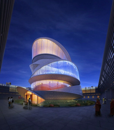
I share these amazing pictures of architecture inspired by math because Web 3.0 feels less wireframes and more movable feast. As the social conversation becomes the medium of exchange online we are LESS likely to GO TO A PLACE and more likely to seek the warmth of conversations with friends.

Math will become a building block of our web architecture just as the only way to imagine these buildings was with math. The math that will matter will be the predictive analytics of Wall Street combined with the artistic beauty of Gehry, the music of jazz and smooth surface of an Alex Katz or the broken plates of an early Julian Schnabel.

As we move into the web's social future our place will be where there are relevant conversations. We will be Bedouins moving from one conversational camp to another, brewing tea in the dessert and listening to the wind as we appreciate the rarity of rain.

More on web designers as Bedouin on G+
https://plus.google.com/102639884404823294558/posts/DvqXp3f7y5Q

Architect's curator insight, May 8, 2014 4:31 PM

Arquitectura se remonta a tiempos antiguos. Esta un sito de la Matematicas incluir en arquitectura. La sito tenga muco pictures de la arte. Edificio es un reflexion de la paisaje. Es un muy bien sito.

Dg

Scooped by Martin (Marty) Smith
Scoop.it!

Hot, Flat, Colorful: 33 Examples of Ultra-Hot Flat Web Design Trend

Hot, Flat, Colorful: 33 Examples of Ultra-Hot Flat Web Design Trend | Must Design | Scoop.it
Currently, one of the biggest trends in the web design industry is the flat design style. In case you are not yet familiar with the term, flat design is essentially design without the drop shadows, gradients, and textures that have been common in web design for some time. Flat design uses solid colors and often typography figures prominently into the design. In this post we'll showcase 33 excellent examples of the flat web design trend. Hopefully they can provide some inspiration that can be put to use in your own work. Buffalo
Martin (Marty) Smith's insight:

Mobile is the secret driver of many of 2014's hottest web design trends. One of the hottest is flattening out web design. Small screens can't handle shading and three dimensionality as well as bigger screens, so flat is one of the HOTTEST web design trends as these 33 examples share. .

Alaina Duty's curator insight, September 25, 2015 1:45 PM

Here are some great examples of some bold, attention-grabbing color combinations incorporated in flat design.

Scooped by Martin (Marty) Smith
Scoop.it!

The Art & Science of Social Login Design

The Art & Science of Social Login Design | Must Design | Scoop.it
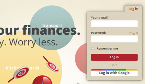
Social login, also known as social sign-in, provides users with one single login using an account they already have – their social network account.
Martin (Marty) Smith's insight:

The NEW Web Design
Reading a new Social Media Examiner report (Scooped here http://sco.lt/5jE7qj ) social login is looming LARGE and IN CHARGE especially thanks to "password fatigue" and big F success as a universal trust mark.

Designing social lgoin can be tricking. When the Atlantic BT team created social login for http://www.curecancerstarter.org

it became clear to me (as client) they were in over their heads. Here are some examples of the art and science of design social login in ways that blend, support and intrigue.

Why is social login so important? The next web is going to be more distributed and less go to a website and consume content. Facebook's dream of becoming infrastructure seems to be coming true, so we need to understand how to design websites with social signin and the social reach it provides.

Martin (Marty) Smith's comment, March 23, 2014 11:28 AM
Good note @wayne_b. I'm sure there are many "more technical" who will use password helper apps. I also see your point about, for a certain segment, Facebook = distrust (me included), but there is a big broad breadbasket of users who will use FB because they trust it and social signon because its easy. That being the case, I will always include a well thought out social signin option on the big stuff we create at @CrowdFunde and Scenttrail Marketing. Marty
Scooped by Martin (Marty) Smith
Scoop.it!

Why The New World is FLAT: What Is Flat Design?

Why The New World is FLAT: What Is Flat Design? | Must Design | Scoop.it
With the release of iOS7 just around the corner, clamor over the changes Jony Ive will institute is growing. The general consensus--on this site and elsewhere--is that Apple is about to get a flat makeover. But for the uninitiated, “flat design” can be a confusing term. So let’s talk it out, shall we?
Martin (Marty) Smith's insight:

Web Design Trends 2014
Like several other major web design trends this year flat design has its origins on our phones. Flat looks better on mobile and so flat is coming to a website near you too.

This is true for other design trends as well such as fewer colors, bigger heroes and better fonts. Since flat design is such a MONSTER trend in 2014 good idea to visit the question of What Is Flat Design. Here Gizmodo explains flat design and its mobile origins.  

No comment yet.
Rescooped by Martin (Marty) Smith from WebsiteDesign
Scoop.it!

Emotion in Web Design Is A Critical Success Factor (CSF)

Emotion in Web Design Is A Critical Success Factor (CSF) | Must Design | Scoop.it
Putting emotion into web design may seem a strange concept, but many sites have been doing it for years, and we are only now beginning to recognize it and talk about it.

Via Brian Yanish - MarketingHits.com
Martin (Marty) Smith's insight:

People buy with emotion and justify with logic, so finding ways to incorporate emotion into web design is a CSF (Critical Success Factor). 

Mike Donahue's curator insight, March 25, 2014 8:36 AM

Seems designing for emotions is beginning to get its day in the sun. Nice article with several clear examples.

Scooped by Martin (Marty) Smith
Scoop.it!

125 Flat Web Design Examples Inspire | Designrazzi

125 Flat Web Design Examples Inspire | Designrazzi | Must Design | Scoop.it
This collection consist best of website design inspiration that mainly have flat website design examples like headlines, images or content areas. In this
Martin (Marty) Smith's insight:

My favorite is Heather Lynn.

No comment yet.