Your new post is loading...
Master Blasters
When everything is social community rules. Curagami our Triangle Startup Factory funded startup is working on helping ecommerce merchants and content marketers validate the ROI of social and content marketing. Community is a CSF, Critical Success Factor, because community is what creates an army of advocates.
This post is about how to win the hearts and minds of your most important customers - those willing to advocate your products, services and web content.
A common misconception is that black is thought of as a color in the same way that red, blue, purple or even green are. In actual fact, black is the complete absence of all color...
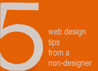
After almost 14 years an Internet marketer and the last two as Marketing Director for Raleigh's largest web and software design agency I know people need HELP buying web design.
5 Web Design Ideas From A Non-Designer
Graphic Designers ROCK
I have more than tremendous respect and admiration for graphic designers. The ability to use tools like Photoshop and Illustrator to create MAGIC is something I will always envy. I know enough to know just how magical those skills truly are, so thank you.
I would LOVE to convince gifted visual marketers of the need to fix five mistakes I see over and over, mistakes that can HARM a websites bottom line and ability to scale.
I confess to making some of these mistakes myself. Easy to do when caught up in the NEW chase. I got so I printed out this list and keep it in view so it smacks me as a reminder while creating ideas for a new design.
Despite the list being omnipresent I forgot a subscription option on CrowdFunde.com two months ago, so EASY to forget these ideas:
** Email Subscription
Any websites lifeline is the LIST of supporters and subscribers they OWN. If Google changes their algorithm and PPC goes bankrupt you can always may your own list, so making sure the ability to opt in to that list is omnipresent is a CSF (Critical Success Factor).
** Keywords In Category Names
Think, "Do we want to win that keyword," when reviewing your navigation. You may select to have your URLs rewritten to be more keyword specific, but those internal links play an important role with Google's spider and SEO so KEYWORDS are a must.
** Research Keywords
My CrowdFunde co-founder Phil Buckley asked me if I thought attorneys or lawyers would be the most searched term. "Lawyers," I answered confidently knowing I was wrong (you never win these who will win questions lol). Attorneys is the winner and by a large margin. Don't write copy to what you THINK when it is so easy to do a little research and KNOW.
** The Tricky Part To Web Analytics
Here's the rub to web metrics. They operate in a constant seesaw dance with one another. Attorneys may be the most searched, but maybe that is because the Mass Tort guys have crushed the deck in some way (have no knowledge of that only using it as an example so please don't sue me lol). When you DESIGN with numbers you design better, but be sure to ask your SEO contact where the rubs are in the numbers. Rubs are numbers that LOOK one way but actually ARE another. Trust me you NEVER want to spend the kind of time in Google Analytics knowing where the rubs are requires, so ask.
** 80/20 Rule
One Internet marketing FRACTAL we discovered is 20% of the links, traffic, pages always get 80% or more of the value. Your job is to build a flexible framework so when your managing team SEES the emerging 80/20 rule you can easily shift the presentation to favor the 20 over the 80.
Now please take these practical, money making ideas and make them beautiful and THANK YOU for your dedication to BEAUTY in design and life :). Marty
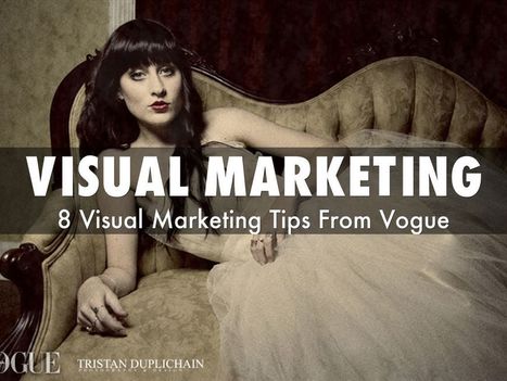
Vogue's Marketing Lessons
* Be Specific (use BIG numbers). * Be Branded (use existing brands). * Be Topical (happening NOW iis easier).
* Be Welcoming (Models on hompage stare directly at camera).
* Use alliteration and rhythm in headlines (make em sing).
* Use juxtapositions.
* Use action verbs. * Use SIMPLE colors.
Follow those 8 lessons and your web design improves.
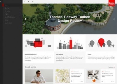
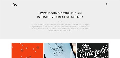
Design Beauty As Online Strategy
Beauty has a problem online. Imagine a line with pretty pictures on one end and makes money / converts on the other. As website design travels away from the balanced center out to either pole something is given up.
Beautiful sites often feel solipsistic and self referential. Commerce sites feel transactional and much like an not very special commodity. As visual marketing commands more and more of our attention, efforts and communication arresting imagery is important.
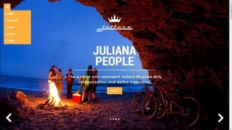
You can't sell someone who doesn't stop long enough to know who you are. Is beauty an effective strategy in and of itself? No. Is commerce an effective strategy in and of itself? No. Truth lies in the magic promise of a balanced approach as these 10 examples of somewhat practical beauty share.
My favorite and the one most centered between those two poles?
Juliana Bicycles - I don't typically like group scenes that aren't open to the viewer as they can send an exclusionary message. This bicycle site doesn't because of the magic of place pictured and the ancient desire to warm next to a fire with friends.
Would NEVER have thought Juliana Bicycles hero could feel so beautiful, friendly and inviting breaking several key rules - but it does.
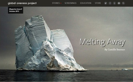
Nonprofit Websites
Nonprofit websites are designed to tell stories something we all need to do these days. My favs include Housing Works, Too Young To Wed and Melting Away.
A blog about ecommerce marketing, running an online business and updates to Shopify's ecommerce community.
Marty Note
Ecommerce is hard to make "BEAUTIFUL". The conventions are well established now such as hero, underneath or to the right of the hero is a line of products, nav leads to category pages then to product pages, big search box and so on.
Here are 30 cool takes on convention that don't spill conversions all over the floor, the danger of modifying ecommerce convention, but do create intelligent and NEW feeling ecom web design.
My favorite is Norwegian Rain because their hero tells such a amazing story with so few words. Very difficult to do a group shot like that without looking too exclusive. Like a club that would never have YOU (the visitor) for a member.
I don't get that feel from their image and design. Very cool and NOTHING I would have considered before seeing that a group shot of that magnitude can be accomplished. Norwegian Rain
Storytelling Web Design
How can a website tell a story? By rethinking websites as related content capable of telling a story in either direction and on their own we see the difficulty we face when telling stories using websites.
Websites go forward and backward in time because any page can become a "homepage" based on links or search. A webpage needs to be self sufficient - telling a story on their own - and connected in a dasiy chain where each step along the chain reinforces the chain's connections and "storyline".
This post discusses ways to use tools such as videos and arresting visuals. Graphics are a HUGE and helpful device online. If your story includes icons you've created a navigational language teaching readers to look for symbols when they want to move through the deck.
This is one of the reasons I love icons. Icons aren't fixed in space or time and their connection to each other can be strong or weak. The key is to keep readers reading. The challenge is thinking about information architecture that can easily pay off on its own and point in different directions based on how readers consume the content.
Best storytelling sites I've discovered include:
http://www.robinhood.org/
http://www.redcross.org/
http://www.ihadcancer.com/
Notice a trend? Nonprofits tell better stories in general and their websites function more as great story telling aids than most for profit companies. If you have favorite storytelling websites please share and we will curate in.
Marty Note
Social Media is a CSF (Critical Success Factor) for the future of any website. Why then are social buttons done so poorly on so many websites? Because not everyone believes the TRUTH of my first sentence.
In addition to these 9 excellent Social Media Examiner tips I would add a few:
* Don't change the COLORS of the buttons. Those brands are established now and changing their colors mutes their impact.
* Remember you have 2 kinds of needs - Social SHARES of your content and social shares of your site. Those are two different ideas easily confused. Look at Mashable for some of the best social media button design on the web. Clear buttons on posts with the "SHARES" total number and then buttons on the fiar right for Mashable.com.
Some publishers may have 3 or 4 button groups such as: post, site, author and special content such as polls or Infographics.
* LARGE and IN CHARGE and if your programmers are talented create the total number like Mashable.
* Here is proper structure of an article link:
9 Tips for Integrating Social Media on Your Website http://www.socialmediaexaminer.com/9-tips-for-integrating-social-media-on-your-website/ via @smexaminer
Short intro into the link & attribution at the end. Keep your character count down below 120 for maximum RTs.
* Here is a proper structure for a site:
Follow Mashable on Email, RSS & Social Media http://mashable.com/2011/11/18/follow-mashable/#:eyJzIjoidCIsImkiOiJfbWdmMGlqY3p4c3A5bWk4dyJ9 via @mashable
Here are the 9 tips from Social Media Examiner:
1. Include visible social media buttons. 2. Integrate social where it makes sense. 3. Include up-to-date buttons. 4. Include share buttons. 5. Use analytics.
6. Pay attention to terms and conditions (of social media sites). 7. Don't over do it.
8. Stay knowledgeable. 9. Use http://sproutsocial.com/ or something similar to match social to analytics.
Fantastic Video Website Designs for Inspiration. Selection of Awwwards winning video websites. Video is widely used in today's web design. Video is one of the most powerful tools of visual communication.
Video Online is Harder Than It Looks
These award winning video demonstrate a clear truth - creating a great video experience online is TOUGH. My favorite of all of these examples is Dick's Sporting Goods baseball videos. I like the visual storytelling of the Dick's videos.
I have a real feel for "being there" with Dick's. Problem is as Dicks makes the turn toward home and starts down the positions they lose me. They might lose a die hard baseball person less, but Dick's demonstrates some of video marketing's strengths and liabilities:
Strengths
* Can tell a complex story simply and quickly.
* Holds attention better than reading.
* Creates more hooks to wind a story around.
Weaknesses
* Easy to lose your way from a script / production / website integration standpoint (watch that Keecker and tell me if you don't get a little creeped out too).
* We watch a lot of video, so expectations are HIGH for both production quality and story strength. * Video floats on top of websites more than it is actually part of them.
That last bullet in weaknesses is where the real design stress exists. How do we move back and forth between website and video without losing attention, being confusing or both losing attention and being confusing? Videos tend to dominate webpages.
When I was Director of Ecommerce we finally, after many tries, found a product page video size, style and length that significantly contributed to conversion. Problem is WE created those videos.
As we move into the User Generated Content social Media world of tomorrow we will need to create less and curate more. There is a way to create a web framework to support UGC videos and as soon as I see it I will be sure to share it (if you've seen a video website you think works WITH instead of against its videos please share).
Minimalism has been a popular website design style for years. It has so many benefits; minimalist sites load faster, take fewer server resources, and are often faster to develop than more graphically complicated designs. Plus, they give a professional, clean impression to visitors. Many people still view minimalist designs as ... Continue reading »
|
"I spent a lifetime learning to draw like a child." Picasso
This is an interesting post from Thomas King about the complex nature of simplicity. Picasso's point about spending a lifetime learning to draw like a child seems important for web designers too.
The hardest thing to do is do less. The hardest mind to recover is the exploratory mind, the mind before judgement. When we recover the playful mind, the simple easily rewarding routine of play, our designs run free like Picasso's bull.
Great post from The Guardian on creating clean well lighted websites. My favorite? Discussion on how important surprise is to What's Next.
We've become both cynical and searchers. As incompatible as cynical searchers sounds it is our natural state. We have a tough hide created by more push advertising than the next generation will need to put up with the loss of a very important idea -
We are not human beings having a spiritual experience; we are spiritual beings having a human experience.
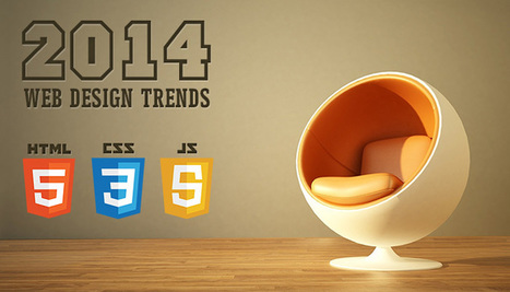
2014 Web Design Trends - Marty Note
Not a secret we are seeing flatter more responsive design in 2014, but I liked the format of the way Script Tutorials explained each trend with examples and wireframes.
2 of these ideas, Video Backgrounds and Interactive Infographics could be huge. Video backgrounds was a new idea to me even halfway through the year.
Reading an article entitled 10 Rock Solid Website Layout Examples on Design Shack.
Fantastic CSS3 Website Designs for Inspiration. Selection of Awwwards winning CSS3 websites. CSS3 is a powerful tool for web designers to enhance the appearance of a website.
For a while now, designers have been absolutely infatuated with all things subtle. We love subtle patterned backgrounds and intricate decorative elements; we
Flat web design has been a huge topic in the web, even Apple is adopting flat web design style and you need to make sure you upgrade your site too!
There are hundreds of websites launched in every day and mostly web design are available in CSS Website Galleries for awards, reviews and inspiration for web

|
Suggested by
cssmatter
|
Over the past few years, we have gotten used to certain standards in web design. In order to make a lasting impression on your visitors, you need to build experiences that go beyond those of a plain, usable website. This does not mean usability has become any less important. It just takes on a different role in web design, now forming the basis for a great user experience for examples of great usability website.
How does your web design SOUND? Strange question, but new neuromarketing research suggests we mentally sound out words we read. Implications for web designers are significant and new.
Most web designers care about how their design LOOKS, but maybe we should worry about how our sites SOUND too. Sound is a HUGE learning aid and one easy to overlook as we focus on colors, font and line.
Adds weight to how VOGUE uses alliteration to create powerful marketing as discussed in 8 Visual Marketing Tips from Vogue
https://www.haikudeck.com/visual-marketing-8-tips-from-vogue-art-and-design-presentation-QPRubvrcT8
and on Scoop.it
http://sco.lt/8qjz7Z
Don't Make These 10 Web Design Mistakes
1. Don't Use Flash.
2. Careful with fonts easy to do bad.
3. Text over images - Not So Much.
4. Too Many Ads.
5. No Clear Call To Action. 6. Too much text (break up with graphics or multiple pages). 7. Bad link colors. 8. Popups suck (don't do it). 9. Tiny font size. 10. Long paragraphs especially problem longer the post.
|


![10 Rock Solid Website Layout Examples | Design Shack [cool way to SEE web design] | Must Design | Scoop.it](https://img.scoop.it/oTupv3ms8sh4CpeucsgQDTl72eJkfbmt4t8yenImKBVvK0kTmF0xjctABnaLJIm9)