22 Reasons Why Your Website Sucks via @jeffsauer [w/ 5 Scenttrail Favs]


Your website sucks.I’m sorry that I have to be the bearer of bad news, but someone had to tell you the truth.Your website is a crime against humanity, an atrocious abomination, a target for Godwin’s
Great list from a trusted source, Jeff Sauer. My favorite reasons Jeff notes why a website sucks include:
#2. IT teams seek efficiency, marketing teams want traffic. Those two goals don't always play nice together.
#5. Designers are another dangerous group to a website's ability to convert visitors into buyers. Designers are important partners, but have firm ideas about preferences for conversion over pretty pictures and recognize the difference.
#6. You get what you pay for and no free or $10 site is going to sing, perform magic or help your mission critical online marketing much. Don't invade Russia in the winter (i.e. outspend your ROI), but don't think you can get anything worth anything for free either. Expertise is expensive, but you save money in the end because you spend less than having to redo the same work over and over again and make more.
#11 We've all been to websites where there is no there, there. If you don't have a passion you want to share with the world don't create a website. Remember the web is a huge lie detecting amplifier. If you have cracks the web magnifies them. If you have flaws they are not up there on the big screen. Good news is everyone does, so an honest, passionate and real share has and will always work beautifully online (just not with a $10 designer or your mom's friend, friend).
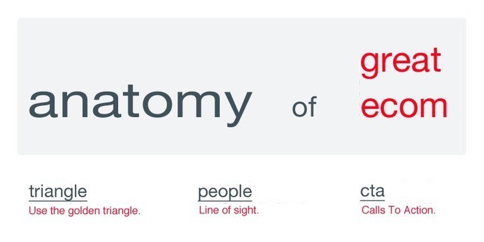
#14 Dedicated landing pages separates pros from everyone else. Those with more landing pages do exponentially better than those with fewer. That stat may not past Freakonomics muster, but the idea is sound. Create more landing pages dedicated to supporting a single PPC keyword with a solid offer and a clearly visible CTA (Call To Action).