Robin Good: David McCandlees, the author of the book Information is Beautiful celebrates great data visualization and information design work through the Information is Beautiful Awards.
Together with a jury of experts like Brian Eno, Paola Antonelli, Maria Popova, Simon Rogers and Aziz Kami, he has curated a unique selection of 300 designs and a short list of finalists in the following categories:
» Data visualization– A singular visualisation of data or information.» Infographic – Using multiple data visualisations in service to a theme or story
» Interactive visualization – Any viz where you can dynamically filter or explore the data.
» Data journalism – A combination of text and visualizations in a journalistic format.
» Motion infographic – Moving and animated visualizations along a theme or story.
» Tool or website – Online tools & apps to aid datavizzing.
The selection itself is worth a tour of the site and of this initiative.
Check: http://www.informationisbeautifulawards.com/
Longlist selection: http://www.informationisbeautifulawards.com/2012/07/our-longlist/
Shortlist selection: http://www.informationisbeautifulawards.com/2012/08/awardshortlist/
Via
Robin Good


 Your new post is loading...

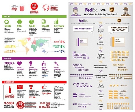


Very insightful look at the what, how and so what of data visualization. Another example of how a good visualization makes data digestible!
aggiungi la tua intuizione ...