

"Simulating climate conditions over the last 125,000 years and predicting how those changes would have allowed humans to spread around the globe, this video models human migration patterns." Read more: http://ow.ly/lWIp304qZEo
Via CT Blake
Get Started for FREE
Sign up with Facebook Sign up with X
I don't have a Facebook or a X account


 Your new post is loading...
 Your new post is loading...
Your new post is loading...
"Simulating climate conditions over the last 125,000 years and predicting how those changes would have allowed humans to spread around the globe, this video models human migration patterns." Read more: http://ow.ly/lWIp304qZEo Via CT Blake 
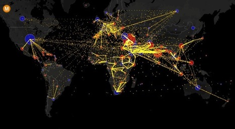
This map shows the estimated net immigration (inflows minus outflows) by origin and destination country between 2010 and 2015. Blue circles = positive net migration (more inflows). Red circles = negative net migration (more outflows). Each yellow dot represents 1,000 people. Hover over a circle to see that country’s total net migration between 2010 and 2015. […] Via Andy Dorn
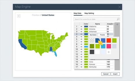
A step-by-step tutorial on how to create an interactive map with Visme, a free online infographic and presentation tool.

António Leça Domingues's curator insight,
December 19, 2016 6:44 AM
Criar um mapa interativo com Visme.

Bart van Maanen's curator insight,
December 19, 2016 10:02 AM
Mooie tool om een kaart van data te voorzien.

"To design a map of the world is no easy task. Because maps represent the spherical Earth in 2D form, they cannot help but be distorted, which is why Greenland and Antarctica usually look far more gigantic than they really are, while Africa appears vastly smaller than its true size. The AuthaGraph World Map tries to correct these issues, showing the world closer to how it actually is in all its spherical glory."

How to tell two radically different stories with the same dataset.

Jose Sepulveda's curator insight,
July 29, 2016 1:19 PM
thee precaution should be taken with environmental data published as integrated variable maps

Colleen Blankenship's curator insight,
August 4, 2016 9:12 AM
Maps, like statistics, can tell very different stories using the same information! Read this for some examples!

Global warming has raised global sea level about 8" since 1880, and the rate of rise is accelerating. Rising seas dramatically increase the odds of damaging floods from storm surges.
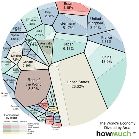
The graphic above (Voronoi diagram) represents the relative size of each country’s economy in terms of nominal GDP: the larger the area, the larger the size of the economy. The areas are further divided into three sectors: services, industrial, and agricultural. The US economy is mostly composed of companies engaged in providing services (79.7% compared to the global average of 63.6%), while agriculture and industry make up smaller-than-average of portions of the economy (1.12% and 19.1% compared to averages of 5.9% and 30.5%).
Tags: globalization, industry, economic, visualization.

Ivan Ius's curator insight,
March 4, 2016 10:18 AM
Geographic Thinking Concepts: Patterns & Trends; Interrelationships

"As you may know, Google Maps uses the Mercator projection. So do other Web mapping services, such as Bing Maps and MapQuest. Over the years I’ve encountered antipathy toward the use of the Web Mercator from map projection people. I know of two distinct schools of opposition. One school, consisting of cartographic folks and map aficionados, thinks the Mercator projection is 'bad': The projection misrepresents relative sizes across the globe and cannot even show the poles, they are so inflated. The other school, consisting of geodesy folks, thinks mapping services have corrupted the Mercator projection, whether by using the wrong formulæ for it or by using the wrong coordinate system for it."

This map points out the highly uneven spatial distribution of (geotagged) Wikipedia articles in 44 language versions of the encyclopaedia. Slightly more than half of the global total of 3,336,473 articles are about places, events and people inside the red circle on the map, occupying only about 2.5% of the world’s land area.

Luis Cesar Nunes's curator insight,
September 17, 2015 9:36 AM
The Geographically Uneven Coverage of Wikipedia

David lyon's curator insight,
September 23, 2015 5:00 PM
A reflection of language diversity in Europe or a Eurocentric Wikipedia?

Chris Costa's curator insight,
October 7, 2015 2:56 PM
Talk about Eurocentrism. I'm a huge fan of Wikipedia for its value as an informal source of information; if I need to learn about a topic I am not familiar with, Wikipedia is a great place to get a preliminary idea of what I am learning about. It's disappointing to see the distribution of information on the site is so skewed, considering that there are so many other regions of the world with long, rich histories, than just those encompassed within the circle shown in the map. I feel like that is symptomatic of a number of issues currently plaguing western academic circles- we tend to not view the rest of the world as being important, which is not only untrue, it's both insulting and ignorant. I hope this disparity is addressed and corrected over the course of the next couple of years.
This site is used to highlight the distortion issues caused by the Mercator map projection. It can be used to show the true size of countries How it Works 1. Enter a country or state name 2. Hover over selection for size information 3. Click on selection to drag 4. Right-click on selection to delete Tags: mapping, visualization, map projections, cartography, perspective. Via Courtney Barrowman
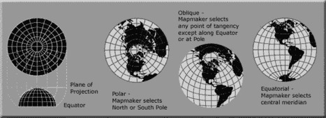
A map projection is used to portray all or part of the round Earth on a flat surface. This cannot be done without some distortion. Every projection has its own set of advantages and disadvantages. There is no "best" projection. The mapmaker must select the one best suited to the needs, reducing distortion of the most important features. Mapmakers and mathematicians have devised almost limitless ways to project the image of the globe onto paper. Scientists at the U. S. Geological Survey have designed projections for their specific needs—such as the Space Oblique Mercator, which allows mapping from satellites with little or no distortion. This document gives the key properties, characteristics, and preferred uses of many historically important projections and of those frequently used by mapmakers today.

Carlee Allen's curator insight,
March 26, 2015 6:58 PM
This article explains and talks about 18 specific map projections. It gives a lot of detail about all of them, and describes the disadvantages and uses for all of them.
I thought that this was interesting because I learned more about map projections, and actually how people use them. 
Leah Hood's curator insight,
August 22, 2017 5:02 PM
This article chronicles 18 map projections, how they are mathematically rendered with their own unique set of advantages and disadvantages. Questions to Ponder: Why do map projections matter? Is one global map projection inherently better than the rest? What is your favorite? Tags: Mapping, visualization, map projections, cartography, perspective.

"Revolution and rotation are the terms we use to describe the motions of the earth and moon. Revolution is the movement of the earth in an orbit around the sun. The Earth completes one revolution around the sun every 365 days. The moon revolves around the Earth about once every month." Via Mike Busarello's Digital Storybooks

Barbara Goebel's curator insight,
December 23, 2014 10:41 AM
Writing prompt: Specify a set of objects to put in motion, have them observe the interactions of the objects, then write to describe. For younger students, supply an observation organizer note sheet. For older students, the descriptions can be as technical as their math understanding will allow. 
Jason Schneider's curator insight,
January 28, 2015 9:06 PM
It's pretty simple, the bigger the particle is, the bigger it's atmosphere is to allow more gravity. For example, Jupiter is the largest planet which is in favor to Earth. The reason why is because Jupiter uses it's large mass to protect Earth from oncoming meteors and comets. It uses it's large atmosphere to absorb comets and meteors onto Jupiter instead of allowing them to crash onto Earth.

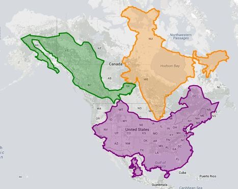
"Most state borders were drawn centuries ago, long before the country was fully settled, and often the lines were drawn somewhat arbitrarily, to coincide with topography or latitude and longitude lines that today have little to do with population numbers. Most state borders were drawn centuries ago, long before the country was fully settled, and often the lines were drawn somewhat arbitrarily, to coincide with topography or latitude and longitude lines that today have little to do with population numbers." Tags: cartography, mapping, visualization, regions, gerrymandering, political, mapping, census, density.
|
The graphic above (Voronoi diagram) represents the relative size of each country’s economy in terms of nominal GDP: the larger the area, the larger the size of the economy. The areas are further divided into three sectors: services, industrial, and agricultural. The US economy is mostly composed of companies engaged in providing services (79.7% compared to the global average of 63.6%), while agriculture and industry make up smaller-than-average of portions of the economy (1.12% and 19.1% compared to averages of 5.9% and 30.5%).
Tags: globalization, industry, economic, visualization. Via Courtney Barrowman
Ivan Ius's curator insight,
March 4, 2016 10:18 AM
Geographic Thinking Concepts: Patterns & Trends; Interrelationships

PIRatE Lab's curator insight,
December 10, 2016 10:30 AM
Another example is the long line of defining the new geography.

Boris Limpopo's curator insight,
December 11, 2016 1:43 AM
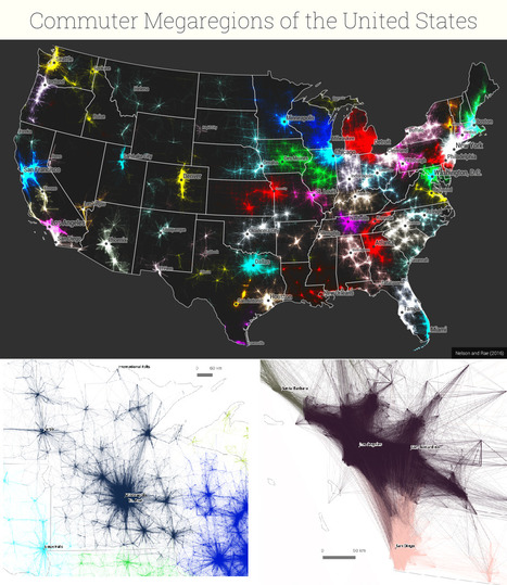
Le macroregioni americane con i dati del pendolarismo
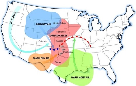
Interested in learning about tornado alley? Then you'll want to read our tornado alley facts and information. Tornado Alley 101 Via GTANSW & ACT
"Google rolled out its new Maps design...from a navigational tool to a commercial interface and offers the clearest proof yet that the geographic web—despite its aspirations to universality—is a deeply subjective entity."
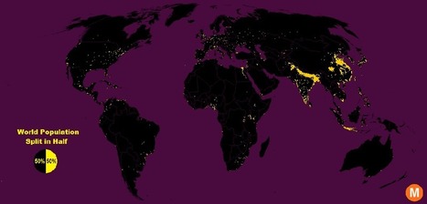
"Data viz extraordinaire Max Galka created this map using NASA’s gridded population data, which counts the global population within each nine-square-mile patch of Earth, instead of within each each district, state, or country border. Out of the 28 million total cells, the ones with a population over 8,000 are colored in yellow."
Tags: population, density, mapping, visualization. Via Clairelouise, Mike Busarello's Digital Storybooks

Brian Weekley's curator insight,
July 27, 2016 10:47 AM
Great simple map of world population. Scroll down and look at the U.S. It reflects the global trend. This also has political implications, as evidenced by voting patterns in the 2012 presidential election. Elections are dependent upon votes, which come from people, which are primarily clustered in cities. Election campaigns would use this data to plan their schedules as to where to focus their campaigning efforts. For the folks in Wyoming, they rarely see candidates other than during the primaries. And these world populationclusters have been relatively consistent historically, particularly in south and east Asia. Northern India has serious carrying capacity challenges. Notice the clusters along the Nile- evidence of arable land.
From
www

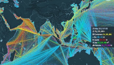
"Ships carry 11 billion tons of goods each year. This interactive map shows where they all go. About 11 billion tons of stuff gets carried around the world every year by large ships. Clothes, flat-screen TVs, grain, cars, oil — transporting these goods from port to port is what makes the global economy go 'round. And now there's a great way to visualize this entire process, through this stunning interactive map from the UCL Energy Institute."

Caitlyn Scott's curator insight,
June 14, 2016 10:25 PM
This resource shows great detail into where are products travel when they are imported but also shows us what and where Australian products are going. Good source in regards to showing how large Australia's export market is. Article contains a good amount of information as to why the routes shown on the map are taken as well as having in-depth data showing the different cargo on board ships. This data helps high light what different countries are renowned for in their exports as well as giving so information into why some countries are poorer than others when analysing their exports. Planned use within unit regarding the cost of Australian exports and its sustainability for the future.

James Piccolino's curator insight,
January 18, 2018 7:35 PM
This is incredibly interesting. I am a History guy, I love the subject and I love finding things I did not know about it. This fun interactive map did not so much contribute to direct knowledge of shipping/trade history as much as it has sparked my interest in it. There are old trade routes, who traveled down them and with what, and the ways those trade routes changed civilization and even sometimes started new ones. I never expected to say the words "Wow trade routes are fun!" but here I am. By the way, if you turn on absolutely everything at once, it creates this beautiful image. It is almost oddly relaxing. Sort of in the way some paintings can be.

A walkable map of the world, made from soil and stone by one man

Ian Fairhurst's curator insight,
November 26, 2015 4:02 PM
One for our Master Plan STEM Unit..... a walkable map of the Earth 
Maricarmen Husson's curator insight,
November 26, 2015 5:35 PM
Un mapa del mundo hecho con suelo y piedras.

Explore the popularity of some of the world’s favourite foods on Instagram. Discover Instagram’s capital of curry, which cities are big on burgers, and where pulled pork is most prolific. Via Michael Miller
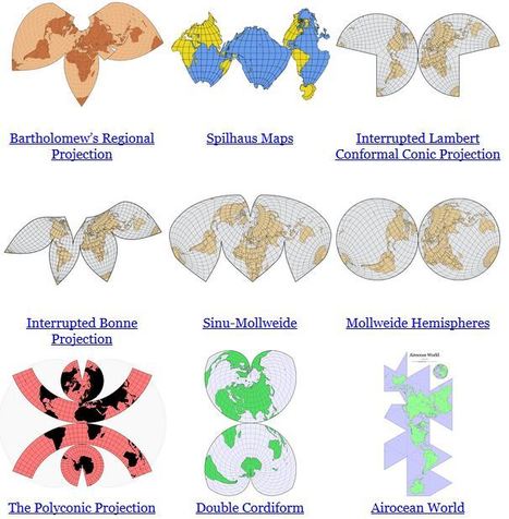
"In some ways, all 2D maps of Earth are interrupted at some point, even if it’s just along the antimeridian at 180°. Interruptions are often in areas of less interest e.g. oceans for a land-focused map." Via Tony Hall

Alex Smiga's curator insight,
September 7, 2015 4:23 PM
Seth Dixon's insight:
No screenshot could do justice to this animation. It transforms a map of the world from one map projection to another, and in the 5 second interval it 'spins the globe' to give you a sense of the the spatial distortions inherent in all projections. This is but one of the many visualizations fromJason Davies mapping project. 
Vincent Lahondère's curator insight,
January 4, 2018 5:42 PM
Un site qui permet de visualiser les principales projections cartographiques
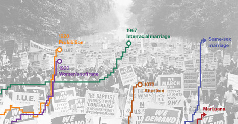
Eleven years after Massachusetts became the first state to allow same-sex couples to marry, the Supreme Court on April 28 will hear arguments about whether to extend that right nationwide. The case comes amid a wave of gay marriage legalization: 28 states since 2013, and 36 overall. Such widespread acceptance in a short amount of time isn't a phenomenon unique to gay marriage. Social change in the U.S. appears to follow a pattern: A few pioneer states get out front before the others, and then a key event—often a court decision or a grassroots campaign reaching maturity—triggers a rush of state activity that ultimately leads to a change in federal law.

Rich Schultz's curator insight,
February 11, 2015 11:27 AM
Would an inverted Peters projection "freak you out"? 
Tiani Page's curator insight,
April 27, 2015 11:51 PM
As part of geography education we are required to teach students about different map projections and the rationale for these. This little video puts it quite well. 
Adelaide Parkin's comment,
September 7, 2016 8:52 PM
This is an engaging and funny clip! It is a great resource that could be used in a lessons introduction! for myself i love finding funny little clips that relate to a topic to play at the start of a lesson and then explain to the students what the topic is! Great resource i will be saving for later
World Religions Christianity Islam Judaism Hinduism Sikhism Budhism Spread of Religions by time from 3000 BC to 2000 AD. Discover the origin of religions Per... Via Suvi Salo

Elle Reagan's curator insight,
March 22, 2015 3:17 PM
This was a nice video of good length that allowed me to see how the world is broke up into different regions. I know that religion is a main factor of how places are divided and so I thought this video was a nice visualization of that. The map with the timeline was nice to have and I liked how it gave us an estimate of how many people are following each religion today. The video also helped me see how religion can be a main factor in defining world regions. 
Jacqueline Garcia pd1's curator insight,
March 22, 2015 3:26 PM
In this video we are able to see the growth and fall of religions. It was quite fascinating to see the number of people in each religion and where in the world the spread. I thought it was helpful to see the dates of events that either caused spread or destruction of religions . For example the birth of Muhammad and the Crusades. THis shows the spatial distribution of religion. 
Ryan Tibari's curator insight,
May 27, 2015 9:58 AM
This video puts world religions in a more basic form. Shows the patterns that religions take on a global scale, outlining the most prominent and least prominent throughout the world. |


The World Economic Forum noted that some spatial research that was originally published in Nature, shows how geneticists took DNA samples from people of different cultures in different parts of the world to track their dispersal throughout the globe. The video uses climatic data, combined with the genetic data, to create a model showing how the human race spread across the globe over a 125,000 year period.
Tags: diffusion, demographics, mapping, migration, population, historical, video, visualization.