

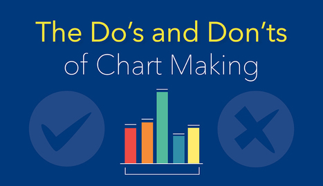

A guide to creating accurate and effective charts and graphs, with a checklist of the most common errors and how to avoid them.
Via Baiba Svenca
Get Started for FREE
Sign up with Facebook Sign up with X
I don't have a Facebook or a X account


 Your new post is loading...
 Your new post is loading...
Your new post is loading...
A guide to creating accurate and effective charts and graphs, with a checklist of the most common errors and how to avoid them. Via Baiba Svenca 

Jim George's curator insight,
September 1, 2016 9:59 AM
Some excellent tips to spruce up the old visuals!

La pluma digital's curator insight,
October 31, 2016 10:12 AM
Una guía para elaborar gráficos no solo fáciles de leer, sino también atractivos para el usuario.

Lilydale High School's curator insight,
December 28, 2016 5:53 AM
Chart making.
Sign up to comment
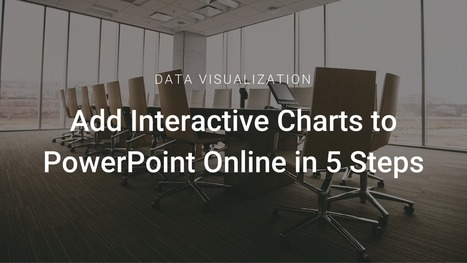
Adding data to PowerPoint isn’t as easy as it sounds. Let’s go over how to add interactive Infogram charts to PowerPoint Online in 5 easy steps:
Via Baiba Svenca
"Through the Free Technology for Teachers Facebook page I recently received a request for some suggested online chart creation tools..." Via Baiba Svenca

Gust MEES's curator insight,
February 11, 2015 11:13 AM
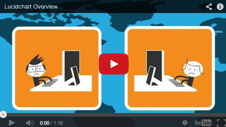
Lucidchart is an easy tool to use to create flowcharts, mindmaps, and graphic organizers. Lucidchart offers a simple drag and drop interface for creating flow charts, organizational charts, mind maps, and other types of diagrams. To create with Lucidchart just select elements from the menus and drag them to the canvas. You can re-size any element and type text within elements on your chart. Arrows and connecting lines can be re-sized, repositioned, and labeled to bring clarity to your diagrams. Find out more tools by visiting the article...
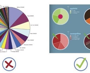
When it comes to visualizing data, it’s important to pick the right graph and the right kind of data range. Make it too detailed, and information gets lost and the reader leaves confused. Too simplified, and your data’s integrity is weakened.
Choosing the right infographic element shouldn’t be an art but common sense. After all, it’s an infographic – readers should get the gist of things at first glance and not have to get crossed-eyed in making sense of things... Via Lauren Moss

Lauren Moss's curator insight,
April 10, 2013 6:55 AM
General reference for basic visualization design elements, applications, and best practices...
From simple charts to complex maps and infographics, Brian Suda's round-up of the best – and mostly free – tools has everything you need to bring your data to life... A common question is how to get started with data visualisations. Beyond following blogs, you need to practice – and to practice, you need to understand the tools available. In this article, get introduced to 20 different tools for creating visualisations... Via Lauren Moss, Baiba Svenca

Randy Rebman's curator insight,
January 28, 2013 12:33 PM
This looks like it might be a good source for integrating infographics into the classroom. |
A guide to creating accurate and effective charts and graphs, with a checklist of the most common errors and how to avoid them. Via Baiba Svenca
Jim George's curator insight,
September 1, 2016 9:59 AM
Some excellent tips to spruce up the old visuals!
La pluma digital's curator insight,
October 31, 2016 10:12 AM
Una guía para elaborar gráficos no solo fáciles de leer, sino también atractivos para el usuario.
'In our Data Visualization 101 series, we cover each chart type to help you sharpen your data visualization skills. Bar charts are a highly versatile way to visually communicate data. Decidedly straightforward, they can convey the message behind the numbers with impact and meaningful clarity, making complex data easy to understand at a glance.' Via Lauren Moss, Jim Lerman

Polychart is a free web service that lets you easily create Dashboards and charts from your existing database. It conveniently connects directly to where you store your data and works in browsers and on tablets so you can create charts and diagrams anywhere you are. You can also export your charts to PowerPoint, PDF and image formats. Via Baiba Svenca

Baiba Svenca's curator insight,
June 21, 2013 4:21 PM
Read the review of Polychart which is a tool that lets you create and customize charts from your own data. Export your charts to PowerPoint, download as image or PDF. Watch the demo video that explains how to use Polychart https://www.polychart.com/ 
Lynn M. Miller's curator insight,
June 22, 2013 12:15 PM
Great article! *Professionalism with a Flair! #lmallc 
Wayne Turner's curator insight,
June 23, 2013 11:08 AM
I'm always looking for ways to graphically present complex information.
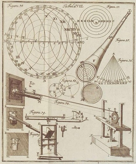
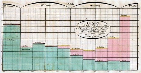
Graphics, charts, diagrams and visual data representations have been published on books, newspapers and magazines since they've existed, not to mention old maps and scientific illustrations...
Despite the lack of tools such as the ones we have at our disposal nowadays, they are as inspiring and important as the best contemporary visualizations. Visit the article link for a gallery of vintage visualizations... Via Lauren Moss

Charlley Luz's curator insight,
July 20, 2013 10:26 AM
muito legal, os Infográficos antes de existir a internet. 35 exemplos de infográficos no papel :) Achei falta do Marcha para Moscou do Minard http://www.datavis.ca/gallery/re-minard.php ; 
Leoncio Lopez-Ocon's curator insight,
July 20, 2013 2:57 PM
El brasileño Tiago Veloso, fundador de Visual Loop, nos ofrece 35 interesantísimas representaciones visuales de distintos fenómenos y eventos que permiten hacer un paseo por la historia de la ilustración científica.
Registration required, free to use. -JL
Robin Good: This has got to be a dream come true.
Create professionally-looking interactive graph charts (and soon also full infographics) with the best tool and easiest interface available out there.
Infogr.am makes it as easy as it can possibly be the creation of charts that will always look great and effective no matter what your design skill level is.
You simply choose the type of graph you want (bar, line, pie, matrix) to create, edit the existing data with your own, and you are ready to go.
Each chart is designed following some basic information design principles, allowing data to be easily read and for the chart to look very credible and "professional".
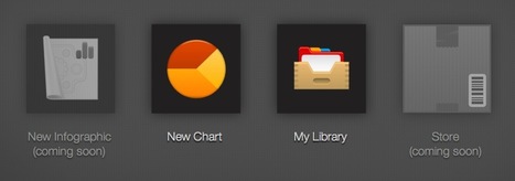
Infogram integrates an online library where to save your completed work, and an upcoming online store.
Awesome. 10/10 Via Robin Good
|


