Into the Driver's Seat
453.9K views | +12 today
Follow
Into the Driver's Seat
Building learners' independence through thoughtful technology use
Curated by Jim Lerman
Your new post is loading...
Scooped by Jim Lerman
Scoop.it!

Mapping the World's Migration Flows

Mapping the World's Migration Flows | Into the Driver's Seat | Scoop.it
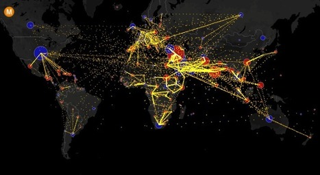
Visualizing the flow of the world's migrants from country to country.


Based on data from the U.N. Population Division, this map shows the estimated net migration (inflows minus outflows) by origin and destination country between 2010 and 2015.

Blue circles = positive net migration (more inflows). Red circles = negative net migration (more outflows). Each yellow dot represents 1,000 people.

Hover over a circle to see that country’s total net migration between 2010 and 2015. Click a circle to view only the migration flows in and out of that country.

For more info about this map, read the article, All the World’s Immigration Visualized in 1 Map.


Tags: migration, USA, mapping, population, unit 2 population.

Ivan Ius's curator insight, December 13, 2016 8:33 PM
Geography Concept Focus: Patterns and Trends
Leah Goyer's curator insight, December 14, 2016 1:30 PM
What a fascinating view.
GTANSW & ACT's curator insight, December 17, 2016 11:46 PM

Migration at a global scale changes places 


Syllabus

Students investigate reasons for and effects of internal migration in Australia and another country, for example: 

  • analysis of trends in temporary and permanent internal migration
  • discussion of economic, social or environmental consequences of internal migration on places of origin and destination

Students investigate the reasons for and effects of international migration to Australia, for example: 

  • analysis of international migration patterns 
  • explanation of where and why international migrants settle within Australia 
  • examination of characteristics and spatial patterns of Australia’s cultural diversity 

Geoworld 9 NSW
Chapter 8: Migration changes Australia and the USA

8.1 Migration: people own the move

8.2 Australia: destination nation

8.3 Where do immigrants settle

8.4 Culturally diverse australia: trends in migration


8.8 Australians are mobile people

8.9 Mobile indigenous populations

8.19 Lifestyle migration

8.11 The power of resources: the Pilbara

8.12 Migration changes the USA

Geothink 

Rescooped by Jim Lerman from :: The 4th Era ::
Scoop.it!

Oldest and Youngest Populations

Oldest and Youngest Populations | Into the Driver's Seat | Scoop.it

"There are 1.2 billion people between the ages of 15 and 24 in the world today — and that means that many countries have populations younger than ever before.  Some believe that this 'youth bulge' helps fuel social unrest — particularly when combined with high levels of youth unemployment.  Youth unemployment is a 'global time bomb,' as long as today’s millennials remain 'hampered by weak economies, discrimination, and inequality of opportunity.'  The world’s 15 youngest countries are all in Africa.  Of the continent’s 200 million young people, about 75 million are unemployed.

On the flip side, an aging population presents a different set of problems: Japan and Germany are tied for the world’s oldest countries, with median ages of 46.1. Germany’s declining birth rate might mean that its population will decrease by 19 percent, shrinking to 66 million by 2060. An aging population has a huge economic impact: in Germany, it has meant a labor shortage, leaving jobs unfilled."

Brian Wilk's curator insight, March 23, 2015 7:08 PM

Demographics seemingly started with age as a metric many years ago and have evolved into marketing tools, political footballs, and ways to combat everything from obesity to social security. Africa is clearly the youngest and probably for a very morbid reason; AIDS and Ebola among other diseases have taken their toll on the sexually active and thus have reduced the average age of their population.

Germany seems to be the place to go for a job as the labor shortage will mean higher wages for the folks who are left. Japan has another issue; a healthy aging population that will strain the government's ability to financially take care of them.

I wonder if the unevenness of Europe is an indication of the two World wars that were fought mostly on the turf. Did some countries lose more than others? If more soldiers, presumably of baby making age, perished did this affect the countries ability to keep pace with the Germany's and Spain's of Europe?

Diet seems to play a large part as well as the Mediterranean is well represented in terms of age. Does their healthy diet of fish, nuts, legumes and olive oil make a difference?

I could spend all day postulating, but I'll leave some of the findings for you to discover...

Deanna Metz's curator insight, March 1, 2016 8:05 PM

The median age of a population call be a quite telling statistic--almost a surrogate for a population pyramid.  I post this with a special attention to Sub-Saharan Africa; the youngest 15 countries in the world are all in Africa, one of the major demographic realities confronting African economies and politics.  Here is a map with the median age of U.S. counties.


Tag: population, demographic transition model, population pyramids.

Olivia Campanella's curator insight, October 31, 2018 11:55 AM
In the article there are 1.2 billion people between the ages of 15 and 24 in the world today. Meaning that, countries around the world have populations younger than ever! 15 of the youngest countries are in Africa. And of the 200 million young people of Africa, about 75 million are unemployed. The worlds youngest country is Niger with a population and median age of 15.1 and coming in a close second is Uganda with 15.5, but Japan and Germany are some of the Worlds oldest countries ranging in a median age of 46.1!