
Infographics blog covering infographics, data visualization and visual thinking. Charts and graphs communicate data, infographics turn data into information.
Get Started for FREE
Sign up with Facebook Sign up with X
I don't have a Facebook or a X account

 Your new post is loading...

|
Scooped by Brian Yanish - MarketingHits.com |
Infographics blog covering infographics, data visualization and visual thinking. Charts and graphs communicate data, infographics turn data into information.
|
|
Scooped by Brian Yanish - MarketingHits.com from visual data |
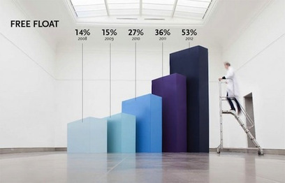
Belgian studio Coming Soon is all about making it big. Their Hand Lettering creations filled a giant chalkboard with letters in a variety of fonts and styles. And with Infographics XXXL, they’ve taken actual graphs and blown them up to a huge size for a client that specializes in the research of nanobodies.
The result is that, instead of casually glancing at the same old pie chart or bar graph, shareholders have something to keep their gaze on the numbers, like a blurry scientist walking by human-size bars or holding up a literal piece of the pie.
See a selection of Coming Soon’s giant infographics at the article link.
|
|
Scooped by Brian Yanish - MarketingHits.com from visual data |
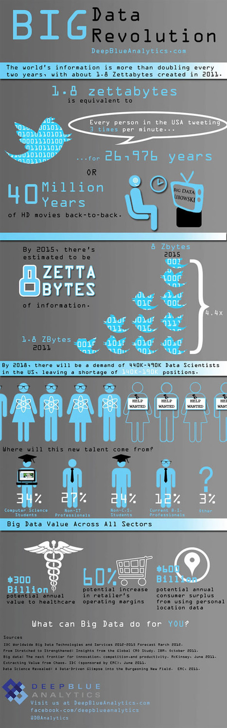
Is Big Data still a big mystery to you?
In recent years, the volume of information coming into companies has exploded, so that many IT organizations are dealing with extremely large sets of data.
IT leaders are rethinking many aspects of how they manage and deliver information, from investments in infrastructure and analytics tools to new policies for organizing and accessing data so they can deliver more of it, faster. They are concerned that if they don't have the right tools and architectures to deal with all that information, then big data can be a big problem. Check out these infographics on Big Data to see the impact...
|
|
Scooped by Brian Yanish - MarketingHits.com from visual data |
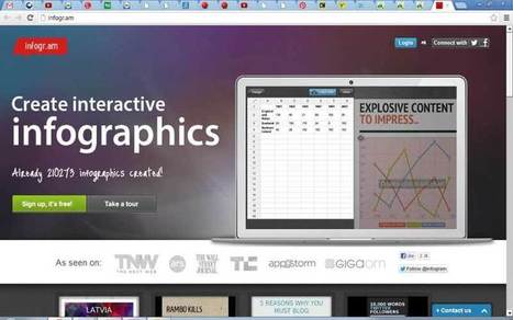
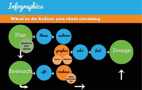
Want to create an attractive infographic but don’t have the budget to hire a professional designer?
Then you should try using an infographic-creation tool.
If your small business is looking for an eye-catching and easy to comprehend way to teach, inform, and inspire others about its products and services, infographics might be a good solution. Infographics can be more effective and memorable than other ways to present data, making them particularly effective for online audiences.
To create an infographic, you should make a list of possible ideas that you want to get across, create the initial draft or skeleton, color scheme it, and research your content from authoritative sites. Then it’s time to select your design platform.
Read about three online tools that can help you create stunning infographics...
|
|
Scooped by Brian Yanish - MarketingHits.com from visual data |

Let’s be honest, we don’t like to read big pieces of text. Text-heavy graphs are rather difficult for understanding, especially when dealing with numbers and statistics. That is why illustrations and flowcharts are often used for such kind of information.
An infographic, or a visual representation of study or data, like anything else, can be done right or wrong. How to create a successful infographic? A good idea and a good design.
Stop by the link for more on what defines an infographic, what contributes to its popularity, as well as the various types of infographics and references for tutorials and best practices.
Additional topics covered include:
|
|
Scooped by Brian Yanish - MarketingHits.com from visualizing social media |
![What The Social Media Ecosystem Looks Like Right Now [Infographics] | MarketingHits | Scoop.it](https://img.scoop.it/aeODM-eUZYOY0CoP0nrhLTl72eJkfbmt4t8yenImKBVvK0kTmF0xjctABnaLJIm9)
The social media landscape is anything but constant — it seems like the ecosystem is changing daily...
This infographic shows what the social media landscape looks like right now. Unlike the famously viral LUMAscape depiction that crowds every single social media company into one infographic, this is a simpler visual of how things work "from customer service and R&D to HR and marketing."
The key question that brands have when planning and then analyzing social media campaigns is how to measure the impact that every dollar spent on paid social media has on the value their owned and earned social media.
An additional infographic analyzes the interaction of these three forms of social media, explaining:
"The high level analysis for media effectiveness takes all of earned and owned divided by paid. Earned is all the impressions generated divided by average CPM, owned includes all channels, and paid is the overall media spend. The higher the ratio, the more earned amplification is generated from paid."


