 Your new post is loading...
The surest way to stifle an idea is to write a long-winded presentation deck about it. PowerPoint, Keynote, and Prezi are powerful tools, but the power comes in how they’re used. A weighty presentation deck can get in the way of the idea itself. The classic Mark Twain quote applies equally when writing a presentation — “I didn’t have time to write a short letter, so I wrote a long one instead.” Born out venture capital work as a recipient of many of PowerPoint deck, Guy Kawasaki has been advocating the 10/20/30 Rule for a decade.
A common myth suggests that great presentations are an art form. While some of the world’s best presenters are certainly artists, we know that their presentations obey the kind of narrative structure that allows even novice public speakers the opportunity to deliver great presentations. So, What is Narrative Structure?Well, that depends on the industry, because narrative structure is important in every profession. While different definitions exist, they all point to the “structural framework” of how an idea or story is presented to an audience. The reliance on structure in a narrative underlines just how attainable great, engaging presentations are. Because if we can show how those are built (e.g. the skeleton), then all that’s left is adding the muscle, or content, and delivering it according to the narrative structure. The other key element in the narrative structure definition is the idea or story. Without the idea or story, there is no narrative to structure. So we really want to lean on storytelling as a way to engage our audience, and for a good reason....
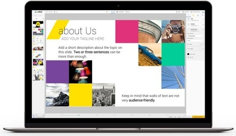
The web is full of beautiful ideas and services. Ludus is the first one to provide an easy way to gather them all in a single place.
Via Baiba Svenca
Beware if you are still creating slides full of bullet points! Very soon, you will find audiences leave the hall in disgust or hold a placard in protest “No Bullet Points, Please.” Already you will find them moan in pain as soon as they see a bullet-ridden slide. That’s not surprising. The audiences are intelligent enough to know what will follow that boring slide on screen: a far boring talk with presenter reading the slides and audience figuring out whether to listen to the presenter or read the slides. Such is the bullet-point terror in the presentation world that cognitive psychologist Chris Atherton writes, “Bullets don't kill, bullet points do.” What are you supposed to do as a presenter then? All presentation experts will advise you to keep 1 message per slide. So if you have 6 bullet points on a slide, you can simply make 6 slides and save the audience a headache. But what if you do not want to follow this advice. What if you wish to keep those 6 bullet points on your slide. Perhaps you are not presenting your slides on a stage. You want to send the presentation as an attachment to one of your prospective clients. You would therefore need descriptive slides in such instances. Or maybe you have a slide full of steps and you do not wish the break the process into multiple slides that’ll make it complicated for you as well as the reader. What to do then?...
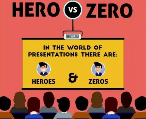
To pull off a KILLER presentation you need to: - Think creatively ... no more lazy bullet points
- Use tools and shortcuts so you can spend your time on the important stuff
- Create clean and captivating slides that appeal to people's emotions
In other words, you need to be a presentation HERO. Here's how to be one ...
A list of creative ways to captivate your audience, from using props and asking thought-provoking questions to telling stories and sharing personal anecdotes.
Via Baiba Svenca
Niftio is a web-based presentation app which provides the user with a library of professionally-looking templates, photos, shapes and charts, that can be fully edited and customized and with a set of easy-to-use functions that make presentation-building much easier and faster to execute. Presentations can be easily shared or downloaded in HTML5 or PDF formats, and during live presentations you can also remote control the playback of your presentation from any device, check your notes and keep track of how much time you have left. Finally Niftio allows the viewers of your presentations to send you feedback and comments, and it provides full analytics stats for your published slideshows. Free version. My comment: Excellent alternative to traditional presentation tools, it offers great templates and visual resources and nifty tools for public presenters that do make a difference.Try it out now: http://app.niftio.com
We all know the basics of good presentation skills: don’t read from a script; don’t overwhelm your audience with verbose slides; and the like. But for a particular kind of high-stakes presentation — one in which you’re trying to get buy-in from key decision-makers — those basics aren’t enough. To persuade the people who have the power to approve your idea or let it die, you need to start with a strong outline. Here are the questions to ask yourself so you can structure a presentation, from the outset, that defuses potential objections upfront and is so compelling a “yes” becomes far more likely....
The best designers in the world are not only known for their amazing designs, but also for their inspirational and motivational quotes about design.
Many of the lessons they teach can, unsurprisingly, be directly related to PowerPoint design!
If you need some inspiration and guidance for your next PowerPoint presentation, look no further:
We have compiled a list of 20 of the BEST inspirational quotes about design that relate directly to PowerPoint.
After each designer’s quote, we’ve given a short explanation of how it relates to your presentation, and what you can do to make it amazing....
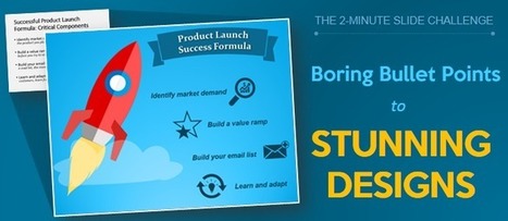
Bullet Points is just pure laziness. Lists are not meant for a slide. 2 minutes are all you need to transform a list to a creative slide!
Via Baiba Svenca
Understand the presentation secrets to creating engaging webinars that will have your audience glued to their screens. These webinar presentation tips will help
Via Baiba Svenca
Forget about PowerPoints with voice-over — that's old school. These "new school" apps can help you engage your students while they're learning from your lectures.
Via Ana Cristina Pratas
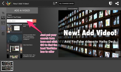
Haiku Deck lets you search for and embed YouTube video, making it faster and easier than ever before to create dynamic and creative multimedia presentations
Via Baiba Svenca
|
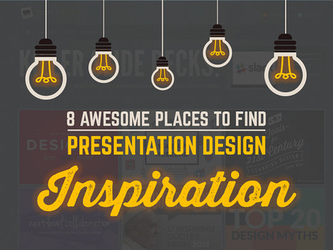
In this list we're sharing some of our favorite websites that offer free resources for presentation design such as templates, icons, images, fonts and more.
Via Baiba Svenca
Free pattern backgrounds that you can create yourself in PowerPoint. Use geometric pattern background and abstract pattern backgrounds for amazing designs!
Via Baiba Svenca
A snoozer slide deck can tank the best presentation no matter how strong your message. By including a short video in your slide deck, you can both clarify key points and spark an emotional response in your audience. Here are three ways to add video to a Google Slide.
We, the digital natives, are visual learners. We prefer to watch a video tutorial rather than go through a PDF document, prefer an infographic over a bullet-point article and a picture quote over a text quote. Several sources claim that the human brain processes visual information 60,000 times faster than text. Studies prove our visual memory is also far superior to auditory one. We are able to recall only 10-20% of a spoken lecture but 65% if the lecture is visual and verbal.
These claims become all the more worthy of our attention if the reports of human attention span shrinking to just 8 seconds- below that of goldfish- are true. What does this mean for your presentations? Make the most of the power of visuals!
Wait, you must be asking “Where do I put all the text?”. First of all, try to brutally cut down the word count on your slide. Keep ONLY the most important words on the slide (we have to free up space for visuals!). Now what? Now, get ready to turn those slides into a visual masterpiece with these 11 hacks
Learn how to create professional PowerPoint Templates using Slide Master in PowerPoint. Use these PPT templates for business presentations or personal use.
Via Baiba Svenca
Giving a presentation is an enormous and (sometimes) noble responsibility. After all, only you can prevent death by PowerPoint to your audience. Fortunately, several tips, tools and other resources can help you make slides to a higher level and make them more professional and captivating. We focus on PowerPoint for most models and additions down, simply because it is the most widely used business presentation software, but many principles and tricks here apply to other applications presentation. We will begin.
PowerPoints are awful. Long and uninteresting, they are the corporate drone of visual media—synonymous with endless meetings, academic conferences, and corporate retreats. For graphic designers, however, slide-based presentations like PowerPoint are synonymous with "client decks," and they're necessary for pitching a design to a client or potential client. These are not your typical boardroom slide show presentations. They can be impeccably designed and visually engaging because, if done right, they'll persuade the client to go the direction the designer wants. Presentations can be a designer’s best tool for selling an idea. Admittedly, it’s not graphic designers' favorite part of the job, but there is a lot that others can learn from how they do it. We asked five designers from four top studios and agencies for tips on creating slide-based presentations—whether on PowerPoint, Keynote, or some other program....
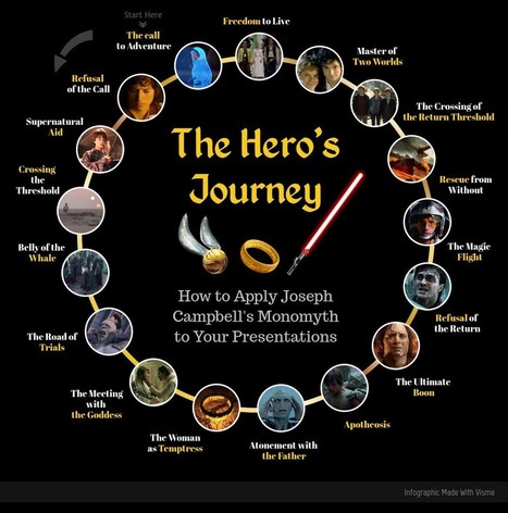
Have you ever gotten a sense of déjà vu while reading a book or watching a movie that’s otherwise totally new to you? Obviously you have— so many stories are built on the same foundations of archetypes and tropes. Stripped of complexities, all stories are basically the same: an individual ventures into the unknown to acquire something they desire.
That’s not a new idea— Joseph Campbell broke the door down in 1949 with his book, The Hero With a Thousand Faces. Odysseus, Christ, Captain Ahab, Gautama Buddha, Jane Eyre, Luke Skywalker… different names and faces, different times and places, but all the same story. Not only that, the same effective story. What Campbell called “The Hero’s Journey” has resonated with humanity for millennia, and is the root for so many stories that we cherish.
So why wouldn’t this apply to public speaking? Any muttonhead can tell you that good speeches tell a story. This infographic will show you exactly how Campbell’s 17 Steps can lead to storytelling success. It doesn’t matter if you want to discuss Martin Luther King’s march to Selma, why you deserve a raise, or Walking Dead plot summaries. The Hero’s Journey can apply to almost any presentation.
Via David Hain, Jeff Domansky
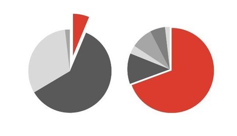
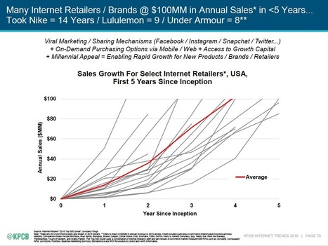
People are usually surprised to hear that I don’t have a problem with Mary Meeker’s huge, yet very unattractive, annual deck of slides. People come out of the woodwork each time it’s released asking me to make them over. Last year, one Paris designer did just that. But dolling up her data took away some of the meaning. For me, the usefulness of how she collected and ordered the information trumps the need to finesse the design of her charts. (Instead of redesigning Meeker's slides, we chose instead to focus on one data visualization problem child: pie charts. Meeker's deck doesn’t have many pie charts, but all of them warranted commentary....
Mary Meeker’s annual Internet Trends Report for Kleiner Perkins is a comprehensive and provocative collection of data about technology change. It’s also the most cluttered, visually jumbled 213-slide pileup in the history of PowerPoint. Reading this deck is like walking through a construction site in which the Hell’s Angels are putting on three simultaneous Cirque de Soleil shows during a Green Day concert. In a snowstorm. While it’s arguable whether there is a unifying intellectual concept here, one thing is completely clear: there is no unifying design concept (unless you count the wordy, telegraphic headings on each slide). Just as you can learn from Meeker’s trend insights, you can also learn from her design disasters. As you look at these slides, ask yourself two questions: - In a quick glance, what main idea jumps out from the slide? If I study the slide further, does it reveal more information? - In too many cases here, the answer to the first question is “Gee, I dunno,” and the answer to the second is “Ouch, I am getting a headache.”...
PowerPoint 2013 has some amazing features that are no less than those offered by Photoshop and other image editing softwares. One such effect that I love the most personally is the ‘Merge Shapes’ feature that lets you create breathtaking effects. One such effect (we gave it away in the the banner image of this post) is the splitting of an image into multiple pieces that serves a very unique function- it interrupts your gaze at the picture at every intersection but still gives you a complete picture at a glance. This grabs the viewer’s attention and forces them to read into each element of the image. The image and the slide as a whole get imprinted on the audience’s mind which is everything a presenter can ask for. This article will guide you step-by-step how to create this split image effect. When you work with us side by side on PowerPoint 2013, you’ll end up with exactly this design:
Via Baiba Svenca
|


![15 Ways to Turn a Very Text-Heavy, Bullet-Ridden Slide into Amazing! [Presentation Hackathon Part 3] | Public Relations & Social Marketing Insight | Scoop.it](https://img.scoop.it/Q9NvKGxsTYqCEJkhpEq5Vzl72eJkfbmt4t8yenImKBVvK0kTmF0xjctABnaLJIm9)


![Turn Boring PowerPoint Slides into Visual Masterpieces using these 11 Image Hacks [Presentation Hackathon Part 2] | Public Relations & Social Marketing Insight | Scoop.it](https://img.scoop.it/6XaR9jf1KN5H88Bnf66CFDl72eJkfbmt4t8yenImKBVvK0kTmF0xjctABnaLJIm9)


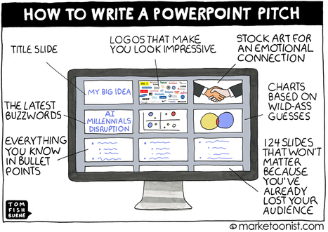
Don't let PowerPoint or Prezi squash your ideas and creativity reminds Tom Fishburne.