


You don’t need to be a good designer, public speaker, or writer to design a powerful PowerPoint presentation. Here are a few helpful tips!
Via Baiba Svenca
Get Started for FREE
Sign up with Facebook Sign up with X
I don't have a Facebook or a X account


 Your new post is loading...
 Your new post is loading...
Your new post is loading...
You don’t need to be a good designer, public speaker, or writer to design a powerful PowerPoint presentation. Here are a few helpful tips! Via Baiba Svenca
Jeff Domansky's insight:
Very useful design tips for better PowerPoint presentations. 
Prezi designs and creates presentation software that is enabling millions of people to be great presenters.Meet the 2015 Prezi Award winners!We’re delighted to announce the very best prezis of 2015. Prepare to be impressed. Prepare to be inspired....
Jeff Domansky's insight:
Best of 2015 are recommended viewing! 9/10
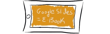
In a one-to-one school district, teachers have the freedom to create, curate, and share content like never before. Read more to find out how Google Slides can give you such liberty! Via Ana Cristina Pratas
Jeff Domansky's insight:
Here's a smart idea for creating interactive e-books using Google slides.

Campus Extens - UIB Virtual -'s curator insight,
May 31, 2016 3:47 AM
Aquest article presenta les característiques de l'eina i els passos a seguir per crear un llibre electrònic.

The problem with presentation design is often more about time than actual design. But you must take time in crafting stellar presentations. This might include building a template that you use for presentations or honing in your public speaking skills. Here, we’ll walk through a few ways to design a great presentation that will engage your audience. (While most of these tips are structured around creating a digital presentation, using software such as PowerPoint, the concepts can also be applied to posterboard style presentations as well.)
Jeff Domansky's insight:
Practical design tips to help you improve your visual presentations.

Lauren Heath's curator insight,
September 4, 2015 12:45 PM
I love this article because I enjoy making powerpoint for studying and now I'm having to make visual aids for speeches in my speech class and this was very informative in helping me create a appealing presentation.

When it comes to presentation design, for instance, there's no shortage of avenues you can take. And while all that choice -- colors, formats, visuals, fonts -- can feel liberating, it's important that you're careful in your selection as not all design combinations add up to success. We're not saying there's one right way to design your next PowerPoint presentation, but we are saying that some designs make more sense than others. To see some examples of the best PowerPoint presentation designs, check out the following decks....
Jeff Domansky's insight:
Check out these 20 examples of gorgeous PowerPoint presentation designs. Creativity with your coffee. Recommended viewing. 9/10

Philippe Hassel's curator insight,
August 25, 2015 9:41 AM
Indispensable, quoi qu'on en dise, Powerpoint n'est pas mort...
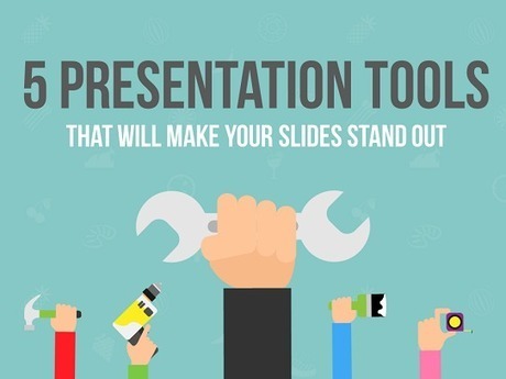
Lucky for you, there are tons of FREE PRESENTATION TOOLS at your disposal to enhance your slides and turn them from boring to awesome. Here at Presentation Panda, we’re all about finding clever hacks to pimp out your slides in record time. Whether it’s coming up with gorgeous backgrounds for your slides, selecting complimentary font styles, or innovating with screenshots and other images, it’s little things like this that will take your presentation from good to great. That’s why you’ll love these five presentation design tools: they’re free, easy to use, and will make your next presentation look fantastic.
Jeff Domansky's insight:
Presentation tools can make designing slides a heck of a lot easier. Here are 5 free tools for you to start using right now.

And what's worse than a boring presentation? Five, 10, or even 15 boring presentations. That's the fate clients subject themselves to during the new business process. And while you might think they deserve to be in this situation, it won't help you win the account. Don't be that agency that drives the client team over the edge with a PowerPoint presentation in 11-point Comic Sans text. Check out this SlideShare for a few tips on how to create presentations that don't suck....
Jeff Domansky's insight:
Review this SlideShare for best practices and tips on how to create a memorable presentation.
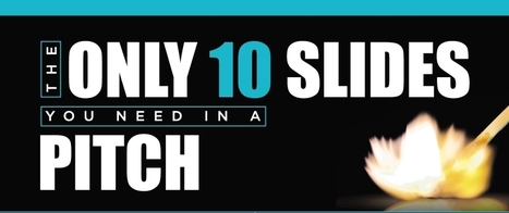
I am evangelizing the 10/20/30 Rule of PowerPoint. It’s quite simple: a pitch should have ten slides, last no more than twenty minutes, and contain no font smaller than thirty points.This rule is applicable for any presentation to reach agreement: for example, raising capital, making a sale, forming a partnership, etc....
Jeff Domansky's insight:
Amen! Recommended reading for speakers, marketers and PR. 10/10

No matter your topic, successful PowerPoints depend on three main factors: your command of PowerPoint's design tools, your attention to presentation processes, and your devotion to consistent style. Here are some simple tips to help you start mastering each of those factors, and don't forget to check out the additional resources at the bottom of this post....
Jeff Domansky's insight:
Improve your PowerPoint presentation skills with these PowerPoint creation and design tips and free templates.
Haiku Deck Picks for Decks of the Year It’s one of my favorite times — when we look back at the most inspiring presentations created in 2014 and select our favorites to be honored as Decks of the Year. Previous honorees and new ones, stylish decks and informative ones, beautiful Creative Commons images and custom collages — there’s a bit of everything in this year’s list, and we hope you’ll find something that inspires you....
Jeff Domansky's insight:
Inspiring case studies, tips, and presentation ideas to help you set your story free, from the Haiku Deck team and its creative community.
|
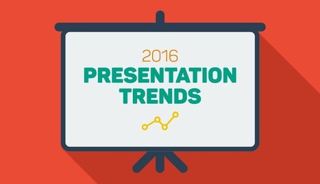
Each year, we see new trends surfacing in the world of presentation design. From passing fads to design standards that will endure beyond 2016, these trends will continue to shape the way presentations are created and delivered before boardrooms, classrooms or even TED audiences across the globe. While some of them may exist only for the sake of aesthetics, others have actually been adopted to suit the needs and preferences of modern-day consumers. For example, the use of flat design, many experts say, is more than just the latest craze; it responds to the fact that realist elements are very hard to incorporate into responsive systems designed for screens of all sizes. To keep you up to date with the latest design techniques, we’ve compiled a list of presentation design techniques that will help you create a presentation that looks fresh and contemporary–just like the content you will hopefully deliver to your audiences....
Jeff Domansky's insight:
10 presentation design techniques and trends that will help you create a presentation that looks fresh and contemporary.
Each year, we see new trends surfacing in the world of presentation design. From passing fads to design standards that will endure beyond 2016, these trends will continue to shape the way presentations are created and delivered before boardrooms, classrooms or even TED audiences across the globe. While some of them may exist only for the sake of aesthetics, others have actually been adopted to suit the needs and preferences of modern-day consumers. For example, the use of flat design, many experts say, is more than just the latest craze; it responds to the fact that realist elements are very hard to incorporate into responsive systems designed for screens of all sizes. To keep you up to date with the latest design techniques, we’ve compiled a list of presentation design techniques that will help you create a presentation that looks fresh and contemporary–just like the content you will hopefully deliver to your audiences....
Jeff Domansky's insight:
10 presentation design techniques and trends to create a presentation that looks fresh and contemporary.
Tufte writes, “Graphical excellence is that which gives to the viewer the greatest number of ideas in the shortest amount of time with the least ink in the smallest space.” These are words to live by for the slide designer. I thought I would share five lessons I’ve learned from Tufte over the years that could easily contribute to more effective presentations. While he emphasizes simplicity and clarity in his graphics, he focuses on the importance of balance and complete, accurate presentation of information. This allows the audience to form opinions and make informed decisions about what they see....
Jeff Domansky's insight:
Peter Khoury shares Powerpoint presentations Edward Tufte.
Every time I ask the question “what’s the most difficult part of writing a speech?” the answer is always the same. STARTING. Writing a presentation is inherent… Via Baiba Svenca
Jeff Domansky's insight:
A very creative design and useful presentation tips.

Baiba Svenca's curator insight,
August 21, 2015 2:08 PM
A beautiful presentation with carefully selected visuals about the most important principles in designing presentations.
Deliver interactive presentations that combine your PowerPoints and PDFs with video, web content, images and polls. Everyone participates from their own device, in person or remote, in real-time or in their own time. No need to download or install a thing. It just works. Via Baiba Svenca
Jeff Domansky's insight:
Cool tool worth exploring. Kind of a Swiss Army Knife of presentation tools. 9/10

aufaitLibrarian's curator insight,
August 23, 2015 8:53 PM
Looking forward to trying this out. Could be a handy alternative to Poll Everywhere as it doesn't appear to limit the number of participants. 
Richard Whiteside's curator insight,
August 24, 2015 9:25 AM
This looks like a great webinar / presentation tool. On first appearances it certainly seems to make Webex look very 'last century'!

Wideo is a neat service for creating animated, Common Craft style videos in your web browser. I've been using and talking about the service for a couple of years now. Recently, Wideo added a new feature that allows you to generate presentations from your videos. When you create a video in Wideo you do so by dragging and dropping clipart and text in storyboard frames. You set the position and animation sequence for each element in each storyboard frame. When you have completed your storyboards Wideo generates a video for you. The new presentation mode in Wideo will allow you to present each frame of your video independently just like in a slideshow....
Jeff Domansky's insight:
Richard Byrne shares a look at Wideo, a cool video and presentation tool priced very reasonably. Worth exploring. 9/10

flea palmer's curator insight,
June 2, 2015 5:08 AM
Create animated presentations quickly with a range of templates and icons, or you can upload your own. The free version limits you to a 45 sec. presentation.
Apart from the corporate world, presentations are used in education as well. Teachers use presentations to deliver information that is successfully incorporated with videos and pictures, thus grabbing the attention of the students and enriching the learning process along the way.While its hard to replace professional presentation designers, here is a list of some powerful tools that would help you to create interactive presentations in case of the absence of professional help..
Jeff Domansky's insight:
Here's a collection of excellent speaking and presentation tools. Recommended reading. 9/10

Gemma Shannon's curator insight,
March 16, 2015 8:49 AM
Great selection of tools for creating presentations including PowToon for creating animated videos. 
wanderingsalsero's curator insight,
March 17, 2015 8:41 AM
Nice info. I write for an MLM magazine and I'm going to spin this as a series. MLM'ers typically sit back and let their companies do everything for them (i.e. on the manner of tools). But in fact, most MLM company's tools suck BIG time.
They talk a lot about being hi-tech but very few are in the marketing sense. The big money earners are the ones who are pro-active and build their own systems. This info is stuff they could use. Most of them have no idea the incredible bounty of free-stuff that's out there.

The intention of minimalism is to generate meaning from the minimum. This requires simplifying the design, using pure colors and simple flat elements. The “Less is More” statement definitely holds true here. Here are some minimalist rules to follow when creating your next piece of content.... Via Baiba Svenca
Jeff Domansky's insight:
Sometimes less is more. Learn these simple tricks to take advantage the minimalist design trends in graphic design to create more professional presentations.

Bob Connelly's curator insight,
February 19, 2015 9:39 AM
I really prefer minimalist design. This short post gives some simple tips on how to achieve this. 
Gabriel Arturo Viera's curator insight,
February 23, 2015 1:29 PM
This type of work is currently widely used.

Susan Gingras Fitzell's curator insight,
March 15, 2015 3:41 PM
Poses a refreshing contrast to what is very *busy* in most digital media. The tips presented are consistent with brain research on how we take in information visually.
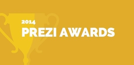
It's time to unveil the winners of the First Annual Prezi Awards— the best prezis of the year! We at Prezi have spent the past few days combing through your nominations.We could not have made our selection without your help. Earlier this month, we invited you to nominate and vote for your favorite prezis of the year. Thank you to everyone who nominated a prezi, and congratulations to all the nominees. Picking just one winner in each category was very difficult, there were so many terrific prezis from which to choose.... And now, let's get on with it — we are pleased to present the best prezis of 2014:..
Jeff Domansky's insight:
Lots of powerful presentation tips and lessons in this great collection.

In a previous post, we mentioned that people tend to nod off in conference calls and how it is important to learn to conduct teleconferences better to minimize loss of time. One suggestion was to use online meeting software where you have the added benefit of presenting slides to your attendees via screen sharing, to help better engage with your audience.
Jeff Domansky's insight:
Basic tips for better slide presentations.
|


This is quite appropriate for me because I am at present writing some training courses using PowerPoint. Take a look at http://humaninterfacepublications.co.uk to see what is coming in 2016!!
Great tips on planning and engaging your audience.
Great tips for creating that Presentation in 5 easy steps.