
Explore the asteroids (3D Simulation): http://www.asterank.com/3d/
Get Started for FREE
Sign up with Facebook Sign up with X
I don't have a Facebook or a X account


 Your new post is loading...
 Your new post is loading...
Your new post is loading...
Explore the asteroids (3D Simulation): http://www.asterank.com/3d/ 
No comment yet.
Sign up to comment
This visualization shows the moon's phase and libration throughout the year 2013, at hourly intervals. Each frame represents one hour. In addition, this visualization also shows other relevant information, including moon orbit position, subearth and subsolar points, distance from the Earth. Click each graphic to learn more about what it means! Finally, to learn more about this visualization, or to see what the moon will look like at any hour in 2013, visit http://svs.gsfc.nasa.gov/goto?4000!
|

|
Scooped by Sakis Koukouvis |


|
|
Scooped by Sakis Koukouvis |
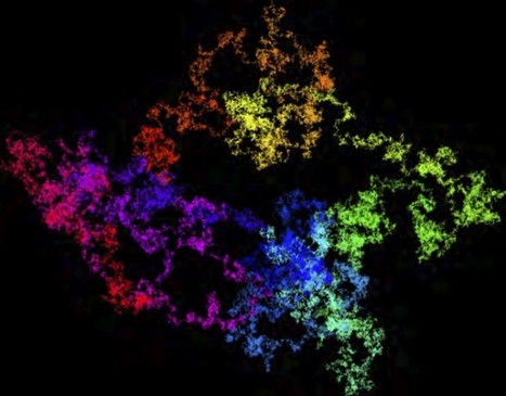
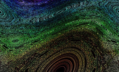
Of course, the number of digits in π is infinite, but over the years, as computers have become more powerful, we know many more of them than ever before. But it’s one thing to say that I can download trillions of digits of π and another to make some sort of sense out of all of these digits. Into this steps a team of researchers from Australia, Lawrence Berkeley National Laboratory, and Simon Fraser University with some elegant visualizations of π. In a recent paper, they used a classic method of visualizing large strings of numbers: the random walk.
More on "Pi": http://www.scoop.it/t/science-news?tag=pi
|
|
Scooped by Sakis Koukouvis |
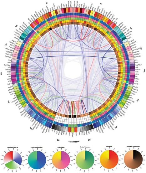
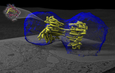
The point is to show how advances in imaging and data visualization technologies enable inter-disciplinary research which just a decade ago would have been impossible to conduct. There is also a somewhat artistic quality to these images, which reinforces the notion of data visualization being both art and science.
CONNECTOME: http://www.scoop.it/t/science-news?tag=connectome
|
|
Scooped by Sakis Koukouvis |
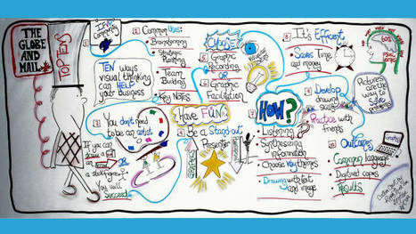
Visual thinking is an approach that uses art to develop critical thinking, communication and visual literacy skills. Incorporating sketching and visual note-taking skills for meeting facilitation in real time instead of using PowerPoint presentations is an effective way to solve problems, articulate ideas and communicate with clients and team members.
|
|
Scooped by Sakis Koukouvis |
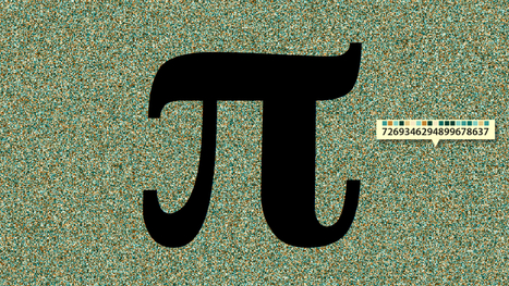

The picture up top is adapted from a rather simple but effective piece of data visualization, created by the folks at design studio TWO-N, which represents the first four-million digits of Pi in a brilliant mess of interactive pointillism.
Other stories about PI: http://www.scoop.it/t/science-news?tag=pi
|
|
Scooped by Sakis Koukouvis |

Our interpretation of the world around us may have more in common with the impossible staircase illusion than it does the real world.
Articles about NEUROSCIENCE: http://www.scoop.it/t/science-news?page=1&tag=neuroscience
|
|
Scooped by Sakis Koukouvis |

he Web's ability to facilitate the transfer of information will continue to revolutionize our world, replacing the very physical space which many of our institutions take for granted. Office buildings, universities and shopping malls exist in large part to store information and facilitate its transfer between human beings. Many offices still hold large file cabinets, college lecture halls were built to allow many students to learn from one professor and malls provide consumers with information before they make a purchase.
|
|
Scooped by Sakis Koukouvis |
The seasonal growth of plants—both on land and in the ocean—is one of the most striking patterns visible on Earth from space. This green "pulse" of life is intimately connected with the planet's carbon cycle and changing climate. In this data visualization, watch plants grow and die with the seasons and learn about the resulting effects on carbon and climate.
|
|
Scooped by Sakis Koukouvis |

Game of Thrones' Circles
|
|
Scooped by Sakis Koukouvis |
A supercomputer at NASA's Goddard Space Flight Center was used to map aerosols - particles suspended in the air - based on observations from August 2006 - April 2007. The result is surprisingly lovely. I've marked a couple of pints you want to pay attention to, like a volcanic eruption near Madagascar; the effect of the event is stunning.
|
|
Scooped by Sakis Koukouvis |

An interactive 3D visualization of the stellar neighborhood, including over 100,000 nearby stars. Created for the Google Chrome web browser.
|
|
Scooped by Sakis Koukouvis |
This video illustrates the creation of memory threads. A simulated P2P network is generated where each peer contains digital memories.
|
|
Scooped by Sakis Koukouvis |
This visualization tours the ocean floor from the gentle continental slopes to the deepest trenches using data analyzed and archived by NOAA. Does it look familiar? It is actually the same data that Google has incorporated into Google Earth and Ocean.
|
|
Scooped by Sakis Koukouvis |
In this new RSA Animate, Manuel Lima, senior UX design lead at Microsoft Bing, explores the power of network visualisation to help navigate our complex modern world. Taken from a lecture given by Manuel Lima as part of the RSA's free public events programme.
|
|
Scooped by Sakis Koukouvis |
This visualization reveals the freshwater stores that NASA’s GRACE (Gravity Recovery and Climate Experiment) satellite detects from space and shows how that data can be used to evaluate groundwater gains and losses, critical information in the effort to conserve the water that people depend upon
|
|
Scooped by Sakis Koukouvis |

Jola et al. make the interesting observation that experienced viewers of ballet, even without physical training, covertly simulate the movements for which they have acquired visual experience, their empathic abilities heighten motor resonance during dance observation - activating the same brain motor pathways actually being used by the dancers.
Articles about NEUROSCIENCE: http://www.scoop.it/t/science-news?page=1&tag=neuroscience
|
|
Scooped by Sakis Koukouvis |
Scale is a simple concept. From a very early age, children know about big and small, heavy and light, more and less. Extreme scales, however, are another story.
|
|
Scooped by Sakis Koukouvis |
See how a lifetime of poor health habits can destroy your cardiovascular system.


Those big chunks of bare rock hurtling around the asteroid belt? They might be worth something. An interactive roadmap shows how to cash in.
http://www.popsci.com/science/article/2012-12/asterank-3d-visual-guide-getting-rich-space