


Research and publish the best content.
Get Started for FREE
Sign up with Facebook Sign up with X
I don't have a Facebook or a X account
Already have an account: Login

Measuring the Networked Nonprofit
24.1K views |
+0 today
Best links and resources for improving practice and proving results.
Curated by
Beth Kanter
 Your new post is loading...
 Your new post is loading...
Your new post is loading...
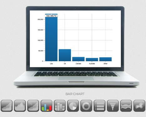
ReportGrid is a new web-service that allows any web publisher to create well-designed charts and graphs out of the traffic being recorded on his web pages and to easily publish them online.
Two critical items characterize this service:
1) Quality visualization of web analytics data
2) Tools to publish it online
In 2004 I wrote: "...Though I am aware of breaking out from the traditional approach to the use of Web server statistics, but I would strongly suggest independent publishers, reporters, bloggers and online journalists of all kinds, to make (a representative sample) of their log server stats publicly available.
...
My recommendation is: Make it completely transparent for everyone to see how well you are doing.
The more transparent you are, the more credible your information will be."
Link: http://www.masternewmedia.org/2004/08/11/pacmeter_popularity_authority_credibility.htm
This is why I think Reportgrid is offering something that will be of increasing value in the near future.
Free and paid versions avalable.
Check (by mousing over the icons) all of the charts types available through ReportGrid: http://www.reportgrid.com/charts/
Features and pricing: http://www.reportgrid.com/charts/#features-anchor
How it works / get started: http://www.reportgrid.com/charts/#getstarted-anchor
Find out more: http://www.reportgrid.com/index.html
(Reviewed by Robin Good) Via Robin Good 
|
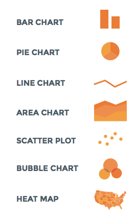
Graphs are a visual treat, as they can present complex information in a quick and easy manner. Mostly graphs are used to reveal a trend, compare statistics or
Beth Kanter's insight:
Handy cheat sheet for picking the right chart and graph. Text description and infographic.

Stephen Dale's curator insight,
December 31, 2012 4:21 AM
A useful overview of different types of graphs and where they might be used. |


Really useful guide to selecting and designing charts and graphs to visualize your data.