:: The 4th Era ::
139.8K views | +2 today
Follow
:: The 4th Era ::
Impact of the internet age on human culture and K-20 education policy/administration
Curated by Jim Lerman
Your new post is loading...
Rescooped by Jim Lerman from Education 2.0 & 3.0
Scoop.it!

The Future of Storytelling and the Influence Of Data

The Future of Storytelling and the Influence Of Data | :: The 4th Era :: | Scoop.it
The Future of StoryTelling Summit presented the perfect opportunity to showcase Power BI’s storytelling prowess. Of course, our team also learned some valuable lessons related to data-driven storytelling, and we’re excited to share these insights to strengthen your storytelling skills.

Via NikolaosKourakos, Yashy Tohsaku
No comment yet.
Rescooped by Jim Lerman from visual data
Scoop.it!

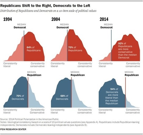
Favorite Pew Research Center data visualizations from 2014

Favorite Pew Research Center data visualizations from 2014 | :: The 4th Era :: | Scoop.it

"The heart of our work at the Pew Research Center is data. And data visualizations that tell clear stories about our research — whether it be about American politics or our changing demographics — are just as important as the words we write in a report. So, what makes a successful data visual? We think it should present information clearly and concisely, engage the reader and allow them to explore that information.

This year, the design staff looked back through our 2014 archive, and these graphics stood out as almost universal favorites. These visualizations presented a particular challenge and, for each of them, we talk about the approach we took in presenting the data."


Via Lauren Moss
No comment yet.
Rescooped by Jim Lerman from SocialMediaDesign
Scoop.it!

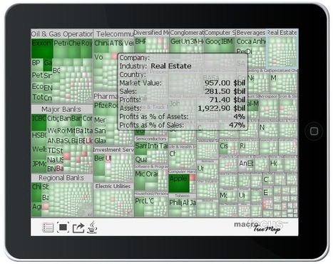
Curate, Organize and Visualize Large Data Collections with TreeMap

Curate, Organize and Visualize Large Data Collections with TreeMap | :: The 4th Era :: | Scoop.it


Via Robin Good, Jimun Gimm
ghbrett's curator insight, July 18, 2013 9:08 AM

This is another post where I recommend that you scroll down to have a look at Robin Good's great commentary. I can not beat his for details. His Scoop.it site is: http://curation.masternewmedia.org/  Thanks Robin!

Jenifer Rettler's curator insight, July 18, 2013 10:15 AM

If you are looking for additional visualization tools for displaying data, TreeMap v. 3.0 offers a classic tree map layout as well as others, like squarified variant, circular, tag cloud and voronoi.

malek's curator insight, July 18, 2013 4:54 PM

Interesting tool, give it a try

Scooped by Jim Lerman
Scoop.it!

How to Tell Stories with Numbers

How to Tell Stories with Numbers | :: The 4th Era :: | Scoop.it
A guide to using the techniques of data mining and data journalism to create compelling, original content in the form of data visualizations


Jim Lerman's insight:

Quite a valuable primer for how to locate, manage, display, and understand data. Lots of excellent links. Do not miss this.

María Dolores Díaz Noguera's curator insight, September 16, 2015 8:03 AM

Cómo contar historias con números..How to Tell Stories with Numbers | @scoopit via @jimsignorelli http://sco.lt/...

Carlos Silva's curator insight, September 16, 2015 10:40 AM

añada su visión ...

ManufacturingStories's curator insight, September 16, 2015 1:20 PM

#BigData #Numbers #Analytics #ContentMarketing

Rescooped by Jim Lerman from visual data
Scoop.it!

Data Visualization 101: Bar Charts

Data Visualization 101: Bar Charts | :: The 4th Era :: | Scoop.it

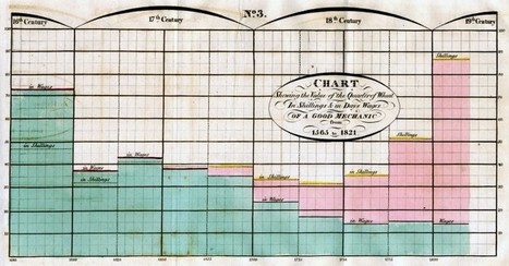
'In our Data Visualization 101 series, we cover each chart type to help you sharpen your data visualization skills.

Bar charts are a highly versatile way to visually communicate data. Decidedly straightforward, they can convey the message behind the numbers with impact and meaningful clarity, making complex data easy to understand at a glance.'


Via Lauren Moss
No comment yet.
Rescooped by Jim Lerman from visual data
Scoop.it!

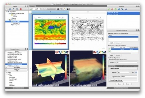
The Future of Data Visualization Tools

The Future of Data Visualization Tools | :: The 4th Era :: | Scoop.it

Data is everywhere and well-designed data graphics can be both beautiful and meaningful. As visualizations take center stage in a data-centric world, researchers and developers spend much time understanding and creating better visualizations. But they spend just as much time understanding how tools can help programmers and designers create visualizations faster, more effectively, and more enjoyably.


As any visualization practitioner will tell you, turning a dataset from raw stuff in a file to a final result in a picture is far from a single-track, linear path. Rather, there is a constant iteration of competing designs, tweaking and evaluating at once their pros and cons. The visualization research community has recognized the importance of keeping track of this process.


Read the complete article to learn more about the future of the practice and the tools that enable designers to create thoughtful infographics and visualizations...


Via Lauren Moss
No comment yet.