:: The 4th Era ::
139.8K views | +0 today
Follow
:: The 4th Era ::
Impact of the internet age on human culture and K-20 education policy/administration
Curated by Jim Lerman
Your new post is loading...
Rescooped by Jim Lerman from visual data
Scoop.it!

The Urban Observatory: A New Way To Compare Cities, From The Creator Of TED

The Urban Observatory: A New Way To Compare Cities, From The Creator Of TED | :: The 4th Era :: | Scoop.it
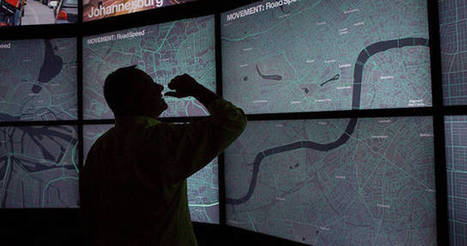
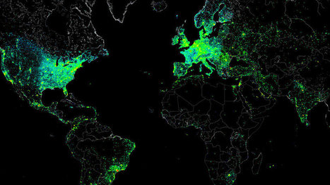
This giant installation and a website you can play with at home lets you compare the worlds urban centers side by side.

We live in a world of easily accessible maps; however, our map knowledge is limited by the fact that no two cities collect data the same way. Maps often aren’t drawn to the same scale, and until now, there hasn’t been a way to compare data on things like income, cost of living, water distribution, and power grids.

It’s a problem that has bugged Richard Saul Wurman, the creator of the TED conference (as well as an architect and graphic designer), for decades.

Wurman recently teamed up with Jon Kamen of Radical Media and Esri president Jack Dangermond to create an ambitious solution: the Urban Observatory, an immersive exhibit featuring standardized comparative data on over 16 cities. Zoom in on one city map and other cities will simultaneously zoom in at the same scale, making it possible to compare data on traffic density, vegetation, residential land use, and so on.


Find more details and information at the article link...


Via Lauren Moss
No comment yet.
Rescooped by Jim Lerman from visual data
Scoop.it!

100 Diagrams That Changed the World

100 Diagrams That Changed the World | :: The 4th Era :: | Scoop.it

A visual history of human sensemaking, from cave paintings to the world wide web.


Since the dawn of recorded history, we’ve been using visual depictions to map the earth, order the heavens, make sense of time, dissect the human body, organize the natural world, perform music, and even decorate abstract concepts like consciousness and love.

100 Diagrams That Changed the World by investigative journalist and documentarian Scott Christianson chronicles the history of our evolving understanding of the world through humanity’s most groundbreaking sketches, illustrations, and drawings, ranging from cave paintings to The Rosetta Stone to Moses Harris’s color wheel to Tim Berners-Lee’s flowchart for a “mesh” information management system, the original blueprint for the world wide web.

But most noteworthy of all is the way in which these diagrams bespeak an essential part of culture — the awareness that everything builds on what came before, that creativity is combinational, and that the most radical innovations harness the cross-pollination of disciplines.


Via Lauren Moss
Patrizia Bertini's curator insight, December 30, 2012 5:59 AM

I see! - goes together with embodied cognition? It seems so... Infographics as a key?

bancoideas's curator insight, December 30, 2012 9:28 AM

Ideas acerca de las ideas que tenemos sobte nosotros/as mismos/as y el mundo que co-construimos

Denise Eler's curator insight, June 30, 2015 7:26 PM

Quando um gestor pede que uma apresentação de 80 slides seja condensada em 3 slides, ou uma página A3, não tenha dúvida: isto vai exigir de você mais que capacidade de síntese textual. Pensar visualmente, especialmente, criando diagramas é uma competência valiosa. Vejo isso durante meus cursos e vivência com profissionais das mais variadas indústrias. A boa notícia é que dá para aprender ;)

Rescooped by Jim Lerman from visual data
Scoop.it!

Infographic: Hackers Create An Amazing, Illegal Portrait Of The Internet

Infographic: Hackers Create An Amazing, Illegal Portrait Of The Internet | :: The 4th Era :: | Scoop.it

It wasn’t malicious. The file itself was the size of a small JPEG. It was given the absolute lowest priority. And it was set to self-destruct if anything went wrong. But this small file allowed one single hacker to measure the Internet activity of nearly half a million connected devices around the world, then share the results with everyone.

How was this even possible? The "hacker" barely hacked anything. In reality, they gained access to all these systems because each had the default "root" set as a password. With this access in hand, they ran several tests focusing on Internet structure and activity. And what they created from all this data is a spectacular map that captures a day in the life of the Internet (and all of its users).


Via Lauren Moss
Annenkov's comment, May 10, 2013 11:24 PM
США и Европа как очаги информатизации
Sakis Koukouvis's comment, May 11, 2013 3:17 AM
Wonderful
Nacho Vega's curator insight, May 11, 2013 12:18 PM

Creative power: hacking at the end of the world!


Using "root" as universal key :))