


Here's our take on some popular approaches to Presentation Design seen in some work by great presenters. Enjoy! Download here for a Tweet!: http://goo.gl/eV54K
Via Baiba Svenca
Get Started for FREE
Sign up with Facebook Sign up with X
I don't have a Facebook or a X account


 Your new post is loading...
 Your new post is loading...
Your new post is loading...
Here's our take on some popular approaches to Presentation Design seen in some work by great presenters. Enjoy! Download here for a Tweet!: http://goo.gl/eV54K Via Baiba Svenca 
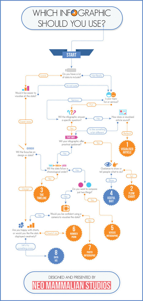
That’s right, there’s more to infographics than a scrolling image full of facts and figures. Different types of infographics are consumed differently. The right kind of infographic should match your data to your narrative and ensure that people take away your message after reading it. While infographics may not come in that many shapes or sizes (600 x 1,800 pixels is the norm), that doesn’t mean there’s a stock standard infographic for you. Use the flowchart to help you decide which infographic is right for you... Via Lauren Moss
|
It could be argued that early caveman actually invented infographics.
It wasn’t until 1626, however, that infographics were published in the book Rosa Ursina Sive Sol by Christoph Scheiner. His illustrations clearly and concisely demonstrated the rotation patterns of the Sun. After that, infographics appeared regularly in a variety of other publications.
In the 1970’s, The Sunday Times, an award-winning British newspaper, began using infographics to make the news more interesting. Throughout the 1980s and 1990s, other newspapers began following suit.
By the turn of the 21st century, new technologies emerged that enabled a host of companies to create infographics quickly and easily. Infographics slowly began making their way onto websites, in magazines, products and games... Via Lauren Moss
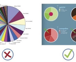
When it comes to visualizing data, it’s important to pick the right graph and the right kind of data range. Make it too detailed, and information gets lost and the reader leaves confused. Too simplified, and your data’s integrity is weakened. Choosing the right infographic element shouldn’t be an art but common sense. After all, it’s an infographic – readers should get the gist of things at first glance and not have to get crossed-eyed in making sense of things... Via Lauren Moss

Lauren Moss's curator insight,
April 10, 2013 6:55 AM
General reference for basic visualization design elements, applications, and best practices... |


This works as a great summary reminder of tools, tips and tricks to make you communication (not just presenations!) more compelling
Great ideas to present in an engaging style.
Een mooi overzicht van de technieken gebruikt door een aantal bekende presentatoren: Kawasaki, Lessig, Godin, Jobs.