WebsiteDesign
32.8K views | +0 today
WebsiteDesign
Welcome to our sharing page on website design
Your new post is loading...
Rescooped by Brian Yanish - MarketingHits.com from Must Design
Scoop.it!

Big Web Design Trends Happening Now via Creative Edge w/ @Scenttrail Notes

Big Web Design Trends Happening Now via Creative Edge w/ @Scenttrail Notes | WebsiteDesign | Scoop.it

We're boiling down 13 of the most prominent web design trends emerging in 2015. Will they change your understanding of a "modern website"? You be the judge.

Marty (@Scenttrail) Notes:

1. Make it big (Agree but not as easy to do well as they make it look).

2. The multimedia experience (agree and same as #1)

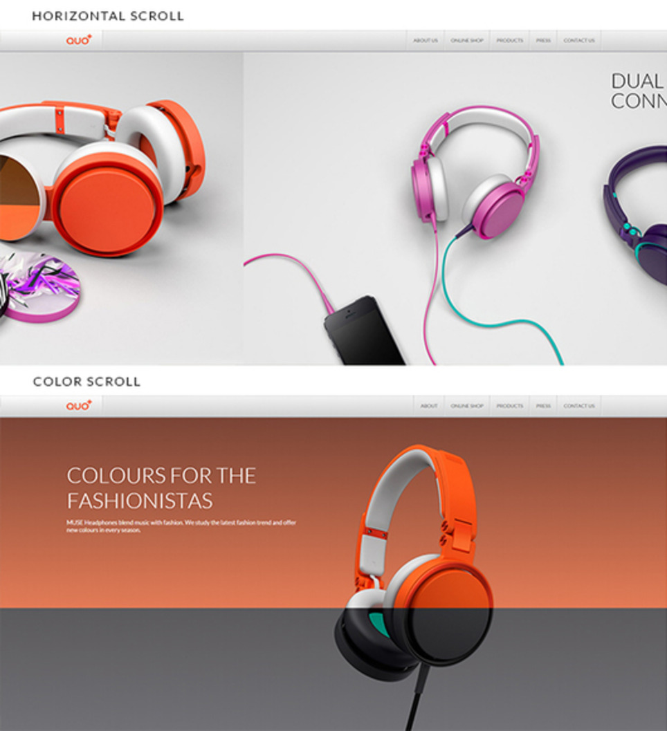
3. The Parallax effect mutations (Horizontal Scrolling) Agree

4. Animated storybook (Agree and cool).

5. Flat design (agree & effect of mobile)

6. No more boxes (Agree and YES!).

7. Tiles (Pinterest effect and agree).

8. Navigation widgets (Agree!)

9. Integrating Google maps (Agree where appropriate).

10. Mashup interfaces (AGREE grab those APIs :).

11. Minimize (Seems to contradict #1, but agree).

12. World Wide Wait (speed is going to be KEY).

13. Designer automation (Agree, can do a lot with templates now).


Via Martin (Marty) Smith
Rescooped by Brian Yanish - MarketingHits.com from Must Design
Scoop.it!

10 of the Best UX Infographics - The Usabilla Blog

10 of the Best UX Infographics - The Usabilla Blog | WebsiteDesign | Scoop.it
Sometimes, as the old saying goes, pictures really do tell 1000 words. And if that’s the case, what’s better than a picture with 1000 words included on it?

Via Martin (Marty) Smith
Martin (Marty) Smith's curator insight, January 27, 2015 10:10 AM

Love these especially the ideal vs actual. So true. M

Rescooped by Brian Yanish - MarketingHits.com from Curation Revolution
Scoop.it!

eCommerce Websites Convert Better With Modern Web Design Techniques

eCommerce Websites Convert Better With Modern Web Design Techniques | WebsiteDesign | Scoop.it

You probably heard about the modern web design term at least once, but how can be used correctly with an online shop? What are the requirements?

Marty Note (here is how I shake out on each of these recs)

Big Hero Or Sliders Agree With Caveat!
Depends on what you do immediately to the right or under your large hero. Hero's create HOT SPOTS on the right and immediately below, hot spots that convert and hot spots NO ONE uses (goofystupid). If you are running an ecommerce site you aren't selling the picture, but you do need the attention it can grab. Make sure you put a Call-To-Action to the right or immediately below. People don't like to click within a hero (especially a big one), so CTA below even if it is a restatement.

http://www.charitywater.org/
Does a good job with a large static hero and a "can't miss" CTA with 3 critical links almost directly below the hero. & I DO NOT like sliders.

Warmer Colors - AGREE!
Websites are inherently COLD so warming them up with strong accent colors is a must. Remember to figure in the images you like to include. You can use more warm color if your images always have white backgrounds. If not, you may achieve "warmer" with images instead of needing to modify your design.

Interesting Grids - AGREE!
Thanks to Pinterest the GRID is getting creative. Grids are a great way to share a lot of information fast.

Flat Design - Agree!
The web doesn't do 3D well (yet), so flattening out your design can help make buying decisions easier. Include zooms if applicable and remember to ask your customers to share pics of your products on them or in their homes (great User Generated Content).


Animation
Vine has me convinced there are ways to create animations that help and don't hurt, but be careful. An animation that doesn't stop (like Vine videos) can be obnoxious. I prefer giving control of animations to the click over auto-play. If someone ASKED to see the animation its different than if you just start playing it and it doesn't stop.


Mobile Friendly UI - Agree!
Your responsive design must master the swipe, spin and scroll of the mobile experience. If your site isn't FUN and easy to spin, snip and buy from your customers won't. Spoke with a friend at lunch in the craft space today and her traffic is now HALF mobile, so make sure your content is FUN to use on a phone or pad and takes advantage of the mobile UI.


Via Martin (Marty) Smith
No comment yet.
Rescooped by Brian Yanish - MarketingHits.com from Must Design
Scoop.it!

50 Cool CSS3 Design Examples Inspire

50 Cool CSS3 Design Examples Inspire | WebsiteDesign | Scoop.it
It's amazing what can be done with CSS these days. Support for the latest CSS3 properties is strong in the latest versions of all the major browsers - even Internet Explorer - and the possibilities for typography, animation and interactivity have never been greater. But finding web design inspiration can be tricky.

Via Martin (Marty) Smith
Martin (Marty) Smith's curator insight, February 15, 2014 9:12 PM

CSS3 has some cool applications as these 50 examples show.

Michael Allenberg's curator insight, February 21, 2014 8:26 AM

The future of web design...

Rescooped by Brian Yanish - MarketingHits.com from Ecom Revolution
Scoop.it!

How DESIGN TREND Is Your Ecom Website Going Into The Holidays? [Infographic]

How DESIGN TREND Is Your Ecom Website Going Into The Holidays? [Infographic] | WebsiteDesign | Scoop.it
A infographic featuring web design trends for 2013 created by Enfuzed. This is the original!

Via Martin (Marty) Smith
Martin (Marty) Smith's curator insight, October 13, 2013 1:13 AM

If your Ecom webstie isn't responsive, doesn't have great content and isn't social....well good luck with that and be sue to send a card from where you end up in Jaunuary :).

Intriguing Networks's curator insight, October 14, 2013 2:26 PM

Design trends to track when considering web development and enhancements for your year end marketing

Rescooped by Brian Yanish - MarketingHits.com from Must Design
Scoop.it!

Future Of Web Design 2

Future Of Web Design 2 | WebsiteDesign | Scoop.it

Web 3.0's Whaam!
Just as Roy Lichtenstein’s Whaam! 1963 seemed to blow abstract painting off the walls web 3.0 will change everything we call "website design". After creating Future of Web Design (http://sco.lt/7r6zkf) Haiku Deck I realized some shots were fired but not enough.

Web 3.0 powered by a ubiquitous web for people and things with semantic intelligence changes how we create websites and Internet marketing. Math will be a future web designer’s friend. 

Websites will float based on predictive analytics and real time behavior. Behavior responded to with tested creative designed for personas and segments to CONVERT is more Google-like than anything web designers create now.

David Merrill's siftables are the best demonstration of how content will become intelligently self aware AND agnostic to the kind of hubificaiton web designers practice now.

http://youtu.be/JP0w9lZoLwU Siftables

Hubificaiton is about bringing THEM to US. APP-ificaiton is about creating agnostic widgets. Widgets easily placed anywhere (as Amazon's mini-cart widget demonstrates here: http://sco.lt/4iahNZ).

Web 3.0's mobile ubiquitous web will reversing hubification emphasis on traffic density (bring visitors into a hub). Distinctions will chante too. THEM and US will fade in favor of relevant experience (the commons). 

In this context CONVERSION becomes an extension of an experience instead of the other way around. We rarely shop / search for things merely for the pleasure of the search.


We may start with one goal in mind and end up achieving a different set of goals, goals created on the fly in real time based on how the web responds to our journey, but our process feels like US.

Predictive analytics, personas, segments and an increasing amount of tested creative controlled by math means our unique feeling of US or ME may continue to exist, but THEIR sense of our next behavior mean this is a distinction without a difference. 

If you fit a persona, that persona predicts what relevant content you need when the feeling of having Big Brother on your should could be overwhelming. Mutual benefit is why consumers won't revolt.

When websites convert 40% of their traffic, as Schwan's does now, their efficiency trumps density. Efficiency trumping density describes Web 3.0 perfectly.  


Via Martin (Marty) Smith
No comment yet.
Rescooped by Brian Yanish - MarketingHits.com from visual data
Scoop.it!

Serif vs Sans: The Final Battle In Typography [Infographic]

Serif vs Sans: The Final Battle In Typography [Infographic] | WebsiteDesign | Scoop.it

Within the typographic communities, people have debated on the issue: Do serifs contribute to the legibility of typefaces, and are sans serif typefaces less legible?


Like many things, these two different fonts have pros and cons. This infographic takes a look at the argument of serif vs sans serif...


Via Lauren Moss
ComeStilVuole's curator insight, March 18, 2013 3:19 AM

Sans o serif? Ecco come usare i font giusti per ogni strumento.

Best Infographics's comment, March 18, 2013 2:21 PM
Each font has their own uses, but sometimes it is a personal choice.